I’d say there’s also another approach.
Approach C
Grain Field and Economic Field are two separate buildings, each able to switch between food and coin.
This would avoid the technical issues with option A while making them functionally the same. The only difference is that the two field types would be separately selectable when double clicking which would be beneficial in my opinion.
The African build menu definitely has enough space for two slots so this would help. As for the names, I’d go with this:
Cash Crops (or Cash Crop Field) - produces coin
Cereal Crops (or Cereal Crop Field) - produces food
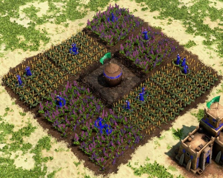
But this only deals with one of the issues that makes Fields so annoying. Even after they are built, selecting, switching and assigning villagers is a pain. They should also double the size and capacity of Fields. This could be as simple as sticking two Fields together into a rectangle. With two different Field types, each could come in a different orientation by default so you could neatly fit them around a Granary without needing to rotate. For example, Cash Crops could have a default horizontal orientation and Cereal Crops could have a default vertical orientation. With the recently expanded Granary radius, these double fields would still fit perfectly even when adding an additional layer of fields.
The differentiation between Field types could be further enhanced by locking the ability to switch behind the Crop Rotation tech. The upgrades might need to be switched up anyways because one is named Cash Crops.