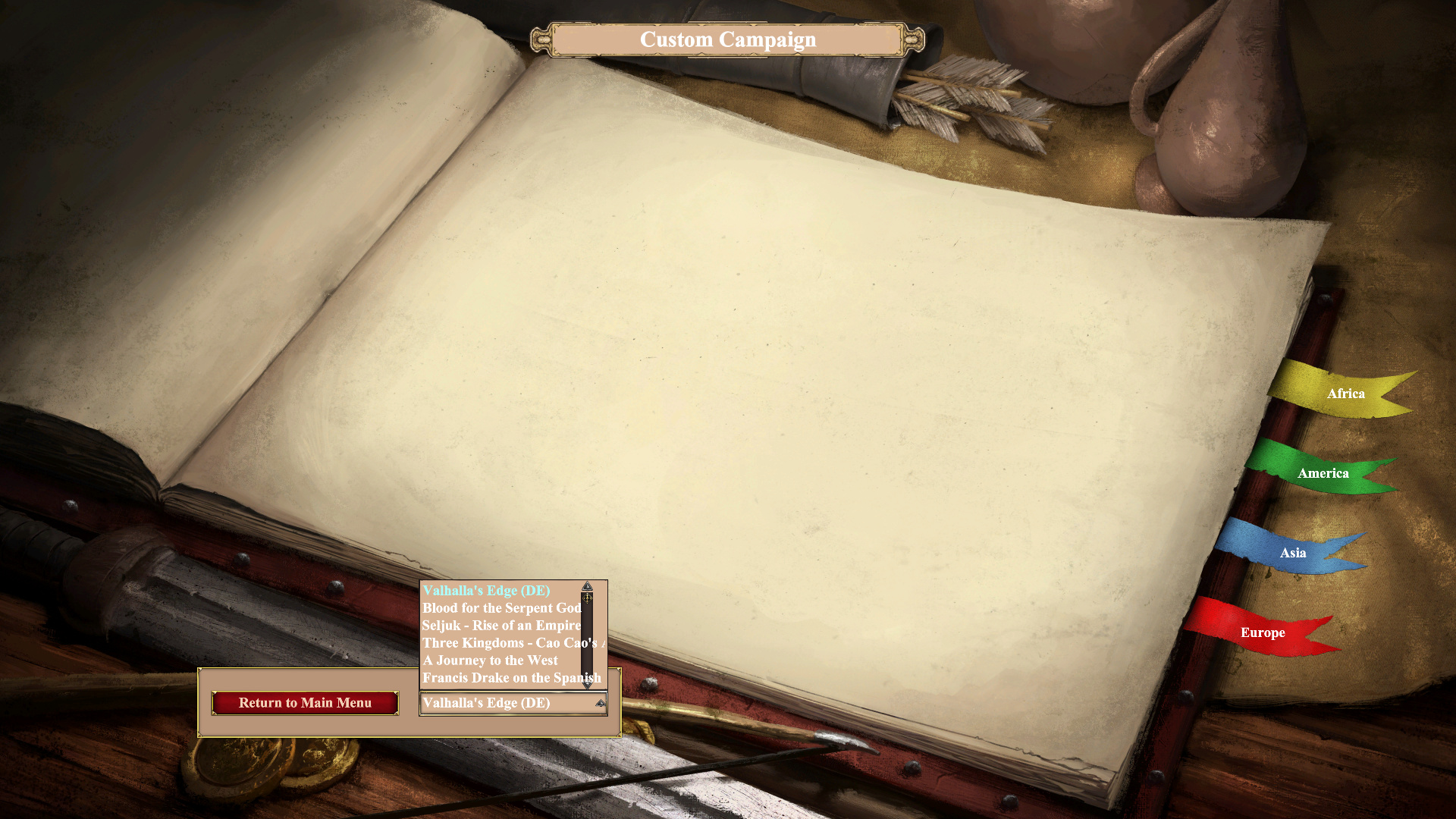
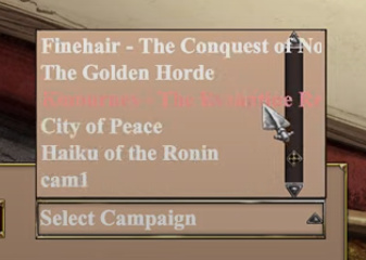
On screen for selecting custom campaign, the first campaign is preselected in dropdown, which is confusing, because it actually is not selected and player needs to select it for playing. It would be better to have dropdown be empty by default.
Also the dropdown is very small, which means, that it is uncomfortable to scroll and names of many campaigns don’t fit into it.
IMO it would be better to display names and thumbnails of custom campaigns in tile layout for clarity and ease of selecting.
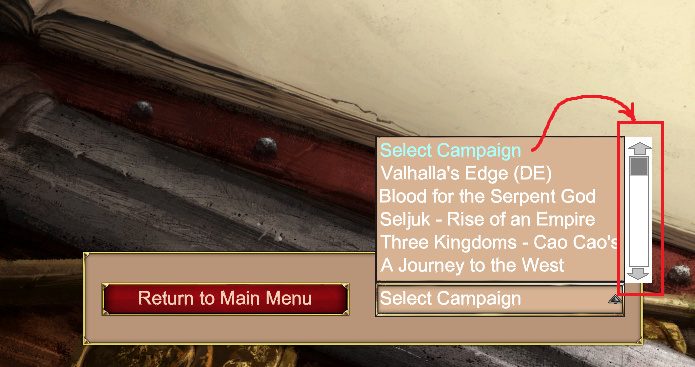
It seems like this menu should get a scrollbar. Fortunately, you can use your middle-mouse button to scroll down it, but if someone’s MMB wheel is busted or they don’t know the list is longer, they may never see all the maps that are installed. Usability-wise, it just makes sense to add a scrollbar, imo…
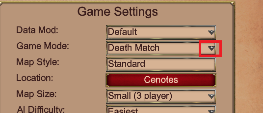
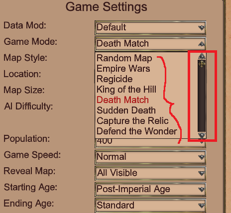
And, if it helps, there are other areas of the game where a scrollbar already gets utilized, like here, when choosing a Game Mode. The list is longer than what fits in the box, so a scrollbar is provided:
Looking back at one of my YouTube videos, there used to be a (poorly positioned) scrollbar in the menu.
Looks like it was removed in a recent update.
That menu needs a significant redesign. Even with a scrollbar, it’s cumbersome to use for more than just a few scenarios. And the white text on a light background is extremely difficult to read.
Oh, wow. Cool find! Yeah, it isn’t the best menu. There is also so much vertical room on that page that they could easily make that menu be a lot taller, to aid in its usability and readability. Should maybe be able to see 10+ campaigns at a time rather than 5. Also, should it be organized alphabetically, maybe? Or maybe newest at top, if it isn’t already that way.
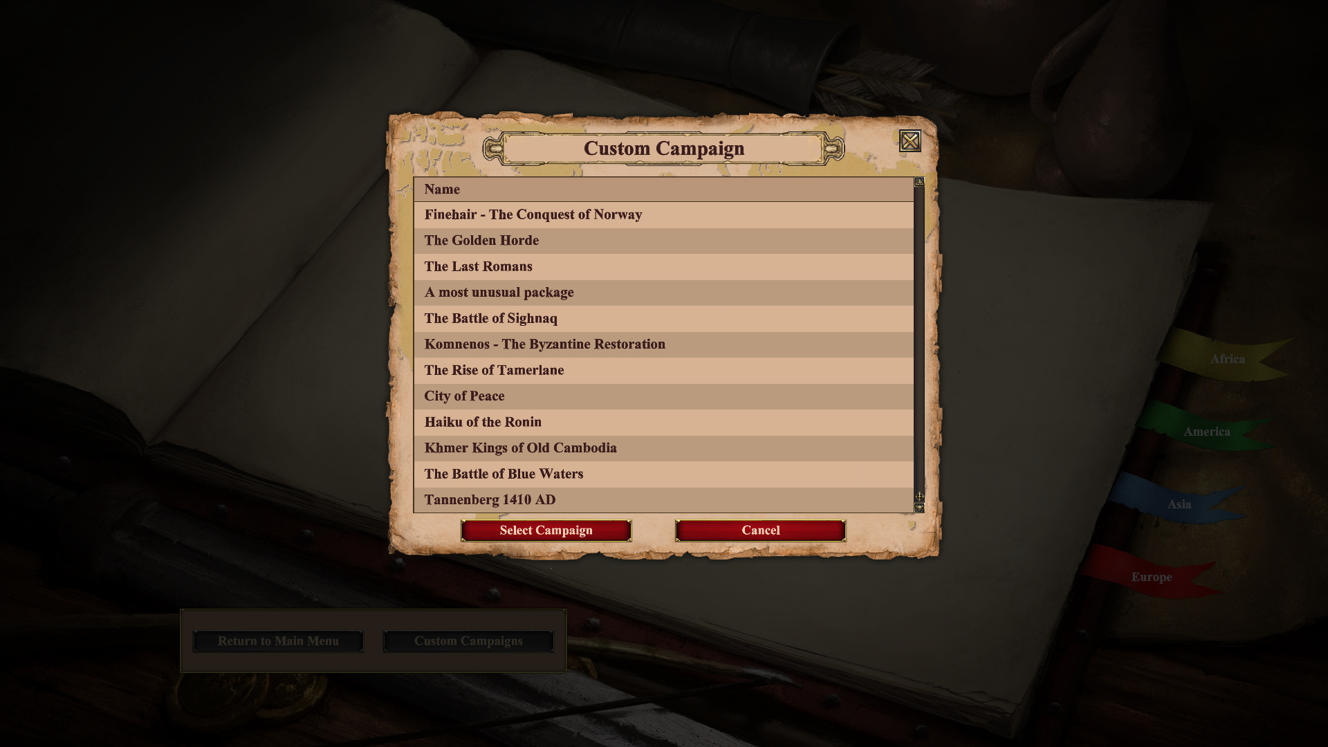
Custom campaigns screen looks much better now, but campaigns are not sorted alphabetically, which makes it cumbersome to search for campaigns from long list.
It appears, that campaigns are sorted by prefixed mod names, not by campaign names. For example “Komnenos - The Byzantine Restoration” is sorted after “The Last Romans” (should be before), because prefixed mod name “1962_Komnenos - The Byzantine Restoration” comes alphabetically after “14759_The Last Romans” (notice the prefix).
Custom campaigns, which are in resources folder, not installed as a mod, are at the end of list. They should also be sorted mixed along with mod campaigns.