Game Version:
- Build 101.101.34223.0
- Platform Steam
Issue:
TL;DR
Having East Asian languages share the same typeface can cause many problems, so please don’t do that.
Description
I love and appreciate how DE has added fun and numerous graphical enhancement over this classical title and that’s why I bought it, but there is one point less than perfect that is about text localization. Actually, it’d even likely be called a quality degradation when I recall how we played the original editions in those days. The problem with DE is that strings have wrong shapes.
Actual Problem 1
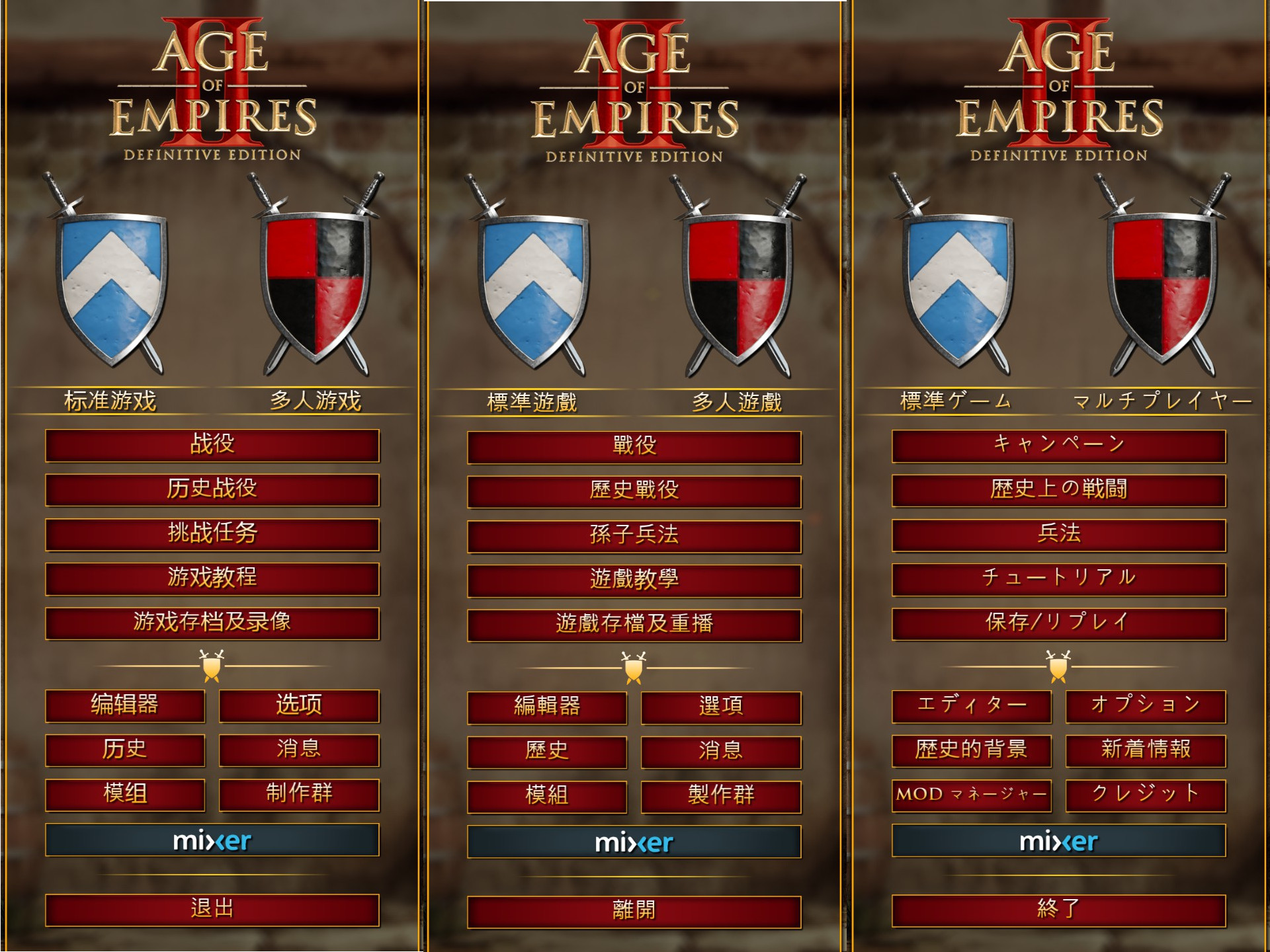
In the screens controlled by WPF (main menu and history AFAIK), a weird thing happens that the game seems to try to find a character first from a Korean font then from a Simp. Chinese font. This makes all locales that use Chinese characters (SC, TC, JP from the left in the image below) have mish-mash of typefaces which inevitably contains broken character shapes here and there.
Suggested: change font fallback setting according to locale, not on a codepoint basis. At least looking up Chinese characters in Korean fonts doesn’t make sense because Korean use little of them in informal writing such as that in video game. Add Trad. Chinese and Japanese font for each locale too. Any commercial OS platform should have separate ones for each language, so there shouldn’t be any compatibility issue. If you don’t know what to use, please ask, for example, me?
Actual Problem 2
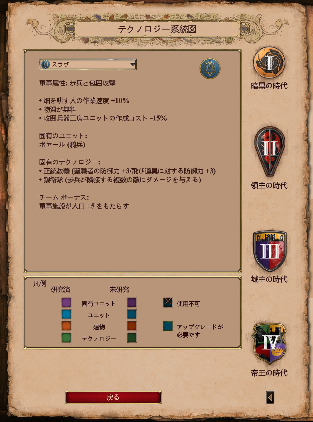
Screens not controlled by WPF seem to use a SC font for Chinese characters globally. That means TC and JP locales suffer from wrong or uncomfortable character shapes. For instance, below is a part of tech tree UI in Japanese, but I can already pick up at least six characters (統, 図, 包, 房, 究, 戻) not quite right for Japanese and three characters (器, 具, 与) wrong i.e. you’ll get a cross from your teacher if you write that way.
Suggested: make use a font dedicated to each language, same as above. There is no neutral font whose glyph shape satisfies standards of all those languages. What’s worse, the commoner characters the more probability they have divergent shapes.
Is That So Important?
It simply looks so bad that anyone could immediately notice. Since it’s less like a bug report, I’ll defer the background information to these articles. But generally, people in each of those locales are not familiar with another locale convention and do not use another locale’s typefaces unless they want to put some exotic flavor or give a playful or “a bit off” impression. As this game has a very elegant look and feel graphically, I can’t help but feel the text goofy all the more so with what it is now.