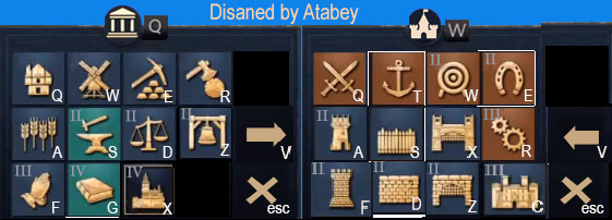
That would be better if relic arranged hotkeys just like OP suggest. But i think port should be in military tab, and arrow key needs put on G key, cancel key on B key, university on Z, TC on X and wonder on C. They should remove delete key from UI panel. Buildings being fitted on 4x3 grid would help fingers dont need to stretch to T, G, V row. Just my opinion.
1 Like

I rearrange buttons using Paint (pls ignore key letter) 
3 Likes