Currently the post-game stats timeline is displayed as a percentage stacked area graph. But I think this is a bad fit for the kind of data displayed. It completely disregards the changes of the overall total, i.e. the total number of units in the game. If one player produces units it intuitively looks like another player loses units. Or maybe he actually lost units and none were produced. You just don’t know (the few totals on the bottom rarely help).
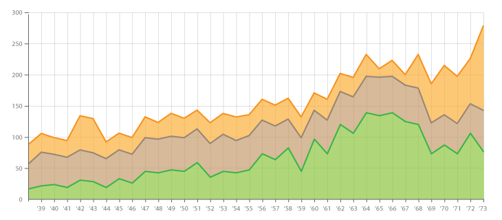
A normal stacked area graph would be a much better fit. In that kind of graph a wider or narrower area does actually correspond to this exact change in unit number and it is therefore much more intuitive.
Example: (from https://datavizcatalogue.com/methods/stacked_area_graph.html)