
Hello! I been working on a mod that will eventually override the UI. The main goal is to improve visibility at the expense of prettier icons or HUD size. I am currently looking for feedback.
“Part One” is meant to correct a lot of the issues I have with the current Icon pack. The monotone golden icons are quite beautiful. When looking at them up close, you can appreciate all the work that went into them. However, this art design choice sacrifices visibility and readability of player actions in the game. This impacts both the gamer’s experience as well as the esport fans.
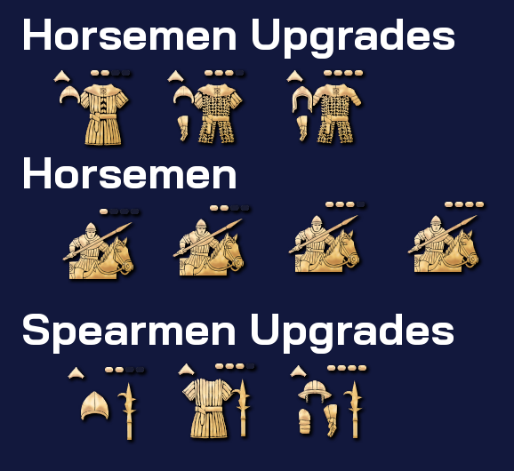
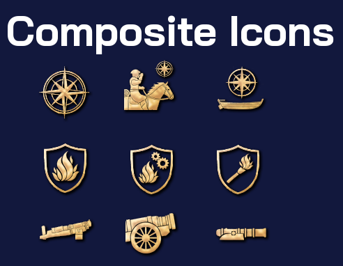
Design variety is also limited, and I suspect that’s one of the reasons we have so many composite Icons (Icons that are a mix of other symbols or icons)
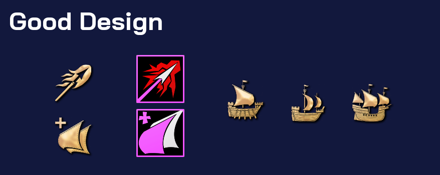
There’s also some great examples on good design, that I’ve managed to translate. And some that I might never get to redesign due to the more simplistic art style I’ve elected.
The core art design of my mod is working with colors and contrast to improve the visibility of the entire HUD. Using black as a background with negative space of background colors for unit representation.

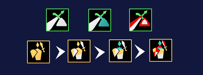
First, Each Icon has an identity with what it’s meant to do.
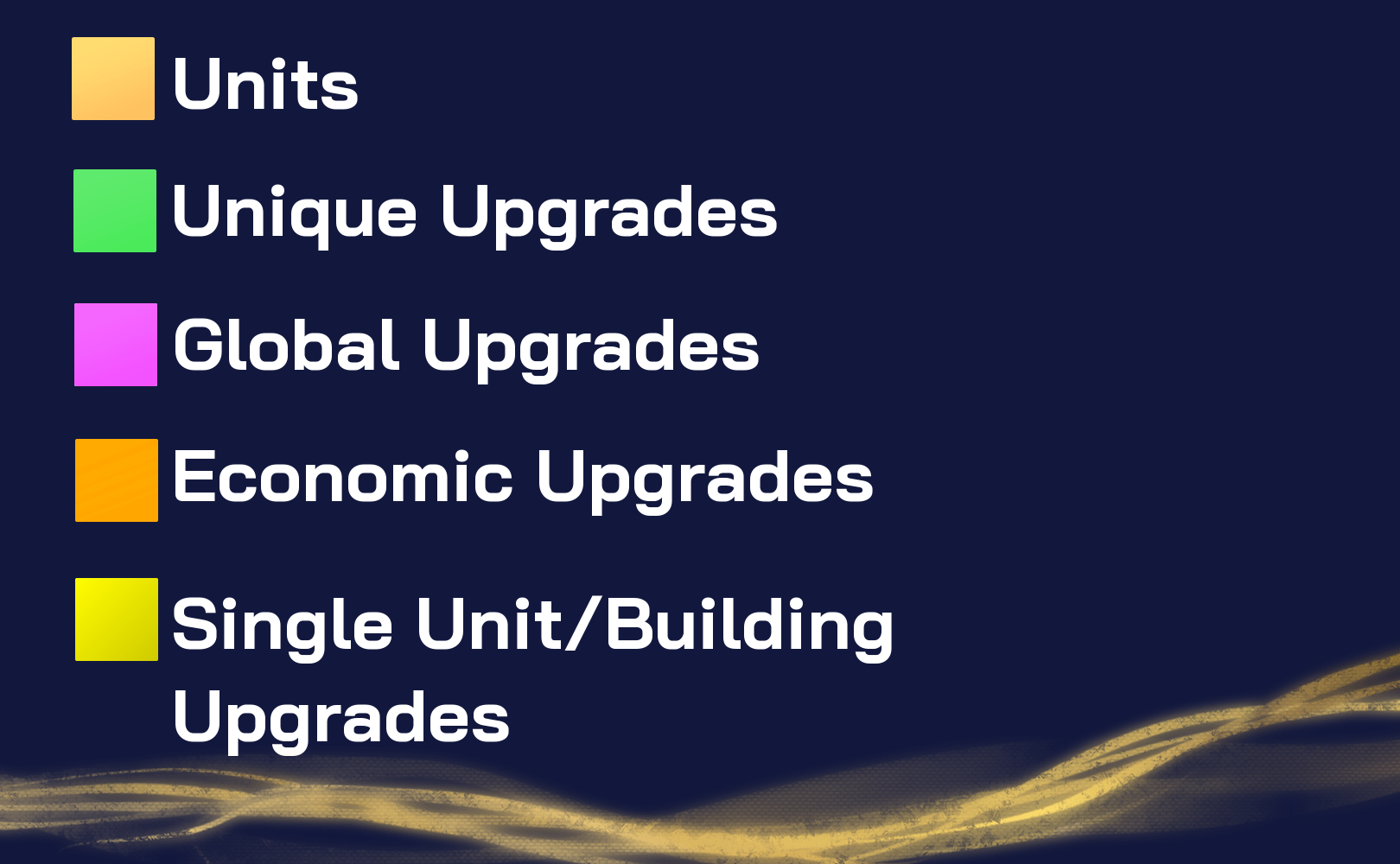
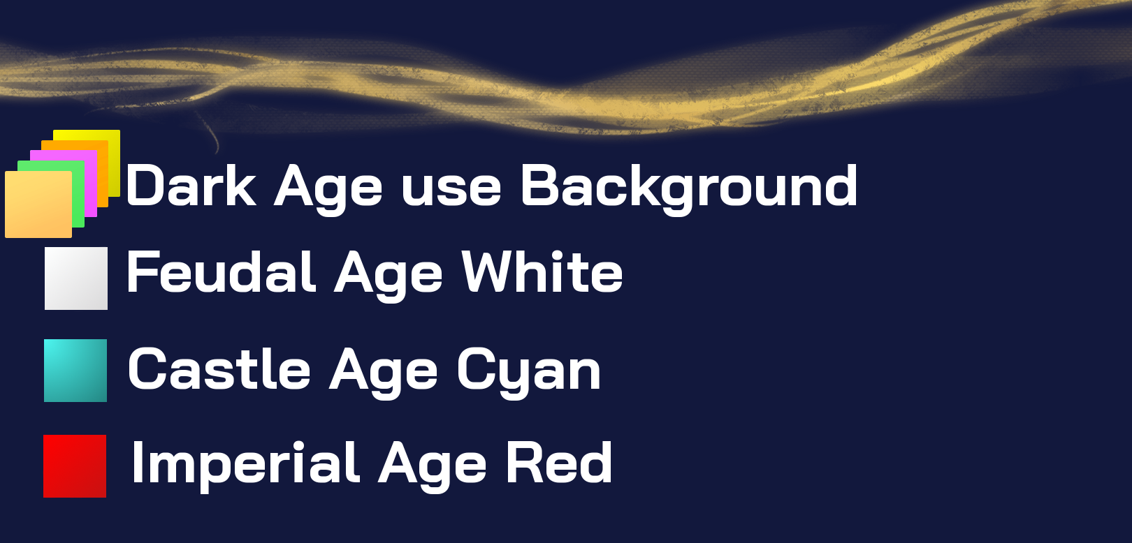
Then we can add colors to the drawing to differentiate between age technologies/units. Ideally as I improve the icons, castle upgrades should be colored with cyan only and imperial with red only. Mixing only white and the background color giving a contrast in design where castle looks cold and imperial looks warmer.
Ultimately, one should be able to easily associate icons to units, ages and function.
There’s much work to be done yet. I’ve published an early version of this Mod on the PUP under the “High Visibility Mod” name. It only works for the English and you can already see that I’ve replaced the “unique flower” decorator with an English flag.
I’m also looking for caster and pro players that could comment on possible improvements.
