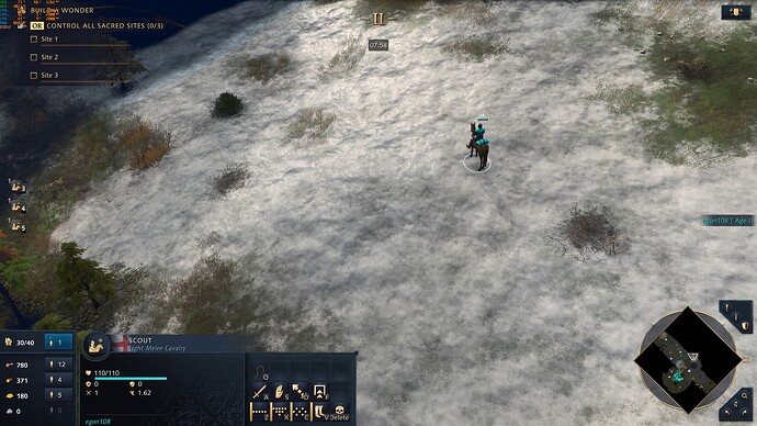
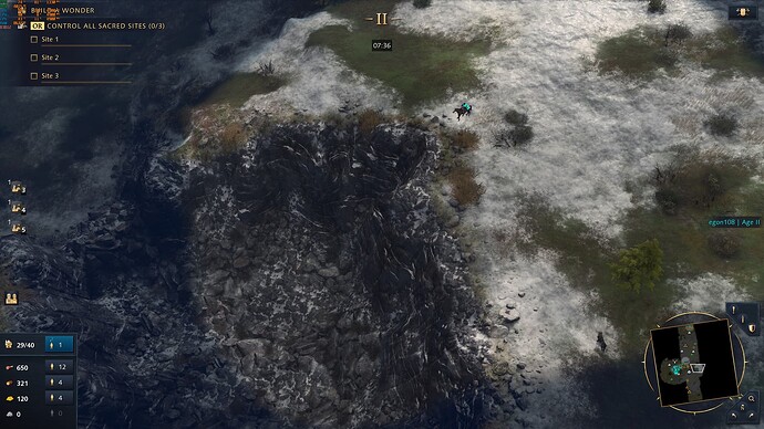
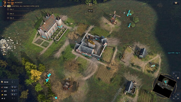
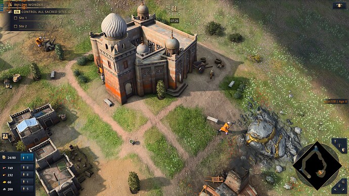
Imagine the changes in this PUP as getting a new pair of prescription glasses. Everything looks sharper, cleaner, more detailed, but you are looking at the same things really. If the art style has grown on you, then this will make you like everything a bit more.
This is how the game should’ve been released and more of what I expected of 2020’s RTS graphics. It’s way better but there’s still a long way to go with non-animated buildings assets, total lack of gaia, poorly implemented reflections, outdated water effects, etc.
I do disagree with the title of this thread about he graphics being “insane”. Everything that I’ve seen about Unreal Engine 5 is insane, this is just keeping up with current-gen graphics.
8 Likes
I just meet you recently and didn’t know you existed before. if it was by an alt or something similar that’s another history
yeah, it was the first thing it crossed my mind, (maybe not insane but indeed amazing)
1 Like
maybe you’re right who knows
I do get it though. When we have all been eating just plain bread for the last year and a half, a regular steak tastes like heaven. In the context of what we expected this is insane and I never thought effort would’ve been put into revamping the graphics like this.
Here’s wishing water is next.
4 Likes
I miss seeing a guy around, does your old account nick start with ‘m’?
1 Like
Here are the snow reflections with the new terrain rendering (TBC snow reflections have been here since launch day, but look a lot better now, alas you have to rotate and zoom in to see them, why devs?):
And together with the improved cliff textures:
The other thing that ambient occlusion improved upon dramatically was the lack of contrast AoE4 had previously and one of my biggest complaints. You can now see buildings casting shadows on themselves more accurately and creating more visual separation from brighter areas. Same goes for forests, bushes, etc. If anything, devs, you can even ever so slightly darken the occlusion effect and shadows and it’ll look even better:
1 Like
Environment now looks more “realistic” they should improve units texture in future patches, but overall IMO is this the best patch they will release, they actually acknowledged the criticism in the art/graphics department and that’s good.
5 Likes
See, this exactly what we asking for. We don’t need graphics like manor lord to be happy.
4 Likes
I can’t see the updates because i played with gamepass (i bought here DLC, x-packs).
From the screenshots i see some improvements in particular for terrain: developers improve the textures. But what i would like to see Is the same work for the unit models, buildings and animations.
But if we wanna see all of these improvements we Need of new levels of zoom in to see models and Battles more close.
This Is a good work by developers and i Hope they’ll. Continue to improve the graphic.
Someone could post screenshots with units?
1 Like
Agree. I would like to see more improvements for the unit models. Developers have done It with terrain. they could do the same on the units, buildings, gaia, water and animations.
But i have to Say that’s a good start.
4 Likes
And i was forgetting: developers should improve weapons because many of them seem plastic (spears, for example).
4 Likes
Finally, a step in the right direction. Now fix those odd buildings design, increase both units and buildings textures, and improve that water graphics.
9 Likes
People defending every current state of the game: No we don’t need too many unique units! New players cannot remember! This game is like chess! We don’t need hyper realistic graphics either! It’s already a great art style! It meets all low-end computers and fits the gameplay perfectly! You don’t understand gaming/design/programming! That’s why AOE3 failed!
Developers: No.
Thankfully.
10 Likes
My name is a mistery.
About to be discovered
R u interested?
Can you figure it…
Only by my words  ?
?
(Yes my name is on that message for those who don’t get it lol)
1 Like
