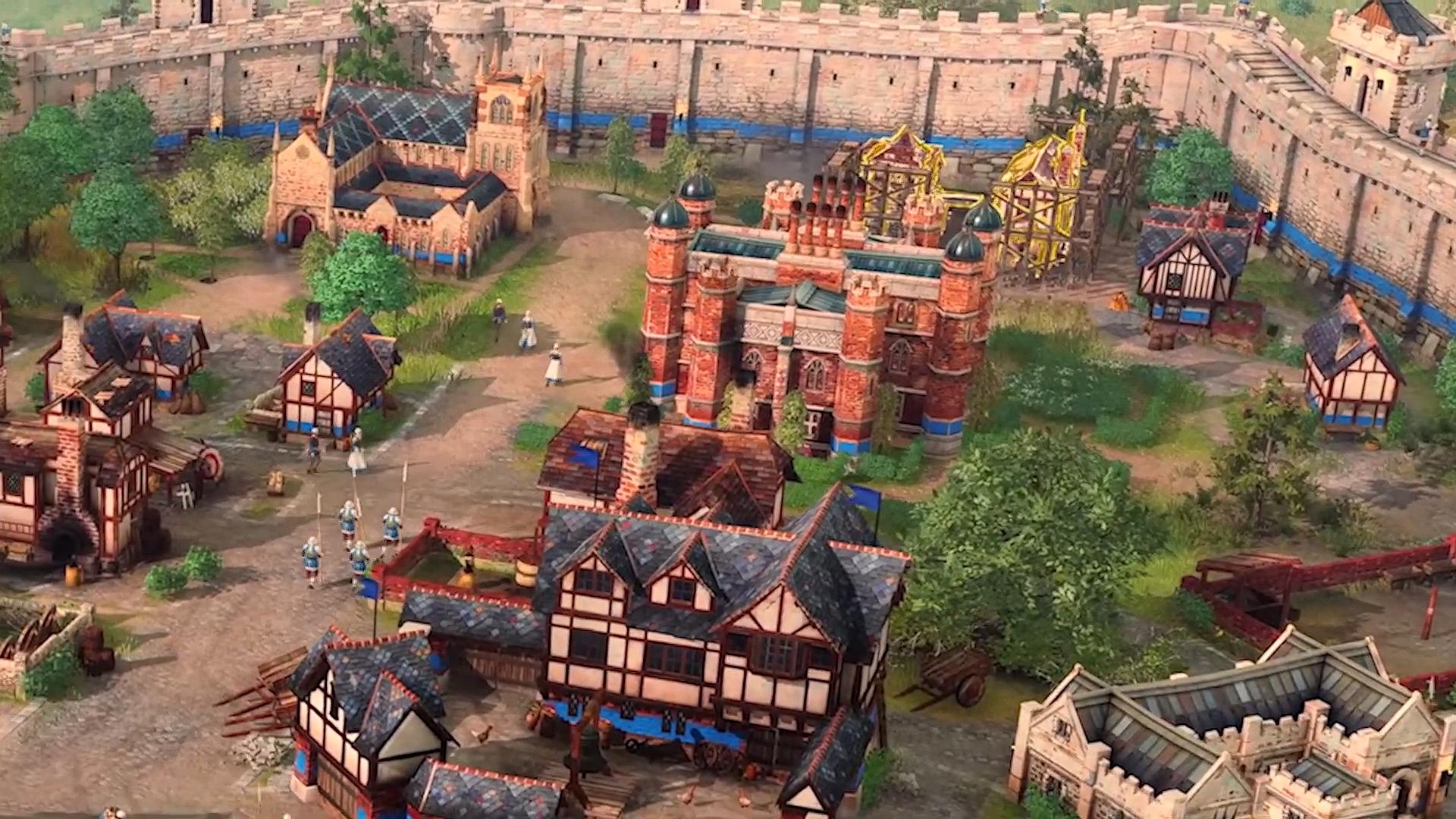
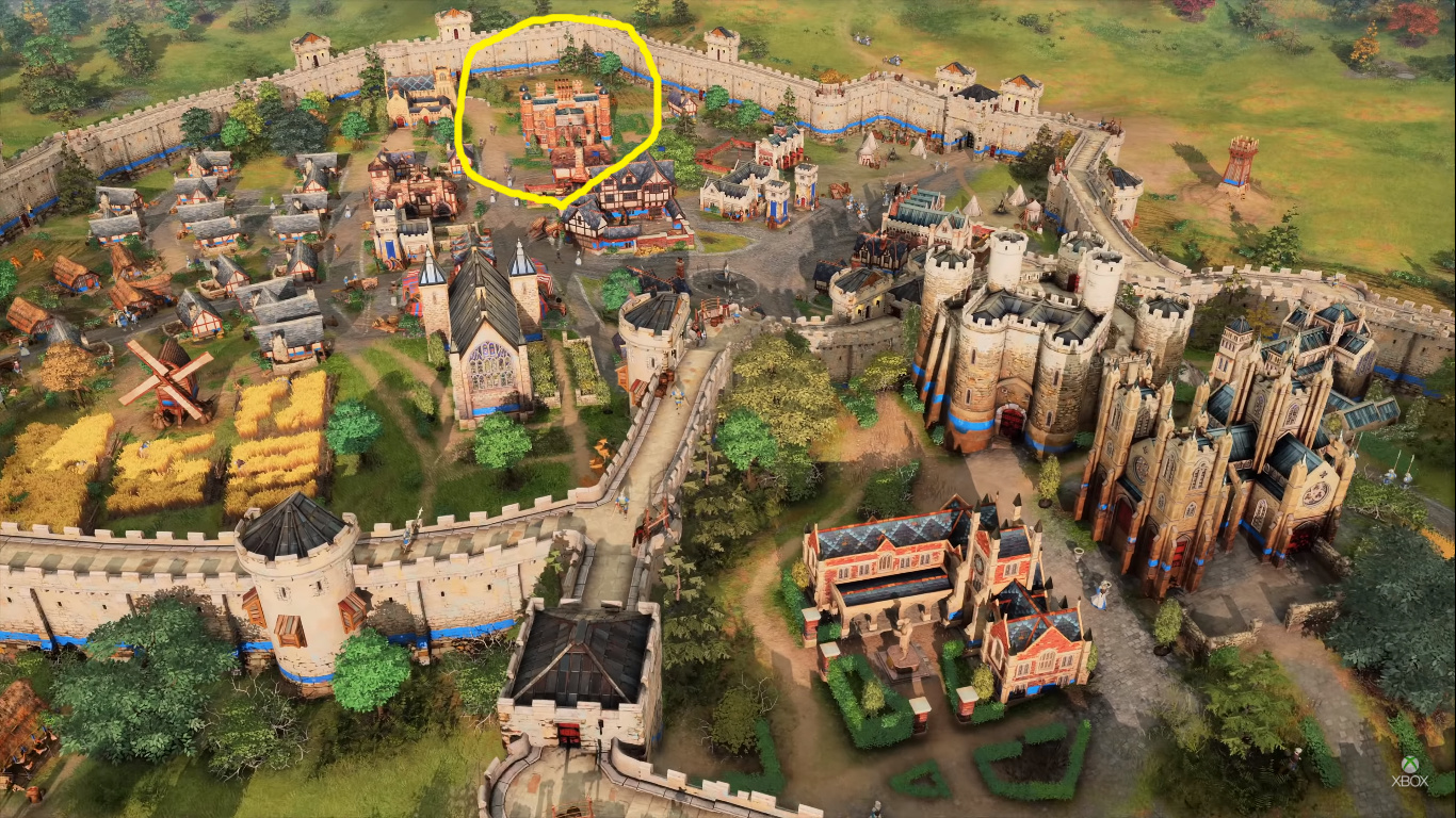
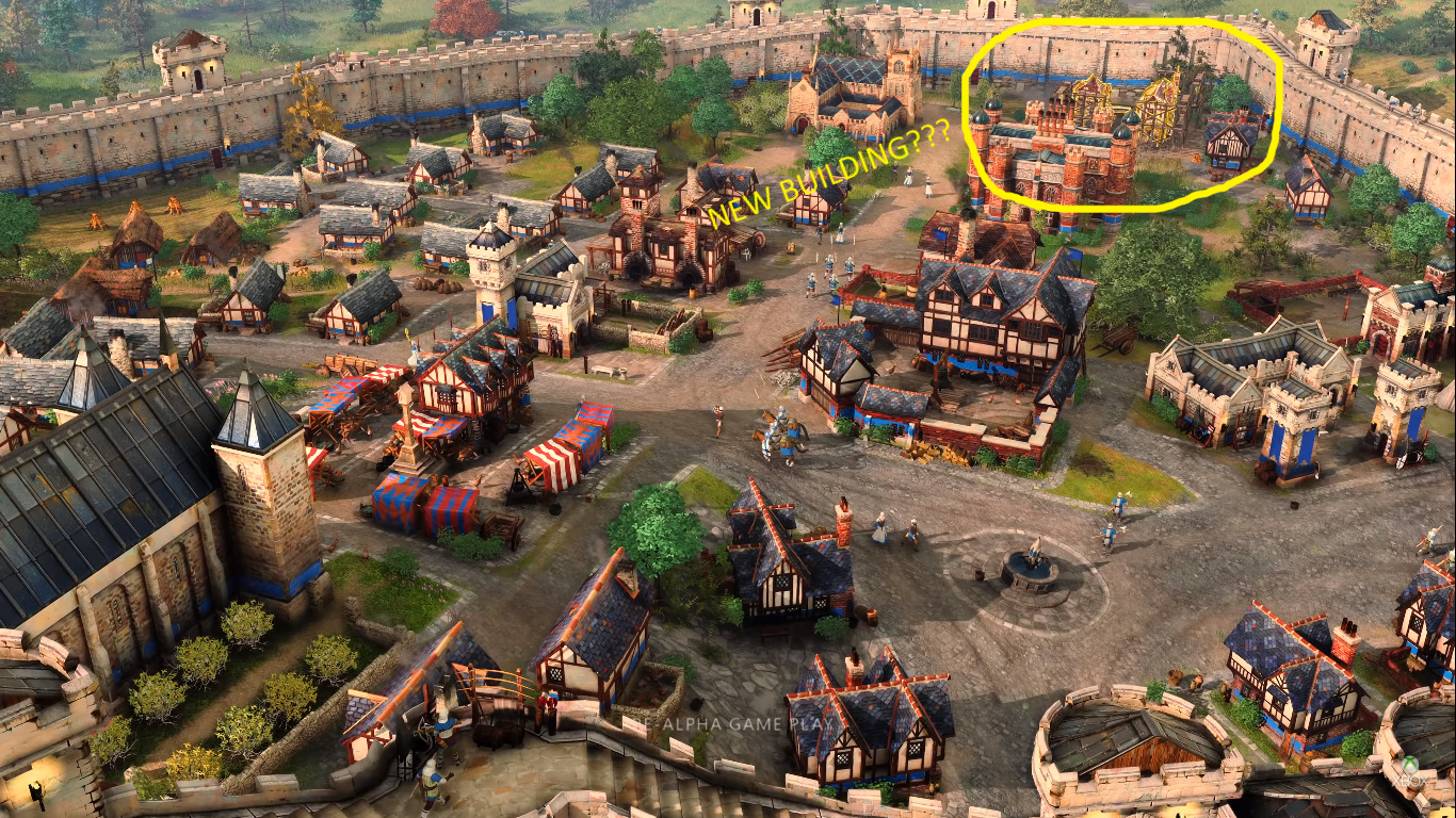
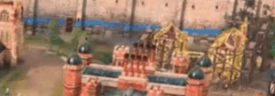
AOE 4 has this crappy unit selection by colorful stroke outline across units and buildings that hate most of rts players and used in red alert 3, c&c 4 and dow 3 instead of classic circles selection under buildings and units? Just look to the farthest building in the middle of screenshot.
Why? Why lelic choose such horrible decision, it’s clearly that such outline across units selection is much worse and much more uncomfortable than classic unit selection by circles under them that standart for rts for more 20 years. Also this crappy outlines across units and buildings pretty heavily ruining immersion and atmosphere of game because it’s distract too much attention from what is happening on the screen.
Who was responsible for such crappy UX? Please lelic, fire this UI lead, becaus it’s pretty stupid decision tbh, I hate it at all, return classic circle unit and building selection.
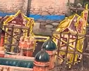
It looks like the farthest building is under construction. Notice the scaffolding around the perimeter. Would you not like to easily see which building is still under construction?
This could be 2 things, to summarise so far the aboves:
Only when under construction perhaps this yellow outline appears and maybe flashing too.
You selected this building and want to assign gather point before it finishes.
I think the first one is OK but not neccessary.
Second one is indeed not a good idea, but for this to be proven an already built building selection need to be seen cause only the first point can be really proven by the screenshot. In the video does it flash?
And overall, Good spot! Few of us would have realised.
Not a big fan of those bright outlines either.
Isn’t the scaffolding itself a satisfying visual feedback to know that the building is still under construction?
I do not like either case. Imagine constructing multiple buildings and all are beaming like that at the same time like christmas lights, yikes. Too noisy.
I am not against outlines at all and I’d like to see more of it to form a final opinion but as of now it doesn’t look very subtle. Compared to how everything else look like, this building sticks out like a sore thumb.
absolutely it is a building under construction.
and stop say these things,“oh we have guys on the wall,game will be AAA” or “i don’t like art style,this is terrible change it.”
just say “i love it” or “i don’t like it,i hope it will be changed”
we haven’t seen the gameplay yet.don’t be very pessimist or very dreamer.just wait for news.
I couldnt find which building was meant at first because I found nothing eye-catching being constructed…
what I mean is that, the yellow highlight didnt make me think it was being constructed, instead it camouflaged the construction-beams etc and made me think that building was a golden pavilion.
I think Yellow/gold is a bad choice of color.
It should fit better with a complementary color to the wooden constructions color.
Yes, we don’t need such outlines across units and buildings. Doesn’t look good.
But possibly you can disable these, we know too little about that to complain.
And I also think it’s under construction because of the construction beams and unfinished looking building.
I don’t like the outlines because it distorts the naturalness of the game. Such beautiful graphics are wasting away. And the buildings are a little small? Clearly, accurate proportioning makes the game more realistic
More details / less “smooth” textures. Especially the trees need an upgrade
Hopefully everything just looks a bit “cartoony” because it’s not ready / Pre Alpha because in general I like the graphics, it just needs some more realism.
Guys seriously that trailer was nothing more than a tech demo and a first look how it might be. Almost nothing shown was final. So stop arguing about something like this, wait until MS shows more later this year.
What do you mean? That was clearly gameplay.
“I do want everybody here to understand what you saw gameplay there is what we are playing every day on the team. paid audience applauds” ~the official announcement video
Everything in that trailer is real; everything we show will be in the final game. (…) But all that’s real, genuine gameplay and nothing we will show won’t be in the game. […] That is why we waited so long, and what we’ll continue doing with Age going forward.Windowscentral
"What we decided on pretty early was that we were only going to show what we knew would deliver and that was kind of our mantra.Gamesradar
“…all that’s real, genuine gameplay and nothing we will show won’t be in the game.” He gives this as a reason for the long wait for news: “That is why we waited so long, and what we’ll continue doing with Age going forward.”Trueachievements
I was being sarcastic. It was obviously all cinematic but they kept saying it was “real gameplay” which bothers me because we learnt nothing about the gameplay.