Not really about bigger or smaller, it’s about proportion - maybe I should explain it more clearly,
For example, in the first picture I posted, the longbowmen could walk into his castle easily, while the Chu Ko Nu needs to lower his head down. And that is supposed to represent a city gate.
And the second picture, the Mangudai, is straight taller than the first floor of the castle. Also, the size of the stairs when compare to the Japanese castle, which also has stairs in front, the Mongols are not even wide enough for a person.
Again, It don’t have to be accurate, but at least it should be believable, and stay consistent with all of the other existing buildings.
Yeah now I realise your point. Especially the doors on top of the castle are tiny for a orthographic projection game. Problem seems to have already started with the Bengali Wonder. It also has small trees. It was clearly miniaturised to half it’s original size.
They must have reused assets to create the model quickly without doing research. Malay use Turbans, loose cloth or baju lamina armour which looks like the Indians.
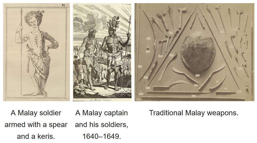
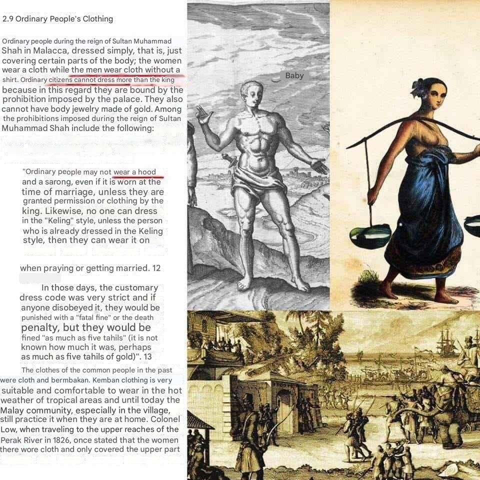
Your description fits an AOE 3 Malay warrior post 1700s, not a medieval Malay warrior. Malay clothing before the 1600s is similar to the Javanese, most people go around bare-chested. This is recorded by the Portuguese, Dutch, and the English, even by the Malay themselves. Tome Pires ca. 1513 even said that the Malays of Malacca followed the Javanese style of dress.
“Ordinary people may not wear a hood” : The hood before translation is tengkolok, also known as tanjak or destar. If you’re more critical about the images, the Malay commoner wore some sort of headband or headscarf that did not cover the whole upper head, not a tengkolok or tanjak (the “turban” of your comment), as those are nobility’s headgear. The outfit in the photo below only fits for 19th century Malay, not pre-1700s Malay. In this era, the usage of tengkolok/tanjak/destar is more widespread, not only used by nobilities. Note that by this time, their clothing covered most of their upper and lower body.
As for the armor, I suggested Baju Lamina in my previous comment because it’s the type of armor confirmed to be owned by Malaccan Malays, but they do not necessarily wear it. The Portuguese explicitly stated that the Malays almost never wore armor, even the oval shields were scarce, and only used by officials. But to me, it is better than depicting Elite Karambit Warrior with Sino-Mainland Southeast Asian armor.
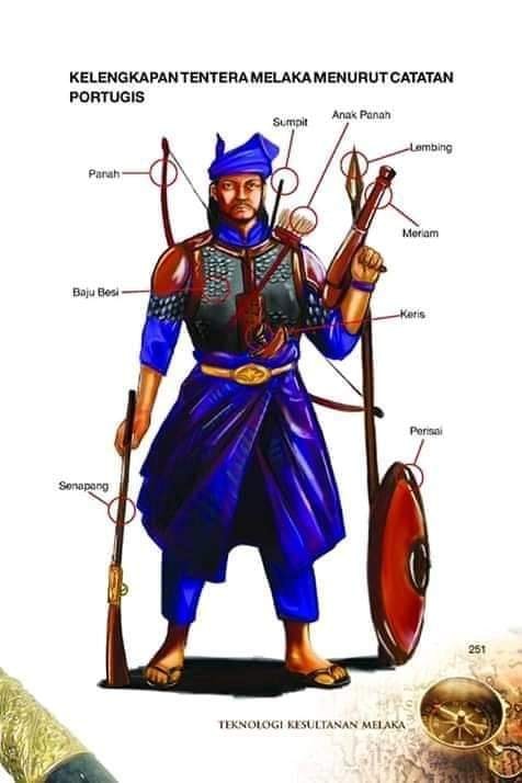
There are many Malaysian posts depicting Malacca-era Malay people with 19th-century clothing. It’s like depicting Joan of Arc era French with Napoleonic era French clothing. Worse, Malay chauvinists often depicted Malay warriors with “sophisticated” equipment like this (see below) instead of what was actually reported/recorded and what was actually depicted.
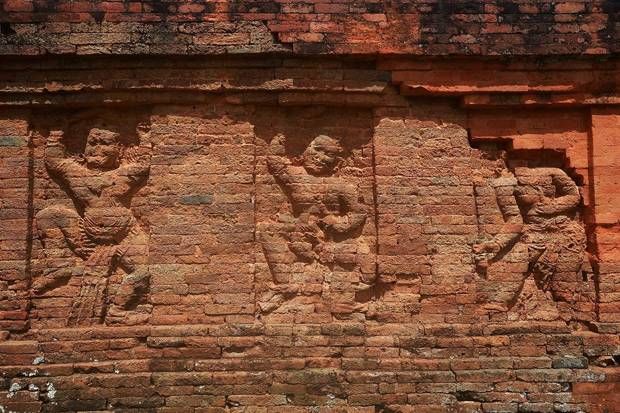
The book above said “The equipment of Malacca’s soldier according to the Portuguese”, no, it is not, the book cherry-picked sources and combined the equipment into one soldier. The depiction of the equipment in the image is very inaccurate too, had they referenced European depiction of Malay people of the same era, they would know that the Malay dressed lightly and lacked armoring (even round shields), and that most of the Malays fighting men were commoners drafted to war (levy) with the support of slave army. The Javanese, however, have a pretty good record about armor, including karambalangan (breastplate), kawaca (variable meaning but can refer to cuirass, chainmail, or jacket), siping-siping (scale armor), and waju rante (chainmail). According to the Dutch scholar Pigeaud, the armor depicted in the Penataran temple was chainmail, but it could also be a scale armor (siping-siping). For Elite Karambit Warrior I would suggest Malay armor like Baju Lamina instead of the Javanese armor mentioned above, since Karambit, a Minangkabau weapon, originated from Sumatra.
I’d like to take a stand for the developers. Considering everything they had to consider, all the interests they had to reconcile, they did a very good job.
For competitive players, all buildings and units are still easily recognizable; for players like me, who care about flair and authenticity, it’s also a quantum leap.
A new standard has now been created and can be gradually developed or revised. They can now incorporate feedback and pick out individual things patch by patch in the future.
Whether it’s entire architecture sets, individual buildings, old hero units… many things are conceivable.
So, I’m more than satisfied. For someone like me, who exclusively designs scenarios myself and then plays them, this patch and the DLC offer countless new opportunities to spend countless hours refreshing old scenarios or creating new ones.
The DLCs have now laid a new foundation. Now they can rework/redesign individual things piece by piece.
Whether it’s castles, entire design sets, or old hero units, they could tackle a few things for each patch and gradually introduce them into the game. I’m personally looking forward to it.
Poll would have been better with a picture attached for the new skins. Video is too long to watch. Some might have voted negative only after seeing one or two skins.
While I wasn’t happy about the DLC news, I’m very happy and grateful about the new skins for Castles, UUs, Monks, and Monasteries.
There’s bound to be inacurracies and stuff you can nitpick or want different, but I think it’s a huge improvement from before. And I appreciate the effort that’s been put into making all the new visual content.
I don’t think the scale is a problem, I mean, just look at villagers besides literally any house, the doors aren’t even half as big as the vill
Yeah some like the Centurion and War ele have too much gold
I would like a mod or something that made the gold parts black, which would still be fancy but more believable as steel
I do think it fits the “knights and chivaslry and stuff” theme that the Franks have going on in most aspects except for their unique unit. So in that way it feels appropriate. It also reminds me of the castle in Beauty and the Beast, which may be less appropriate, but at least that’s also French-inspired?