I just bought AoEIV game last week and I am having a fun time going through both the campaign and multiplayer.
However, there are some things I hope that we do and do not see from AoEIV to AoMII.
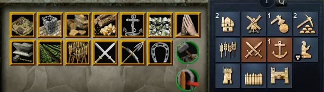
[HUD icons]
-
Colorized version just seems more impactful. At least to me anyway. The AoEIV’s icons are more “uniformed”, “organized”, and clean. However, I think that if AoMII was to have a clean set of organized and colorized icons then that would be perfect.
-
Every hud icon for every mythical races should be different, too.
For example the icon for the barracks regardless of what race you play remains the same. It looks like two swords intersecting like an “X” shape. The Egyptians back then do not use these types of swords. Why is this icon represented across all races? Imagine playing the Japanese myth in the game only to have an icon of two broadswords as your barracks icon and not the naginatas or katanas. It’s weird and super inconsistent if they don’t take this into consideration.
In AoEIV, barracks, archery, stables, regular units like spearmen, knights, all look the same across all civs. Please do not let AoMII make that same mistake. Otherwise it will be seen as super lazy and “disrespectful” to the integrity of the game and the people’s intellect.
Probably the only things that should remain two toned colors are the military formations. That’s fine, imo.
-
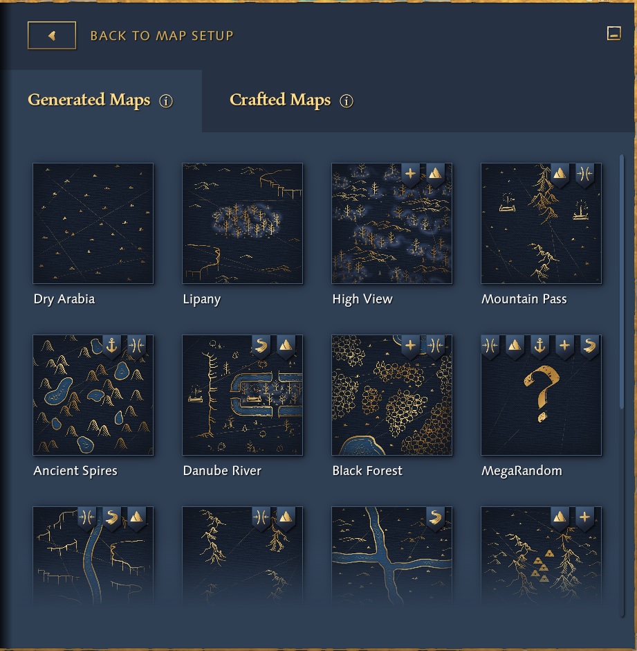
Map selection iconography should be colorized too.
This just looks boring compared to AoM’s map selection from a coloration perspective.[Graphics]
AoEIV’s graphics are superior to those of AoM’s obviously. But I can guarantee you that AoM’s graphics will look more timeless compared to AoEIV’s by the time the latter is finished.
AoE’s graphics look stale and blurry at times. AoM’s graphics on the other hand have very contrasting and impactful colors that don’t look confusing at first glance. Ideally, AoMII should be colorful and not blurry like AoEIV. In fact, the buildings and units from AoM stand out compared to the background terrain. While AoEIV’s look like they mesh and mix both the units and the backgrounds together - looks like a very blurry water painting.
For comparisons:
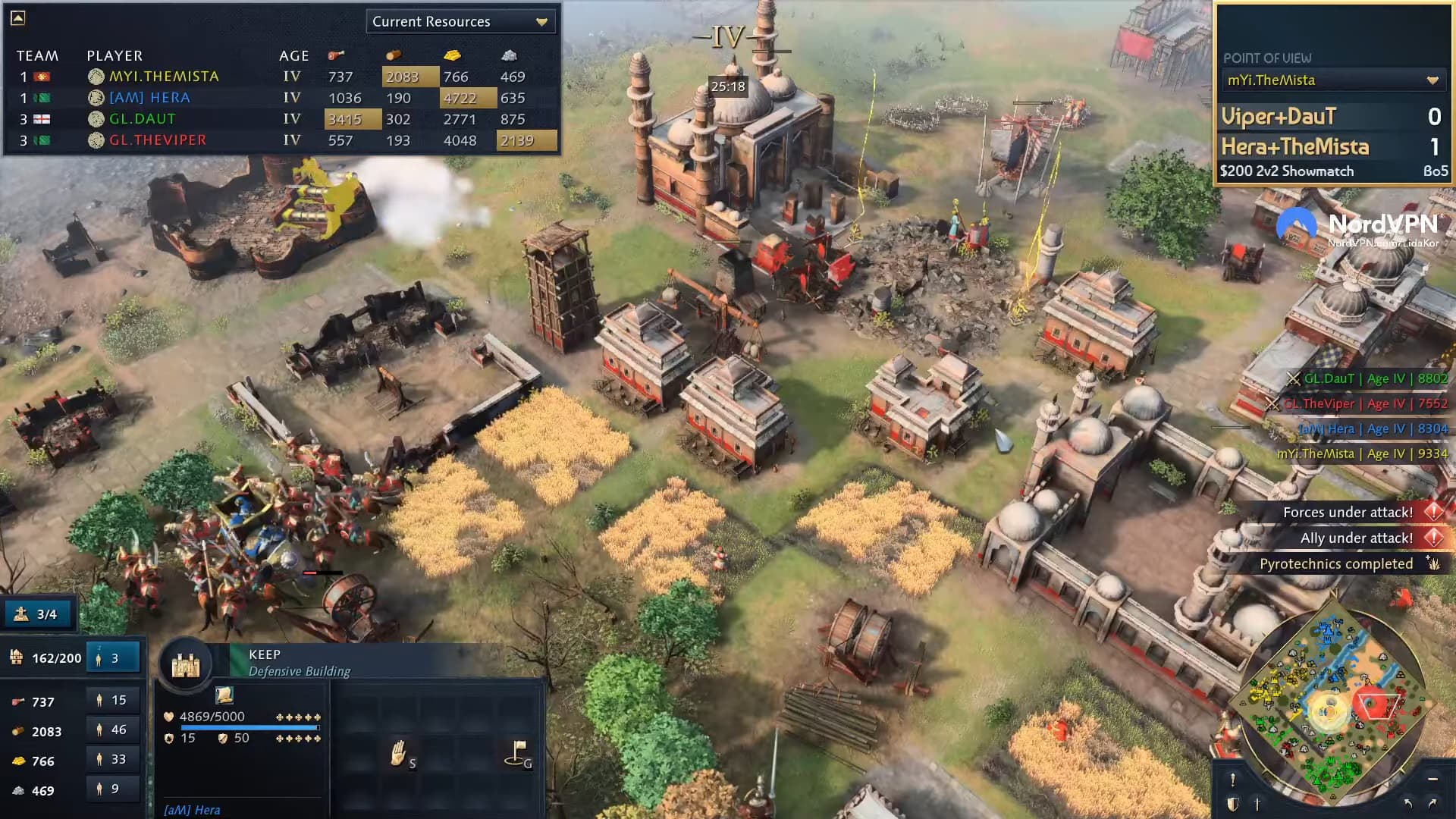
Notice how some of these patches of grass terrains next to the wheat fields look extremely blurry. Whyyyyyyyy?!
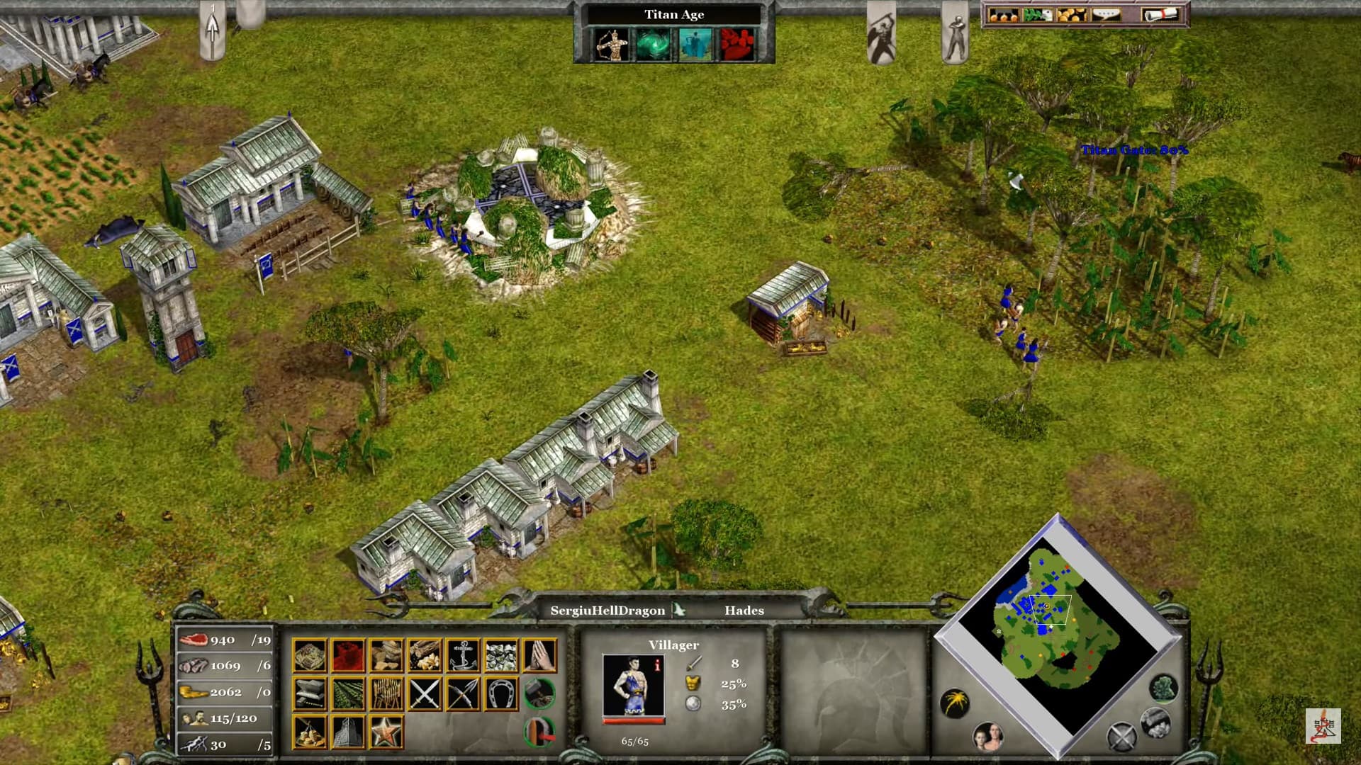
Look at the stark difference between the buildings/units compared to the terrain floor. It just sticks out and easily more readable.
[Animation]
I am not a fan of AoEIV’s animation where the villagers sometimes appear as yellow silhouettes when constructing a building. Villagers who construct buildings shouldn’t be reduced to these yellow outline silhouettes.
I will come up with some more later but if you do have other recommendations then feel free to add some more. Let’s make AoMII the best game ever!