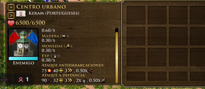
as you see there is enough space to show that a urban center has 90 attack wihout scrolling
Its very important to know if a urban center is atacking with 90 atack,
on age of empires 2 we know that town center is atacking with a biggerr damage because when the attack increases it throws more arrows, but in aoe3 de this increase in attack is not reflected, only on IU, but we dont have time enough to scroll to see if the atack has increased.
so why dont use that huge unused space to show the IU?
i know it is hard work to improve the IU, but the game need it.
thanks in advance
i hope my suggetion doesnt be forgottten
I’ll look into this at least in my mod, not an easiest problem to solve, but not impossible, it should be possible to do with just less spacing between text
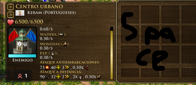
but, you dont need to redice the space use put iu info on the “space” i wrote
thing is, knowing how its coded, these panels are strictly separate
1 Like
hmm isnt the easy solution just to always put the trickles at the bottom?
The trickles are fixed so its not important information, you just need to know that is there
so it might be “easier” ( no idea if it actually is) to have it such that the trickles are always at the bottom, even if vils are garrisoned
the real problem imo isn’t how text is displayed on the panel, but the panel scaling, slightly beefing that one fixes the issue, letting all text display
well, where the word “space” is we could just make this part (see image) wider so it occupies the unnecessary space, that unncesary space dont display anything could be eliminated
putting shorter sections side by side could do it