In your latest video Age of Empires IV: The Holy Roman Empire - YouTube
we can see that you scaled weapon size down and it looks way better and more realistic.
old weapons looked like they were log sized x).
Anyways it seems that it looks way better and thanks for listening to some of our complains.
another thing which could be nice is that arrows shouldn’t hit at 100% and some should stay on the ground and not disappear immediately.
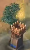
However Flaming arrow still seem big.
other things to improve for visuals :
- Too much smoke on gunpowder.
- Can’t see the cannonball and impact on gunpowder.
- there are no physics for units hit by a cannonball. i think they should at least fall.
- Building scaling units scaling.
- there could be better or alternative textures for units and ground dirt textures.
- improving the zoom
- Helmets having a different color for visor. I don’t understand an iron helmet having a bronze visor. plus it looks ugly in my opinion. Gold helmet = entire golden armor don’t mix the colors of armors it is ugly. Sometimes i would prefer plate armor to be iron, steel or even black /gold which was way more common than silver gold.
whatever, thank you for listening !
16 Likes
Why being so humble? Sounds liked we are begging.
Do they acknowledge the community for all those suggestions?
Actually most of us are just telling “elephant in the room”. We didn’t ask for some fancy functions that devs need to make great efforts. We are just stating that the game needs to have some basic function/perform that aoe2 have already achieved 20 years ago, e.g. scaling, zoom.
Aoe4 is not developed by indie studio where devs work on their weekends but by a big team and it is going to be sold as a AAA.
6 Likes
This is what they should do. This game sells for $60! ! !
2 Likes
this should be how we ALL in this forum comunicate to devs , gently like you. Well done , i agree on this thread 100%
8 Likes
You do realize AoE2 had horrible zoom 20 years ago. But no one cared, they understood the limits of the time. But now, there is no excuse
1 Like
AoE2 didn’t have any zoom at all.
Also the scaling of the buildings is off.
They are very badly proportioned just to force the doors to be the size of soldiers.
Also buildings like wonders are often just a part of the real building or in a different scale.
AoE2 is very very far from perfect.
Just because the doors are the correct size doesn’t make all the scaling good.
Look how small the internal area of the houses are compared to the door size, it nearly looks like a telephone booth.
I and many other hope that they don’t change the scale.
You have multiple buildings that can easily fit 200 people but yet your total population is 200 (with usually only 100 villagers). It would look like your town is empty if the scale was correct.
Also the unit footprint to building footprint ratio is close to AoE2 now. Just that AoE2 has cartoon buildings and AoE4 doesn’t.
1 Like
So funny you dare to talk about wonders. If there is anything wrong with aoe2’s wonder, aoe4’s wonder is beyond terrible. They don’t represent anything at all and don’t looks anything wonderful.
Scale in aoe2 is not the real scale. Everyone knows that, but why no one mentions it? That’s because the scale is good enough to cheat the brains. Aoe4 scale? So cute the horse in the stable!
BTW, if you are saying aoe2’s scale is easy to deal with because is 2D. I’m fine with it. However, if you say aoe2 has “cartoon buildings” I can only imagine you take AOEO as aoe2.
1 Like
Smooth goal post change. You go from saying, “AoE2 got scale right!”
to
“AoE2 scale cheats the brain!”
Thanks very much for getting back to us! We appreciate the feedback and would love to hear more from you. We will pass on your suggestion regarding arrows to the dev team, please also make sure to let us know if you have any other ideas about the game.
25 Likes
Firstly, do I actually say “right”? If you quote me, better not to invent quotation.
Secondly, does right means “true scaling”? It is right because it cheats brains.
1 Like
I don’t complain about AoE2 because it’s an over 20 years old game by now.
If AoE2 was released now (without AoE2 every exiting before) than people would certainly complain.
A lot of people like how AoE4 looks like, it’s just a few people that complain.
And those people never tried playing the game with “real” scale. Because if they did they would notice it feels worse and is much harder to play.
I’d probably even prefer the scale from the Fan Preview.
But I guess AoE2 fans have to hate anything that is more like AoE3.
3 Likes
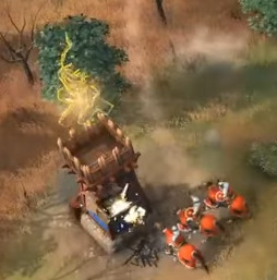
This is a huge issue and I’m wondering why its not brought of more often. There is too much smoke and it prevents you from seeing whats going on. Please take a moment to watch this official game from the 1 hour and 5 minute mark:
Its too difficult to see projectiles for both Trebuchet and Bombard cannons.
At 1 hour 6 minutes and 10 seconds you see 3 bombard cannons shooting into Archers, but the only thing you see is a huge black smoke cloud which blocks your view completely. There is no physics like Aoe3 either. It doesn’t feel like these shots are having the impact they are supposed to have. Adding a black smoke cloud doesn’t make it feel powerful. It just creates a visual mess which makes it difficult to tell whats going on.
Also the fire arrows look ridiculous. Please, just make them look like Age of Empires 3, they looked so much better. That game had proper physics aswell. We must have physics like this in Aoe4.
Also please take a look at this exact moment. Way too much smoke. I can’t tell whats going on and who is winning the fight. This needs to get fixed ASAP.
2 Likes
You imply that AoE2 got it right by saying
I take that as you saying AoE2 did scaling, zoom, ect right and AoE4 did not.
It is not any more right than AoE4. Both are design choices, people just don’t mind AoE2 because that design choice fits within a 2d game
That scaling would look even worse than AoE4 scaling if it was a 3d game
Do I ever mention aoe3? Actually I like aoe3. I like the ragdoll system, which is missed in aoe4. Back to the topic, I feel the game is missing the good features of aoe2 and aoe3, which are expected to be included. The community should not be so grateful when devs are finally putting something back.
It is just we are tired of complaining but you defenders are more enthusiastic. We will see the real results with steam reviews.
Arrow fire shouldn’t produce smoke in the same way gunpowder does. At the moment towers and keeps etc seem to produce smoke when only firing arrows. This looks silly and makes it harder to immediately tell different kinds of fire apart in my opinion.
AoE3 has a very similar scale to AoE4 though.
It is impossible to make a game look realistic when you want players to build medium size towns but also only have 200 population (of which usually only 100 are villagers), that can’t look right. Imagine a realistic scaled castle that is besieged by less than 100 man.
For real scale with realistic buildings you would need like 1000 population.
If you want an AoE with infantry squads like CoH that could work. But I guess most people wouldn’t like it.
1 Like
For arrows it will be cool to have a small miss chance that doesn’t affect gameplay, and arrows should remain unavoidable by players.
1 Like
I meant to just talk about farms here, but I got carried away. Sorry  My Tech Stress Survey form didn’t work out for me and wasn’t able to submit and mention any of this stuff there.
-
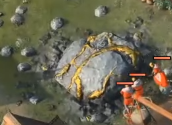
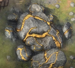
Gold piles, or at least the gold veins, could look a bit more valuable/epic. I think they could use some additional TLC with texturing/surfacing. The stone parts could look more like dry stone/rock – maybe more angles and contrasts put in? – and the gold parts could look more metallic, valuable, and awesome. The stone looks pretty smooth and non-stoney to me; more like some type of clay or putty:
-
I think farms need more frames of animation. There’s a lot of patches that pop on and off, from dark green to bright yellow over one frame, and then back to dark green over one frame, etc. Feels like placeholder/unfinished animations and is visually distracting to see all the farm squares popping on and off.
-
I also don’t feel it’s very clear to know how much of the farm is consumed and when it is about to be fully exhausted. Maybe I didn’t play it enough to get a sense for that, but assuming they don’t last forever, I think it might’ve been hard to tell; or at least I never picked up on the warning signs. I’d just see them depleted and so would re-make them. In general, farms did seem to last a very long time; too long, imo
-
Dead units blink out of existence rather than decay in any way. It’d be less visually jarring and more polished to at least have some sort of fade (similar to farms squares popping in and out). One can hope for AoE2 decays, but it seems that is less and less likely as time goes on and the franchise evolves. So, at least having units fade away or sink into the ground over time is more subtle and polished.
-
The dust and smoke everywhere flickers (dust kick-ups, buildings and building crumbles/rubble, blasts and explosions, tramples, etc.) Seems like they’re 2-D cards without enough frames to make smooth animations or something? Volumetric 3-D dust/smoke/fluid sims might be nice to implement at some point, assuming they’re not currently that
-
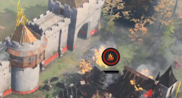
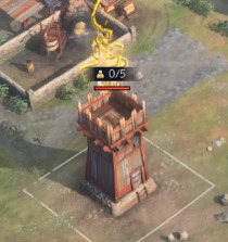
The icon frequently seen above buildings is unclear. I’m not sure what it means… and it’s huge/distracting, and eventually everywhere. It looks like sticks and a campfire symbol? I’m not sure what I’m supposed to do whenever I’ve seen it. Light a campfire on top? Or am I supposed to put some type of military or villager units in or on top of the building when it appears (for better defenses?), since a “0/5” type of number is often accompanying the icon? Does the building need to be repaired? Every game I’ve played I’ve felt like I’ve been missing out on something potentially good/cool by not knowing what to do to fulfill the campfire icons’ needs… and they’re all over the place when I play.
- If there’s no hover-over pop-up help for it (which I’ve never been able to find any), I recommend making one. Or when clicking the building, make sure it spells out what that building is lacking or needs when it’s showing – if such verbiage doesn’t already exist. Like I said, in the heat of the moment in games, I could never find anything telling me what it was and I didn’t have time to do more than the basics (hover over the icon, or click on building and read text about it – neither of which seemed to explain).
-
It actually looks a lot like the Setup Camp icon at the English’s Council Hall. Maybe it’s related?
-
Some buildings actually get a fire icon when they’re significantly(?) damaged, so is the campfire showing that it’s just partially damaged and hasn’t reached the more critical state shown here with the burning building? All in all, I hope you can see my point that, visually, the campfire icon can be read in a multitude of different ways. Good icons should be more intrinsically descriptive; and the campfire one may need in-game explanation (or easier to find explanation), or a different icon created altogether. And a smaller one, since it becomes visible so often:
-
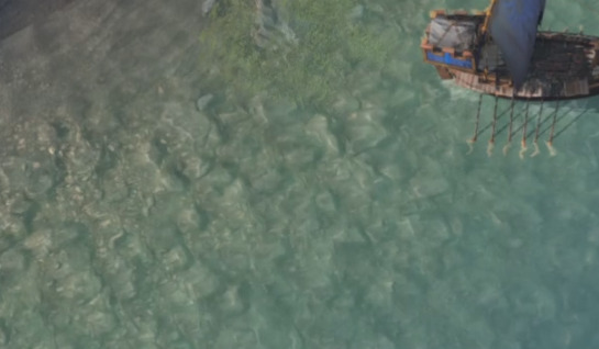
So far, the waters I’ve seen look a little cloudy (and muddy in one map) and lifeless. Not too inviting. I know not all water is or should be crystal clear and beautiful, but visually, it seems to be a little lacking in the visual zest department so far. The colors are very muted and earthy, which contributes to their ‘nothing to write home about’ appearance. I bet tropical map water will look pretty cool, but even the non-tropical map waters could seen so far could use some beauty upgrades
- Aside from the water clarity, there’s not much going on in or under the water (fish, rocks, crabs, shallow water stuff, deep water stuff, rock size variations, etc.), as far as I can remember. I saw some vegetation in one area, but the lack of contrast and similar coloring to the water makes the green leaves blend in with the cloudy water and feel visually bland with it.
- From what I’ve seen, there’s a lack of massive boulders or larger-sized rocks mixed with smaller ones in the shallow water for visual interest/texture (or even some could jut up from deeper sea) – as in actual 3D objects rather than a texture map. It feels instead like a simple rock texture is applied everywhere. It may or may not be a small repeating (tiled) pattern, but it seems like it is. (Please know that I’ve only seen one or two water maps so far.)
- I’m used to AoE2’s water, so anything better than that is a step in the right direction, which you’ve already achieved. I just think AoE4’s water should be taken to another visual level than it’s currently at
- There’s no feeling of actual swells, waves, or ripples out in the deep sea or coming to shore… no spec hits, and suds/foam seems like just a quick 2D texture. Ripples/current seem to simply be an animated displacement texture placed on water.
- Uniform rocks rock texture (all rocks similar size and are all half-buried in sand). Almost feels like a faux rock wall, where it’s just one continuous rubber sheet of texture created from a rocky mold. A lack of contrast, hard edges, texture variety, and/or shadow contrast may be leading to this feeling:
- 2D foam textures (feel a little generic, but get the job done, I suppose)
- Vegetation (hard to see, lacks contrast and visual interest):
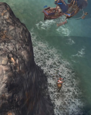
- Disappearing barrel:
At any rate, thanks for making AoE4! Seems fun. And listening to feedback!
I’m hoping things like Zoom level and UI icon concerns can be addressed before launch
8 Likes
This is definitely not true. The building destruction and ragdolls physics in AoE 3 are fun, but far from proper or accurate. They’re way, way over the top.
I agree though that AoE 4 should tone down the smoke and the fire arrows.
1 Like
")