while it is new (sarcasm ahead), i wouldn’t really call a game that hides any and all reflections with esports sun placement thats the same on all maps, shiny
aoe 2 was still pleasant looking despite 2D, so thumbs up there, they nailed DE visually
aoe3 and its DE meanwhile allow for true direct graphics comparison, ever noticed the sun position in aoe3 was slightly different, to vastly different on every single map the game ever received? it adds character to the maps, more unique atmosphere, as do other small details
there are some textures that reflect sun glow, namely arctic teritorries ice bridge, that need camera to be rotated for the effect to appear, but thats 1 texture, in aoe4 this happens with every single texture and shader, example, water in aoe4 looks the worst precisely at default camera rotation, same with other shaders and any texture with tesselation, very much intentional choice it seems
2 Likes
General escale no. But some buildings yes should be rebuilt if they would want to do a good visual work.
We can only Hope in some graphic updates in the near future.
No. If you read my last two comments you’ll see that I very clearly backed up exactly what I said.
Most of your comment here has nothing to do with what I said anyway. I am not going to engage in a debate on why you think AoE4 is horrible.
I have not even said the AoE4 blacksmith icons are “better” overall. I have explained how they are better specifically at conveying information. That’s it.
3 Likes
Sorry but in my personal experience those icons have not helped me much.
What helps me is the position where they are kept. So that at this point even though I do play AoE4 very little, i know that the first row first column in the blacksmith is for melee attack.
If you jumble up the icons, i assure you i wont be able to adjust quickly even though you claim that the icon is very clear about what it does.
Here’s why i think you’re kidding: it doesn’t help to click the blacksmith and see a bunch of green squares that look very very similar. Sometimes my eye cant distinguish between the sword and the arrow in those icons (but i still get it right because i know where each one is).
Compare this to AoE2/3, not only do I know where each icon is, after a few games, I’ll be able to associate the tech with the image, and even if the icons were jumbled up, i know exactly what that picture means because the pictures are distinct. I strongly believe someone new to the game should put some effort into learning those images. The devs shouldn’t try to spoonfeed the new players at the cost of making lifeless UI.
That’s my 2 cents anyway. In my previous comment I talked about a different issue because this game disappoints me so much and I get carried away.
Have a good day
7 Likes
@obviously LOL
I’ve seen yesterday some popular dota2 streamer who tried aoe4. He thought that “+20% training speed” works around blacksmith and build several to speed up.
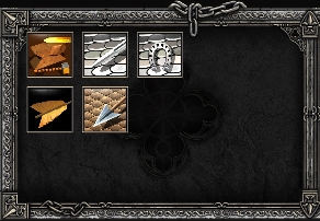
it’s obvious that padded armor < leather < ring
You can see rings, leather and padded armor. And
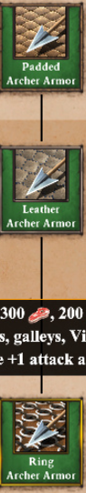
Without “description” the picture is nothing.
But with description - why do you need some dots in the picture?
They cover pretty well. Fletching/bodkin arrow both used to improve strength and accuracy of bows.
As some would love to say historically accurate. LOL
If you understand what fletching is and how it affects arrows. it’s super easy to understand “what the upgrades do or which is which very well at all.”
To sum up, you did not even try to look into aoe2 icons and their naming.
6 Likes
In case of Forging/Iron Casting/Blast Furnance as well as Fletching/Bodkin Arrow/Bracer I do think that AoE 2’s icons do a good job of conveying the effect of the upgrade.
Each icon looks different, making it clear that the upgrade will improve on the previous one, especially the offensive Archer upgrades. An arrow with fletching has better aerodynamics thus can fly further and hit harder. Same with Bodkin and Bracer.
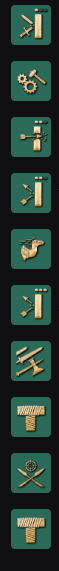
The problem with AoE 4’s upgrade icons is, that it’s 3 times the same icon + the dots added to indicate the tier of the upgrade (which are way smaller ingame). In the heat of the moment, it can happen that you don’t know whether you already researched the upgrade or not if you don’t keep track of it.
Edit: It doesn’t have to be a AoE 2 v 4 discussion, let’s add AoE 1’s icons from the Storage Pit as well:
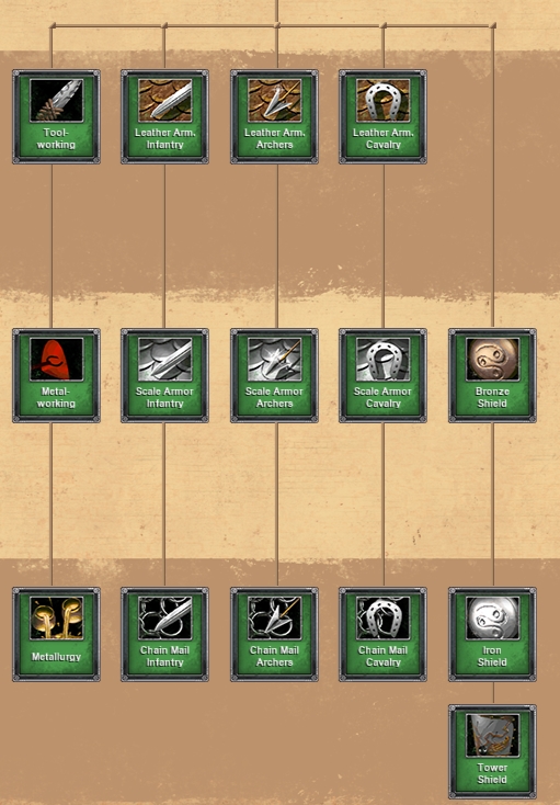
Like AoE 2’s, each icon gives you an idea on what to expect.
3 Likes
I would prefer this.
There are far better ways to both reflect the tier and the function other than “same icon with pips”. It just takes a little more design efforts.
The other point I’m trying to make is tier is not important. The position of the icon is more important. If a see a certain icon filling that role I’ll click it if needed. If I do not have enough resources I’ll wait for it. I do not really need to know if it is tier 1 or 2.
For pro players on the other hand they could possibly memorize every icon.
Is someone here really comparing age IV “icons” to glorious age2 icons? Realllllyyy? Age 2 are 10000 times superior, that is art in game design.
3 Likes
People also play video games because they’re video games, and not because they’re historical simulators (which, uh, they often are not, because, video game).
I don’t get this “where are all the people who don’t share my opinion”. They’re here dude. They’ve always been here.
Relic’s problem is that the game needs to appeal across a demographic that will simply not agree on everything that should or shouldn’t be in the game. It’s the problem any franchise has, and I will bet hypothetical money because I’m invoking a hypothetical timeline, but if Ensemble was still in business they’d have the same problem. A lot has changed in the past 17 years, and making something that’s AoE 3.5 or whatever would have as many problems as Relic trying something a bit more of its own thing as they have done.
Heck, AoE III itself was divisive. Online was divisive. And yet we have people here that fairly love both games. We have people that still prefer AoE II. How do you reconcile a playerbase that has examples of all three, that don’t necessarily like the other games in the franchise? How do you bring in new players?
These are hard questions, and realistically it’s something that gets harder every time a new iteration is released. Look at Civilisation, it has the same problem. It just has the benefit of having 10x the playerbase of Age of Empires (like, in total - Civ VI has 31k playing it right now, and CiV still has a whopping 16k right now as well). And that’s not counting Civ IV which is arguably the most famous iteration, which I can’t count accurately because the original release predates Steam.
No, it isn’t. Padded and leather are basically interchangeable at a glance.
The whole thing about icons is just, weird. Icons aren’t meant to be taken by themselves at a glance the first time you boot up the game. That’s why they also have textual descriptions. This goes for the earlier Age games as well as Age IV. But recognition at-a-glance is important, and bearing that in mind, Age IV’s icons are more distinctive. Yes, they are more abstract and they lack a flavour that people may prefer, absolutely. The pips are also easy to confuse at a glance, and there maybe is a better way of conveying that information.
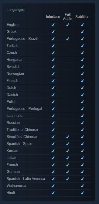
But going “this game made 20 years ago is better” is just silly. It was made 20 years ago. Does anybody have any idea how far UI has come in that time? Like, generally, the field of UI, UX and our understanding of it and how it relates to people using it? Accessibility alone didn’t exist back then, nevermind anything else. Language support? What language support? Look at the list for AoE II: HD. Compare it to this:
I completely get that people prefer subjective things, like game design, how things feel, the details how icons come to life, etc. I also get that Age has typically had a “style” of interface and departing from that is going to turn people off of the game. I respect that.
But in terms of conveying information in a user interface? You’re just confusing your personal preference for actual qualitative measurement.
5 Likes
I see a lot of modern games with more modern UIs that also have more complicated icons and do not fail to convey information.
Maybe the style of AOE4 is so delicately designed that you can only fit in “same icons with different number of pits” otherwise it will collapse.
Just like the zoom before the summer update.
2 Likes
I’ll snip a bit out of the big post, just for emphasis.
I’m not saying the game can’t have more complicated icons. I’ve even suggested, in ages paste, more colour variations on them myself. And honestly, as usual, there are things I’d like them to work on first vs. something like revamping icons, and I get that other people have different priorities. Nothing wrong with that.
What I am saying, is that claiming “Age II icons are definitely superior” is nothing more than a personal opinion r.e. preference.
4 Likes
I think you are confusing three different aspects of the problem:
You can make a (A) (B) UI with (C) icons.
A: good/bad
B: modern/not modern
C: complicated/simple
That is 2x2x2=8 combinations and each is very possible with a lot of examples.
(B) is the quantitative technical standard you’re talking about. (C) is more related to the artistic style. These are more or less objective. (A) is purely personal and subjective. That’s what people mean when “AOE2 icons are superior”. It is “the (C) of AOE2 icons is (A)” not (B).
You can make an 1990s UI with that icon style. You can also male a good UI with 2020s standards with all the accumulated experience in 30 years of game development, with the same style. That’s why DE exists.
I’m not sure whether it 100% works in this way but I think style comes first then you build a “modern” UI around that style.
Just like even a modern game with 2020s graphics (which is objectively better by a lot of technical stadards than a 1990s game) would be criticized with bad graphics while the latter was praised. The reason could be the artistic style, the color, the lighting, the overall feeling, or even the optimization. Saying “it is still objectively better by this and that quantitative standards” avoids the problem. Most people are not commenting from a technical perspective.
3 Likes
Yeah because god forbid someone else to have a different opinion on something right?
2 Likes
Let’s play the game:

So. do not ply the game of “at-a-glance is important” against aoe2 icons. Cause aoe4 will defiantly loose.(may be you can find a few examples overwise… but in general aoe4 icons will lose 100% )
I wanted to pointed out:
Aoe2 had logic behind icons + naming, and if you read description. It’s enough to start recognizing the difference upgrades.
(he claimed it does not have logic… but it has quite strong logic…image association-logic)
I would never understand why dots are better, if you can take another picture
We color unblind ppl - we have problem with distinguish icons in same colors.
and counting some . … … dots is hard. … … … cause they small.
PS
also, do you remember “naming” of upgrades? Or is it melee+1 melee2dots, arrows3dots?
Should we check streamers? and how they name upgrades?
What dots even mean? It does not mean age. how many times upgrade was pressed? But why you have different names for 1dot and 3 dot?
1 Like
Since the UI icons are technically “2D images” I don’t see a problem with making a mod to change them, or allow a variety of options of UI icons. It is allowed as a trigger in the editor of Aoe2:DE, I don’t think there will be a problem in the future if the devs implement an official alternative version in Aoe4, like a “classical UI”, or “Age2UI”, would be funny.
Until I know, If it is still not allowed to do in the editor, it is to avoid the problem of Aoe2:DE, that right now with too many Mods modifying the entire base game, even in Ranked, it is already very difficult to fight against human players without knowing how many of them are using in their favor against you.
The AoE4 icons are absolutely, objectively more clear on indicating what the upgrade does. The pictures literally show it straight up.
The AoE2 icons are not as clear. Showing metal being forged gives me no indication of what the upgrade does. Is it stronger swords being forged? Or stronger armor? Or both?
That does not necessarily mean the AoE4 icons are better overall though. Which some people seem to keep thinking I’m saying. That is not a claim I have made. The AoE2 ones are certainly more varied and colorful.
Of course once a player has memorized the techs and their locations or hotkeys, the icons themselves become much less relevant.
The main reason it’s useful to have the icon show what the upgrade does is for accessibility and intuitiveness for new players.
It would not be difficult to design icons as colorful as those in AoE1 and AoE2, that still clearly show the techs’ effects like those AoE4.
The level could also be indicated in other ways than the small pips, but still be clear. The AoE1 and AoE2 icons do not do this very well. There is no unified indication of which tier they are. In SC2 this is done with color for example instead of pips.
I don’t see why we can’t take the good from the way each game does it. It’s not some competition where we’re trying to decide who’s best.
1 Like
That one is actually quite easy to recognize as the attack upgrades are on the left of AoE 2’s Blacksmith and the defensive upgrades are on the right.
The symbol for Forging is a sword on an anvil that is being shaped so it gives you the idea that the sword will be sharper and can attack more efficiently.
What might be confusing here is that you’ve got 3 different types of armor upgrades whereas you only have a melee and a ranged one for AoE 4 to make things easier.
But well, if in doubt, you still can hover over the upgrade to see what it does.
I don’t think that you say that.
The AoE 1 ones actually also do this well. The Tool Age attack upgrade gives +2 melee attack and uses as a symbol something that looks like a knife. With Bronze Age come more advanced techniques, thus Metalworking is introduced. With the Iron Age, even more advanced techniques to increase attack come into play, so the upgrade is Metallurgy.
What probably can be problematic is the 4th armor upgrade with Bronze Shield etc as these increase the pierce armor of Infantry. The “normal” Armor upgrades tho are in my opinion easily distinguishable with Leather as a primitive form of protecting being first, then Scale and then Chain.
I don’t see the games in a competition. I only think that AoE 4 would profit a lot if it goes the same way as AoE 1-3 regarding upgrade icons. Or if it replaces the dots with different colors as in your SC2 example.
The problem with your scenario is you’re simplifying it a lot. Modern / not modern is a curve / spectrum / line (however you want to call it), and not just two points. It’s also complicated because different genres have different conventions, and different genres have advanced at different rates (sometimes just bog standard over-time-ness, but also sometimes because a game does something truly exceptional that everyone rushes to try and replicate - not necessarily a bad thing). RTS, on the whole, has advanced less than something like RPGs have (into ARPGs, back into classical turn-based isometric RPGs, and everything inbetween). Opinion, etc.
Complicated and simple are absolutely preference, because you’re not calling them “messy and clean”. Which is how I’d describe older game icons (generally) vs. newer game icons. An interesting standout here is DoW III, which went all-in on very realistic icons that didn’t stand out massively, and the readability was then criticsed (I’m not claiming the game didn’t have other issues, it’s just a rare example of a game that went the other way on icon design and saw it not work out. I liked them myself, but naturally I have a Warhammer background and unit recognition there I could basically do blindfold).
Having two icons that look the same in greyscale is not good icon design. To take an obvious example: leather vs. padded. Why? Because we know so much more about colour vision deficiencies than before, for example. Patterns are important even to those of us with 20/20 vision. This is why I support more colours in the UI icons than the two (?) we have at the moment. Because we can do more patterns with one or two more colours, and these would break up icon sets in a more distinct manner. This is why I recognise the pips aren’t the most obvious system to indicate rank or veterancy (of anything, be it a unit, tier / age, research, etc). They’re something, but I’m sure there could be something better.
But they are something. You’re not going to get a Padded and / or Leather situation, once you’ve figured out the pips exist. And that’s a thing. People were judging Age IV icons before they’d even gotten the game. Before they’d had a chance to learn what they map to. Why does everyone know what the older Age game icons are like? Because we’ve all played them all before! Excessively, in a lot of folks’ cases!
That said, I agree with your point on graphics. But to me all that does is reinforce that people are talking from opinion and nothing more. And there isn’t anything wrong with that, but nobody “wins” that discussion. The developers have their own opinion, each of us have ours, and ideally we all get to express ours in response to the developers’ creation. It’s hard not to say this without sounding like “trust me bro”, but I do a lot of UI and UX work professionally. I absolutely accept that mine is just another opinion on the Internet, but I’m not just doing this because I think the game is neat and therefore everything in the game is neat. I’m doing it because I believe the icons represent something good, even if they’re not perfect, or have room (imo) for straightforward improvement.
Nah. Discussion? Sure. Game? With respect, no thanks.
This is why I talked about accessibility in video games. The More You Know™
2 Likes