Hi,
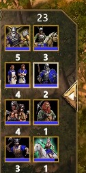
So in AoM when you have multiple types of units selected the panel in which the selected units are displayed although it looks beautiful it can be a little confusing and won’t lets you see what you have selected at a single glance.
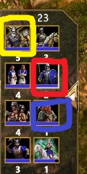
Although AoEIV’s system has lots of flaws but it does a good job of differentiating between military and civilian units by giving civilians blue icons and giving military red icons (Although the simplistic design of AoE also helps in this regard but I think everyone loves the current portraits and icons of units. I personally would hate to see them replaced by simplistic icons just for the sake of competetiveness and convineince).
(As you can see, you can easily identify the villagers amongst all those military units. AoM needs this more because it has a a lot of variety in it’s military units)
Adding a bit of a colored border or emitting colored rays or bulbs of colored light around these units would help a lot.
Although I do understand that implementing this might be very expensive and might never happen. But I genuinenly think the game needs this readablilty,