It’s been a year since I made my original Very Extensive Guide for Picking Revolutions. I promised to revise it for mistakes, confusing or outdated info. It turned out to took way longer than I was expecting to finish it, but here it is! I split the guide into 3 parts.
For quick reading, I color coded all bonuses as: Green for Economy, Red for Land Military and Blue for Naval Military.
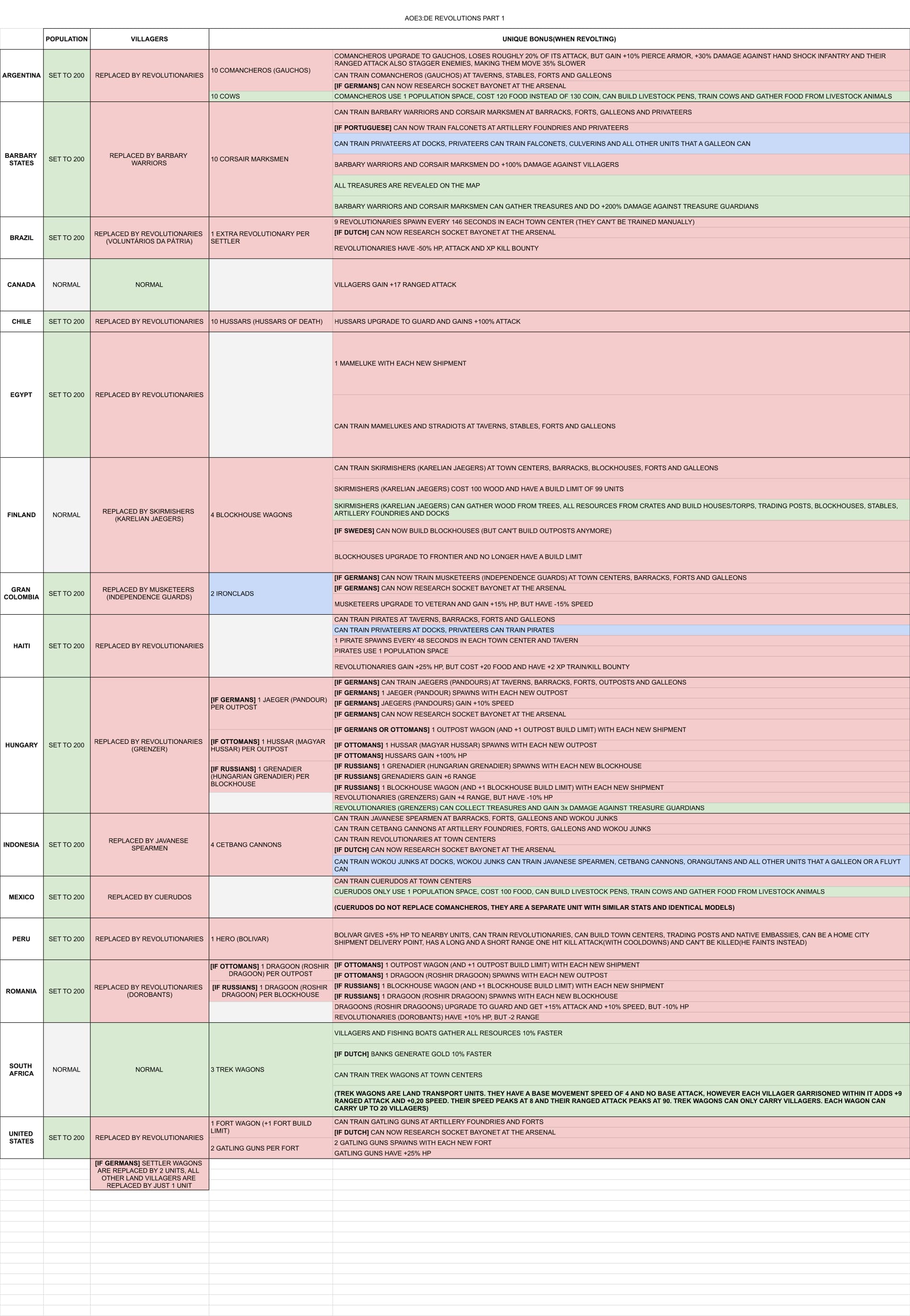
Part 1: Immediate Bonuses
The first part of the guide shows what happens to your civ as soon as you finish revolting. The columns show, from left to right, whether your civ’s population space is set to 200 or not, what happens to your villagers, which bonus units you get and what other unique upgrades and units you unlock.
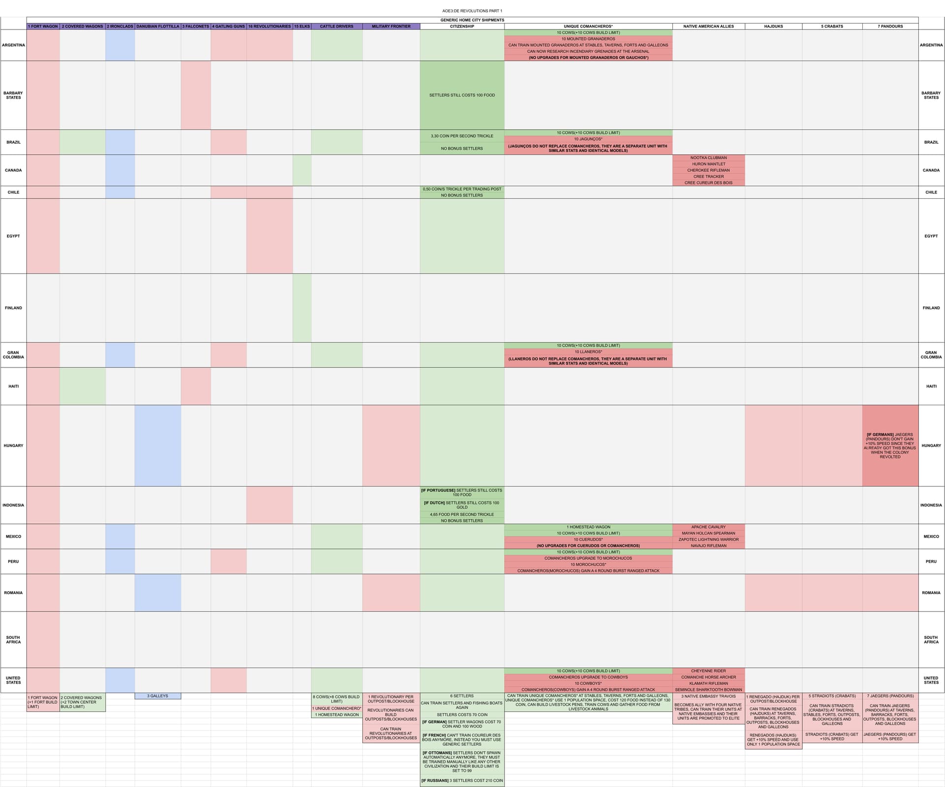
Part 2: Shared Cards
The second and third part are all about the cards that you can send after revolting. Part 2 shows the shared cards that can be found in at least two different revolutions. Most are pretty straight-forward, for the more complex ones you can find the details at the bottom of the chart. Unique exceptions or variations of a card are listed in the chart itself.
Part 3: Unique Cards
The final section of this guide shows the cards which are totally unique to each revolution. For easier reading, I tried to arrange each line to be a different card. Some cards required more than one line, but it should be pretty clear when that happens.

Complete Guide:
Finally, if you want everything in one massive chart, here it is:
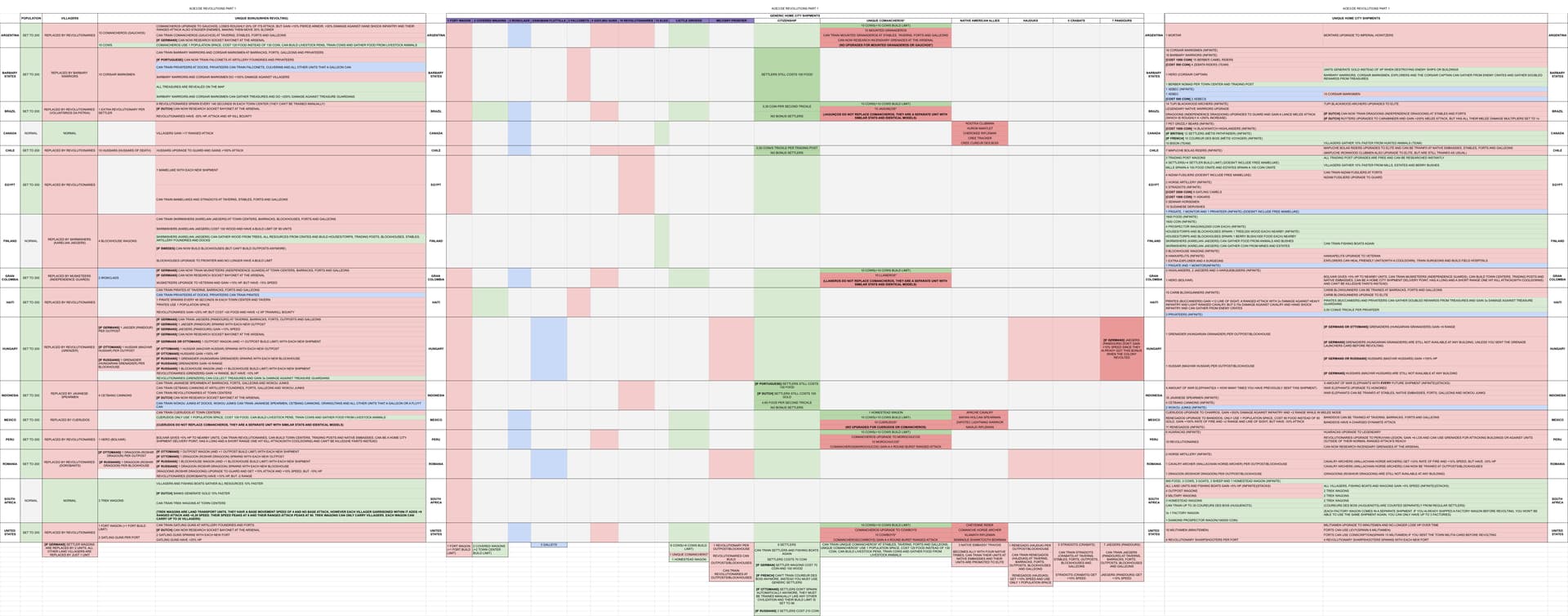
PS: I realized that the uploader had to compress all images into blurry .jpegs. I’ll try to find other ways to share them.
The album on Imgur looks slightly better: AoE3:DE European Revolutions Guide(Patch 54545) - Album on Imgur