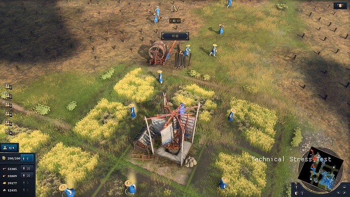
This icon does not have the function of selection. It can only be viewed. It is not necessary to be so centered, because it blocks the view and is very easy to touch by mistake. Please move the icon around the screen.
For example, put it near the resource UI.
14 Likes
Who would’ve thought that freely adjustable UI is still not a thing in 2021. Sad times.
7 Likes
Yeah, where the dynasty is right now is very annoying. I clicked on it trying to select some unit/building hundreds of times during the beta and that stress test weekend
2 Likes
What is disturbing is that someone must have approved this “design choice”.
Really makes you think…
5 Likes
If the production team thinks that the dynasty icon should be placed together with the era icon, you can also move the icon up a little bit, at least not blocking the middle of the picture.
4 Likes
