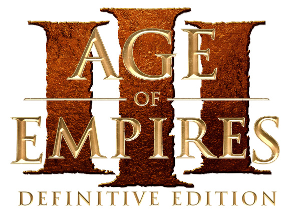
Looks nice, but I still don’t have any problem with the current DE logo design… aside from the bright hairline perimeter around each letter throwing the illusion of 3D off, as I’ve talked about before in this AoE2:DE thread. I prefer consistency with the past two DE logos (DE1 and DE2) in terms of style, since that’s an established look. And now that I re-look at the current logo, I also appreciate its blocky structure they gave. Seems more impactful, strong, forceful… like I want to go win a conquest match 
1 Like
With a metal mirror effect, great. This should be the era of AOE3
Radiating Blade^, I actually think yours is the best of the old, the new and the cross-mix. Having the 3 III seperated with the illusion of 3d depth in it, I like that.
I would enjoy the new Logo with just that change. It currently looks like gold-painted prison bars to me, I think that’s what really bugs me, its flatness.
Thanks for this image Radiating Blade
1 Like
looks amazing, and I think it will be similar
I mean, I don’t really think the logo that came out in that video is the final logo. It’s just a “fast” logo to announce the DE of that game with the essence of the previous announcements
When the games DE were announced, these “logos” came out, like this
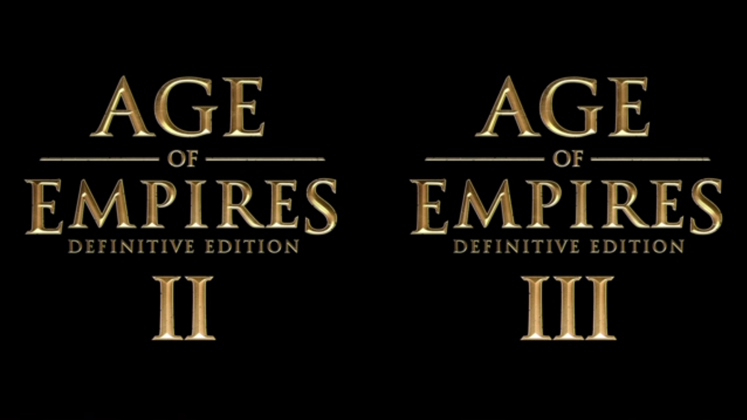
But the original logo of AOE 2 DE is
with the new detail of RED and 3D in the big numer 2. Like the original Age Of Empires 2.
so… I think we don’t know the fintal logo yet
I think it will include the golden typography “Age Of Empires” but number 3 will have a different work and based on the original with some colors
Like your concept of the logo of number 3, RadiatingBlade!
2 Likes