The Age of Empires III logo emoji on the official Age of Empires Discord channel is thankfully in the spirit of the original release.
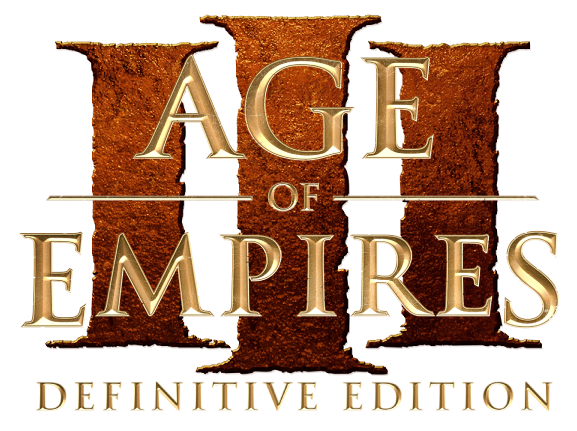
Even though I do not play Age of Empires III very often, my initial reaction when seeing the new Age of Empires III: Definitive Edition logo is that it is not in the same spirit as the original release and sends the message to me that the development team for Age of Empires III: Definitive Edition is not going to produce a faithful remaster. Whether or not this will be actually true is to be determined of course, however I thought that leaving this feedback was important.
I hope the logo for Age of Empires III: Definitive Edition has not been finalized. Any thoughts from more experienced Age of Empires III community members?
It feels like they are trying to keep some sort of pattern in the logos.
The big III looks… clumsy… tho. perhaps if the middle I was bigger, closer to the original, it could work.
I’m not a fan of perfect symmetrical designs, so my opinion is biased towards the original design.
Interesting observation. We shall see of this means something more in terms other than just the logo design. As a long lasting aoe3 player I’m very curious to see how is it going to be treated.
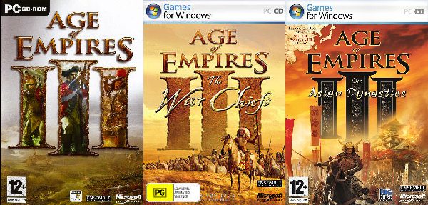
This logo specifically that you posted is from the War Chiefs expansion. But yes, in all of them the middle I letter is a size bigger.
I’d prefer the original design as well, just to maintain the authenticity of it, the logo that we’ve all came to know, recognize and love through these years.
edit: sorry, I had in mind the logos of the old physical editions on my shelf. Nowadays I just use the AD so not really in contact with the rest of them yes that’s also for vanilla
Well, the new design seems consistent with the logos of the DEs. Maybe it’s not the best they could come up with, but i think it’s fine. I wouldn’t be bothered if it was the final design of the logo. What matters the most to me is that the remaster of the game is actually good and not as unpolished and unoptimized as AoE2DE on release.
I like the new logo because it ties it together with the other Definitive Editions. Makes them one cohesive collection of enhanced versions of the games sharing the same design sense.
The only problem I have with the new logos, including the one above, is the perimeter of each letter has a thin light-colored border, unaffected by shadows. This gives the illusion to my eye that we are looking at the reverse-side of the letters and peering into them from behind, rather than the letters poking out toward me. I get why they did it, but I don’t like it because embossed letters like this should look embossed, not inverted. Better solutions exist, imo. Well, this issue, as well as the poor resolution of the logo in-game for at least AoE2:DE so anti-alias jaggies exist
The results so far appear to confirm that the community is about evenly split on the logo design. Interesting. Art appreciation is subjective. Who knew?
I like both… kinda… however, the old one is better. The colours, font (specially “of”) and size (those “III”) were better before. I know the new one keeps up with Age I and Age II, but it feels like a letdown when compared with the old logo. I’d love to see more details from the classic logo. The Age of Empires III logo emoji on the official Age of Empires Discord channel, for example, is already an improvement.
The new logo looks like someone has written ‘Civilisation’ but with different letters.
I dont see the charm of Age of Empires anywhere in that logo.
It lacks:
Cherry Blossoms,
Berry Petals,
Reflections of voyages,
intricate patterns of layers,
fortifications,
unique units in assemble on a frontier, and bushy treecrowns in wind.
I believe The Logo should reflect the artwork and depts of what we can find within. A neutral colour is too blank.
I agree with the author of this thread.
Much is left to be desired, it is probably not finished yet
Edit:
The logo is fortified, and some character exist, the other points still yearn some attention.
You mean like these? (See below images; the banners in Steam.) I don’t think we have much to worry about. The artwork in the DE banners, splash screens, etc. are great. A lot of respect is paid to the respective AoE games with these Definitive Editions, imo. And just because there aren’t oil painting masterpieces inside the Roman Numerals, it doesn’t mean surrounding artwork won’t be beautiful.
Perhaps I misunderstood, but the question was about the logo, and I am not perceptive enough to see the patterns of complementarity within the logo towards its full content.
The new is a very fine logo.
The old was/is increadible.
69 (nice) votes now, in an almost 50/50 fraction… I must say, never thought it would be split like that. The designers must be like “soooo we change it or not?”
I personally do not like this coloring/design for AoE3 DE. It looked good for the first remaster but really doesn’t match the game imo. It is so bland to look at, so dull. The War Chiefs one is rugged, in shape, detail and color; and i think it is a more suitable match to this style of game.
oh mate… should’ve tried the WC3 Reforged beta and release.
aoe2 DE was fairly good through both stages, only issues I had consistently were connection issues.
I liked the cursive ‘of’ more from the old version.
The ‘E’ in Empires has very short appendages. I thought it had slightly too large in the past, a middle-length would be excellent. I view all other letters to be more or less of good to excellent quality.
Is it possible to add a faint light-green/teal-reflective neon nuance into the half-midst of the yellow letters hinting of seeds, bushes, & rainforest river?
(Green is a complementary color of red)


 yes that’s also for vanilla