Yet for wonders, while they have the same stats and same cost, they went the extra mile to make 10 unique wonder icons. It’s slightls inconsistent.
HasanIchess:
So for those that keep saying they prefer the current icons over the ones in for example, AOE2, or other games, can I ask of you to share your favourite icons in AOE4?
I’d like to see what you find to endearing about them. I can point towards many icons in other games, whether it is because they look funny, expressive, cool or just interesting and unique, I tend to float towards liking and disliking icons based on what they convey as well as how it is expressed.
In AOE4, I can’t think of one from the top of my head that I like. I really thought about it. So I went and looked into individual civilizations, and I guess like the Malian’s Poisoned Arrows? Thought I’d like the new Palace Guard, but it feels too busy and shrunk. Overall, I don’t think there is a singular one icon that I actually like like.
So, yea, please share icons that you feel really happy about.
In case one of you responds with “you don’t need to have a favourite icon for them to be good”, then I think that kind of reveals the split in logic between people who like and dislike the current style of iconography. It reveals people who care about these things, and those that don’t. Neither group is more important mind you, and that is why I keep suggesting a style that satisfies both camps by utilizing the vivid simplicity that you guys are so fond of, as well as the colourful expressiveness that the other camp loves.
Above there are two letters, a, one with many ornaments and the other simple, the simple one is of the SANS SERIF type, and its functionality is to facilitate reading, that is its function and it fulfills it well (like the font of this same forum !); So no matter how much someone is fascinated by the letter with ornaments, it is not optimal for reading, the same analogy is with the icons that I already explained and argued! If someone is a fan of the ornamental exuberance of the Baroque, it is up to them and fanatical biases
The thing is, having colourful, ornamented icons helps to make things even more memorable.
Egyptians + Temple with all technologies
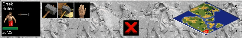
Greeks + selecting a vill
HasanIchess:
You can really see the weapon breaking, therefore it is defense, and it is also possible to identify which is an arrow and what is a sword. Putting words is not appropriate depending on the language that is translated would not fit in the box
Age of Noob made a pretty good video on this issue when the Technical Stress Test was on and imo the issues he mentiones are still valid today, even two years later:
5 Likes