I already mentioned my position and all preferences are relative, I will have aoe4 as memorable because it makes it easier for me, the learning curve, and to understand and play it quickly in a short time, it’s personal, regards
But I also don’t “enjoy” the icons in the older games. You’re attempting to put a “you don’t care about how icons look” into my mouth. Don’t do that.
I care about how they look. I look kindly on the iconography in IV in general. What you enjoy isn’t what I enjoy. But I don’t try and make out that you don’t enjoy things just because we enjoy things differently.
2 Likes
I think you may have misunderstood what I tried to imply. Not saying you’re doing that intentionally.
My statement was infering that we care about things in different ways. The biggest split in the disagreement stems from what we pay attention to or care for in evaluating icons or just design in general. Not every meal is for every person afterall. I was not expressing that you do not enjoy icons simply because you do not enjoy it in the manner I do.
1 Like
You said, and I quote, “the fact is, the reason anyone would prefer the current set of icons is completely disconnected from what can be enjoy about artwork in general”.
This is not a fact. This is your opinion based on how you appreciate art in video games. You personally. Others can of course agree or disagree, but that’s just evidence that it isn’t factual.
Just like how people have argued about art for centuries.
The thing about icons is, unlike “pure” art, is that they have to convey something mechanical. They have to convey meaning beyond whatever influence or expression art in general does. Warhol’s printing technique conveys something different than a set of unit upgrades in a video game. And icons are constrained massively by size. This affects how much they can convey and how they’re aligned with the UI as a whole.
Minimalism exists in art. Colour theory exists in art. The icons in Age IV literally evoke bas relief. The unit portraits are stylised in a way almost reminiscent of the Bayeux Tapestry / artwork in that vein (with the hard lines separating body parts - though again this could be just the bas relief emphasis). And you’re telling me it’s completely disconnected from artwork in general?
You can not like it as much as you want, but are you sure you’ve actually analysed this from an artistic perspective?
1 Like
I still think you’re misunderstanding me.
The entire point of that comment is foundation. Me asking for you and others to find icons that you enjoy from AOE4 is meant to showcase different perspectives and how we appreciate things differently.
The statement that you quoted “the fact is, the reason anyone would prefer the current set of icons is completely disconnected from what can be enjoy about artwork in general” is of course overgeneralizing. For instance, I don’t only enjoy the artwork of icons. And likely, you neither only enjoy the simplicity of them. The statement is meant to sever two different line of thoughts, not invalidate one or the other. To present two paths. To simplify; liking the current state of affairs likely means you enjoy nonintrusiveness, which is different than enjoying artwork in of itself. Though the two can coexist. However, people do tend to lean towards one or the other. I lean towards icons that are more artsty than for example, @CRothlisberger, who having expressed the lack of a favourite icon, seems to lean more mechanically in his statement that he doesn’t care much for visuals.
You can of course enjoy art in its various forms. This is why my question works even if that is the case. Because if you are a fan of minimalism and modern graphical styles, you would likely find these icons endearing. You’d likely have a favourite that you’d share. Me asking for you to share that, should’ve prompted that kind of exposed admiration. Now, for this next example, I’ll assume that you are like @CRothlisberger in the lack of a favourite icon.
It would then be unlikely for you to then have a passion for visual minimalism. If what you prefered was the simplicity or the clarity of it all, you probably mean functionalistic art instead; for you can visually admire minimalism with a dire passion.
So unless your point is simply “there are exceptions to everything”, which, of course; what is your actual stance? Do you like the artwork simply because it is non intrusive? or is it because you enjoy the visual simplicity of the actual linework, the expressed shapes and the condensed perspective? I would guess that you are in the first camp of only liking that it WORKS, not that it looks good in the way it is presented.
1 Like
I invite you then to play AoE 2 DE and 3 DE for a longer period of time instead of just relying on what streamers and misc content creators post or say and then try AoE 4 again. ![]() You’ll immediately notice the difference that unique icons make for eco or Blacksmith upgrades and other technologies with upgrades (e.g. Masonry and Architecture in AoE 2’s University).
You’ll immediately notice the difference that unique icons make for eco or Blacksmith upgrades and other technologies with upgrades (e.g. Masonry and Architecture in AoE 2’s University).
You’ll also notice that it’s not really about being nostalgic for the older games but rather to add immersion. To exaggerate here a bit: the icons in AoE 4 are like playing AoE 2 with Cube Mod.
But yep, it eventually boils down to personal preference.
To give one more example - let’s pick Horticulture/Fertilization/Precision Cross-Breeding vs Horse Collar/Heavy Plow/Crop Rotation. AoE 4 may not have farm upgrades as farms are infinite but these two tech lines work quite well for a comparison:

Horticulture

Fertilization

Precision Cross-Breeding
Horse Collar
Heavy Plow
Crop Rotation
One icon with 3 dots to indicate an upgrade vs 3 unique looking icons.
2 Likes
I think China has some awesome units
2 Likes
They do. Honestly the most unique feeling civ.
1 Like
Why this fascination with having to have a favourite? One favourite? Out of how many icons?
And why you do use this assumption to justify a “lack of passion”?
Like, I’m typing on my phone on the way to a family day out (I’m not driving ![]() ). I’m not going to check I’m using precisely the right word. But I’m pretty sure minimalism is what I mean. The use of negative space to emphasise the meaning of the iconography, and background colour to convey intent. Could still be wrong, obviously. I’ve been a programmer too long, hah.
). I’m not going to check I’m using precisely the right word. But I’m pretty sure minimalism is what I mean. The use of negative space to emphasise the meaning of the iconography, and background colour to convey intent. Could still be wrong, obviously. I’ve been a programmer too long, hah.
You’d be wrong then. I like the linework. I like the resonance with the gold theming throughout the rest of the UI and ingame animations / FX. I like how accessible they are. I like that the meaning transcends how a unit or weapon looks, because it future proofs the design. I like the bas relief / medieval tapestry style.
There’s a lot I like! Both functional and in terms of the actual art direction.
Doesn’t mean they can’t be improved. But if they were to be officially improved (separate to user mods that I’m very, very loud about my support for and the dev’s need to improve support for), I’d want them to keep this overall design.
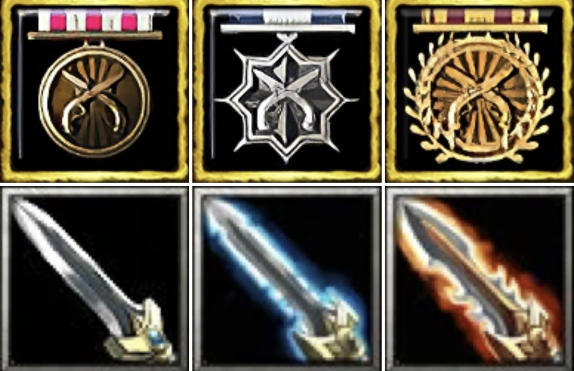
Yeah, they do. The icons are horrendously mismatched from both an artistic perspective and in terms of UI consistency in the bottom set.
Two out of three have black backgrounds, one doesn’t. The first two use real objects, but position them differently in space. The third uses a flat 2D icon (which makes sense; hard to convey rotation otherwise - but it contributes to the lack of consistency).
I’d say the upgrade icons in IV are too uniform (as I always say - IV doesn’t represent some kind of perfection), but they have a far more cohesive look and feel that provides a better base for further experimentation.
This is a technical analysis, not just “I like” vs. “I don’t like”. This isn’t to say that it isn’t opinion - it still is. But I’m making an argument that isn’t rooted in preference.
1 Like
No fascination, I keep repeating as these responses are in relation to that original question. And I’m not using lack of passion as a way to be derogatory as much as I am just using it for distinction. There is appreciating a doorhandle for working, and there is appreciating a doorhandle for its ornate dragon design. You can of course enjoy both that it works and that it looks nice.
Minimalism can be a confusing term due to the role it can serve across various artforms. For instance, with art itself, it takes a backseat in addressing usefulness or function, for a lot of art has no inherent function, and so, minimalism in painting is often expressiveness through minimal channels. Whether it is colour, shapes, perspective, emotions or whatever the contents of that artwork is. In stark contrast, minimalism can be quite different in say architecture, which is where you’ll find the term of functionalism. This is a form of modernism and grew out of a specific point in time where quality and expansion was heavily prioritized. To achieve the best form without cutting corners, but also disregarding artistic expressions in that quest. This idea exists generally in design, alongside with minimalism–but they aren’t entirely synonyms. Minimalism can still be about appreciating the beauty of it, while functionalist design is more about appreciating its usefulness.
Mind you, you can still do both. In your clarification, it sounds like you both enjoy the thematic, visual, functional and expressive way these icons take form–so this is really ideal for you and I’m happy that you enjoy these icons. Though, I would still like to see examples of what you consider to be your favourite icons in the game if truly you do enjoy the visuals–because surely you prefer some over others. And I request this out of personal interest, as I cannot see that beauty myself, and so, would like to view them through your perspective.
There isn’t much to say beyond that. If you enjoy the current visual style then that is that. I still hold on to the idea that many enjoy the current iconography because of its function rather than its visuals, and for those people, I still propose getting a new set of icons that bridge the gap with a new style that fulfills both camps equally.
2 Likes
I agree about the inconsistency in that regard but imo as these three icons look different enough from each other compared to 4’s uniform icons, it makes it easier to recognize those as upgrades. That’s just my opinion tho.
2 Likes
so the new player, some have never played rts or age, must memorize three images and multiply that by all the technologies, that is, instead of playing they come to study! … and then they will tell them that they must memorize build orders and then get used to producing villagers. These are other times, the learning curve should be easy; maybe for regular players your design complies with what you say
No not really. That’s literally something you memorize in your first 2-3 games after trying out stuff. Also, the game has tool tips that exactly say that Horse Collar gives +75 food on farms, Heavy Plow adds another +125 and even makes villagers carry +1 Food (because advancement in technology) and Crop Rotation adds +175 food. The latter is based on the Three-field system being used in the Middle Ages:
(Adding the Spanish article as you’re apparently a Spanish native speaker?):
I don’t see that as increasing the learning curve. At all, it increases immersion and makes you also learn something about the era the game is set in.
A new player however can be confused at AoE 4’s icons if he doesn’t pay close attention to the dots which tbh is something that can and will happen at some point as the icons appear much smaller ingame.
As I’ve said, I invite you to try AoE 2 and 3 and play them for a longer period of time to see if your points still hold up.
4 Likes
This forum is really somewhat like standup.
Some complain about aoe2 units with same skins, but at the same time they protect icons with same image.
new skin == ICANT play, to hard to memorize.
meanwhile dota players with 103*4 + 90items of different icons.
the relics took a bad design decision, but an army of bots/fans came to defend and justify it
Aoe 4 icons i dont know most of the upgrade names and playing since the beginning. Just know them as upgrade 1,2,3
Horse Collar, Heavy Plow and Crop Rotation i would feel makes the game have more meaning. Maybe the icons in aoe4 need a middle area between the older games and Aoe4.
Thought the Age games are about learning history aswell
2 Likes
Funfact: Bill Gates wanted to promote the original Age games as educational software. Bruce Shelley (basically the ‘father’ of the old games) was against this because he wanted to make a welcoming experience in first place, hence using bright colours and saying that the sun was always shining in Age of Empires. If players started being interested in history because of playing AoE that was seen as a nice side effect. ![]()
3 Likes
Yes, I agree on everything…
AoE 3 has European infinite mills, Native/Meso American farms, Asian rice paddies and African fields and yet each one has its unique improvements with its respective icon…
3 Likes
The only reason I can accept for the icon design is they have a specific art style on mind. Then I’m free to dislike it.
But people seem to always fabricate some “functional superiority” with the simplistic icons and pips. Then I wonder why not every game is using this genius design, even really competitive pvp ones like moba games.
First of all icons don’t float around. Icons of the same line are always placed in the same grid. You still just need to remember one icon.
And the “tier” is probably the LEAST important information that the icon needs to convey. How to you decide whether to research a tech? Your resources. Your timing. Its cost. Does the number of pips tell you anything about that? Does it tell you anything about the actual effect?
Or you need it to remind you how many techs you have already researched——we’re talking about pvp right? New players never need a precise control of the timing. If I ninja clicked the tech icon saving 1 second and then lost 2 minutes due to the wrong macro, it means nothing. Or maybe some super duper veteran elite guard imperial golden platinum competitive pvp players in shiny armour cannot remember how many techs they have already used…seriously?
Then there’s no difference between associating the tech with a plow or 2 pips. Otherwise you should advocate using a textbox with effect and cost on it, not a “fancy icon with pips”.
Not to mention for the pvp mode that someone claims the icons are optimized towards, most of the time people only use the hotkey. Then whatever icon does not matter at all.
Okay okay let’s pretend all “new players” are idiots and cannot remember anything beyond 10 shapes.
But there are still a lot of other ways to show both the tech function and tier that look much more interesting than pips.
Both their lineage and tier are very obvious. And they come from games with very different art styles.
I wouldn’t say AOE4 chooses such a delicate art style that straight up prohibits this sort of design. It just takes some design efforts which I believe our brilliant developers are fully capable of if they are willing to do it.
6 Likes
That’s true.
I’m just saying it seems quite arbitrary to be unhappy about the universities not getting different icons, but totally fine with all the other shared buildings in every age game having the same icons.
As for the AoE2 vs AoE4 icons. I really don’t find the AoE2 ones to be some great example we should strive for. As Gorb pointed out they are very inconsistent.
Things like this for example:
Are more colorful, but still maintain an internally consistent format.
That’s what I mean.
Even if you keep to AOE4’s “one color+background” design, you can still show the linage and progression very clearly with slightly modified icons at each tier, instead of simply adding a pip on it.
I agree that AOE2 has “less modern” UI designs without many ideas proved to be effective later. But 1. it’s not that much of a problem in the first place 2. it does not mean AOE4 should go to the direct opposite in every respect.
2 Likes