Putting aside art style preference, everyone knows that multiple icons having the same shape and same color means a nightmare to tell which is which in less than a few seconds, without reading the tooltips. And I’m surprised that it seems nobody else raised this concern here. Or did someone?
@TheFibrewire Also, I think the background color can be applied with different shades, like lighter red/blue for lower rank upgrade and darker red/blue for higher rank.
Icons are made for easy recognition '(iconic), AOE4 is going for a generic icon look so it’s important they make all tech upgrade same. Using very descriptive icons with lot of tiny details does not result in any good, other than just adding more effort.
Where AOE4 icons fail is their position and silhouette are way similar, like arrow and sword they both are a half X. That is what makes them non intuitive, all of a sudden if you keep an arrow’s painting or armor’s painting it doesn’t make any sense or improve the situation.
His video also assumes everyone has played AOE 2 on the planet, so those icons are for such people.
Humans look for shape, overall silhouette then color, last comes details.
Too many colors also will kill the icons, as brain has to remember too many colors and especially when you play with tints, it’s harder to recognize them very fast.
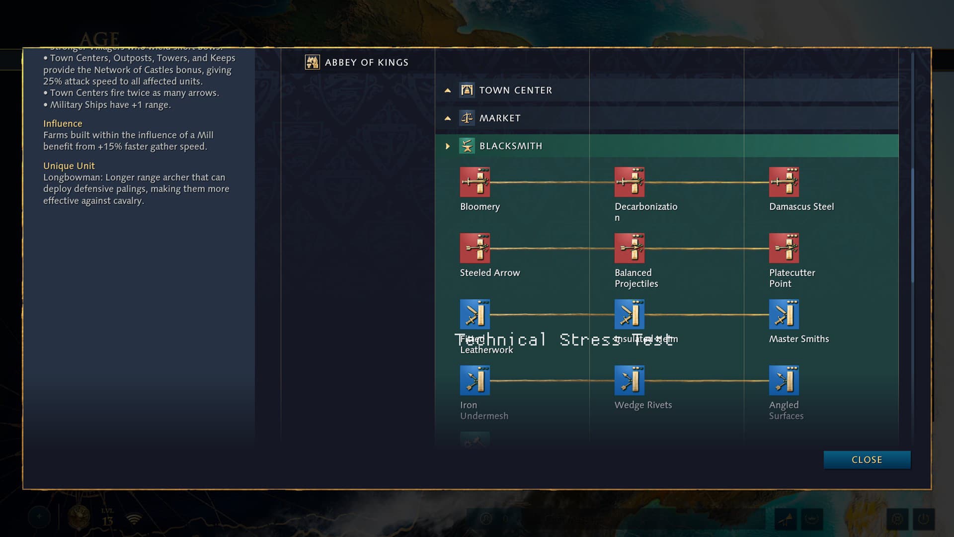
His suggested icons are way worse. I love aoe2, and the icons look nice, but honestly they are functionally much worse than the ones in aoe4. The aoe4 blacksmith icons actually show what they do and which tier they are in the icon, unlike the aoe2 ones.
Yeah these look pretty good. I’m actually starting to like the resources in the bottom left, but it would be nice to be able to toggle between the current and the classic.
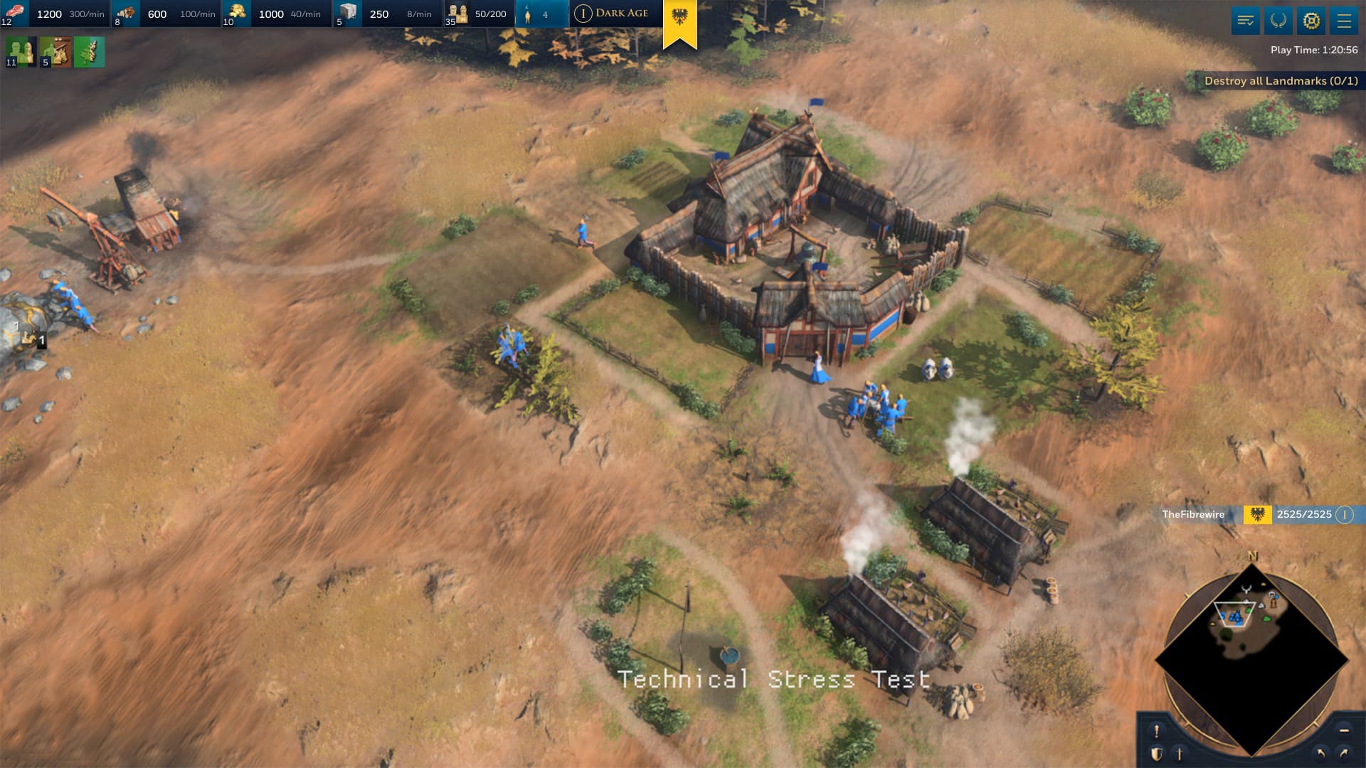
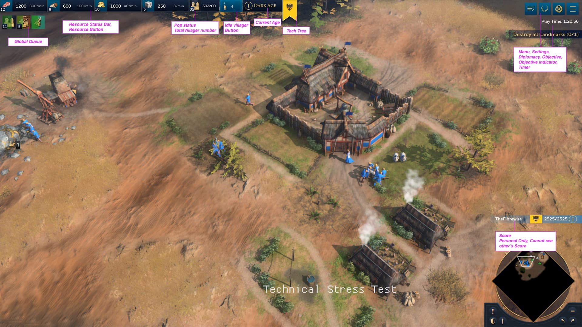
The UI is horrible, and I’m not talking about tastes or opinions here, I’m talking about proper functionality, this UI is not functional.
And no, you don’t need highly detailed and colorful illustrations to make up for a good UI, you need to make good distinguishable icons.
That means, distinctive silhouettes and minimalist design.
THESE ICONS ARE NOT MINIMALIST, THEY HAVE A TON OF DETAIL THAT GETS LOST IN ICON SIZE.
I cannot believe I’ve studied 5 years for a Graphic Design degree to see a multi billion company go ahead with this kind of bad UX/UI in a AAA game and think is any good.
Color grading helps, but that doesn’t fix some major problems which are the indistinguishable silhouettes and level. Even with color, people will first have a hard time figuring out what is each research, and secondly they’ll struggle to know and doubt if they have already researched the upgrade because the icon is the exact same as in the previous age and the level dots are way too small to see in the heat of a game.
These UI icons need a total rework more than just color grading.
My video doesn’t assume that everyone has played Age of Empires II. AOE2 is irrelevant here. In fact, I already showed in the video why some of the AOE2 icons are designed poorly as well.
You’ve done the same thing that I suggested in the video - red for aggressive techs, and blue for defensive techs. However, even amongst the attack techs, there’s still not enough differentiation. Which is why the icons themselves need to redesigned as well.
The mockups that I’ve shown are done very quickly and haphazardly to prove a point. If done better, it’ll capture the proper division between larger subsections (attack vs defense) and even smaller ones (melee vs pierce).
I’d hold off on these comments though. Everyone on this thread can start their post with “X is clueless”. This is not constructive in a discussion.
The icons as they are right now are terrible and Age of Noob is right.
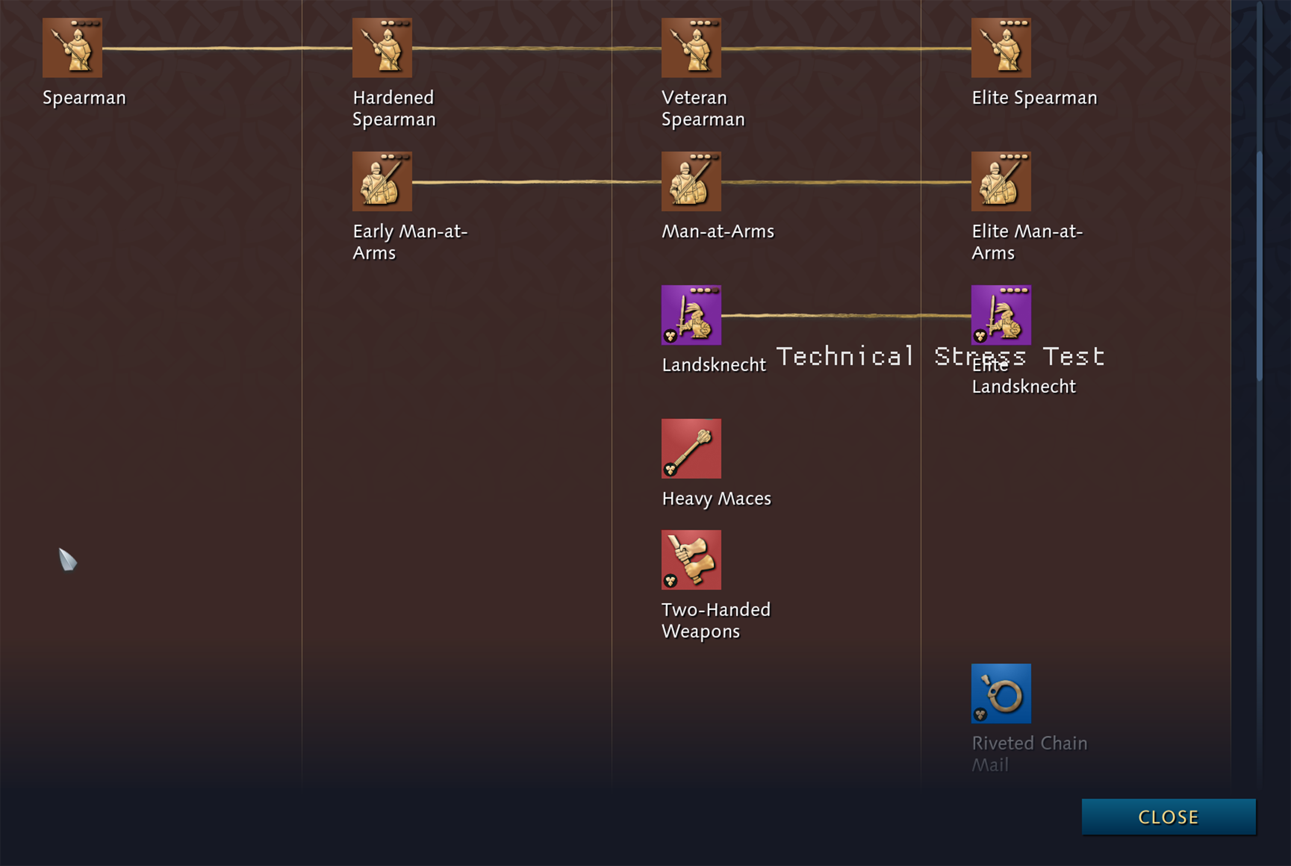
Icons representing armor upgrades for melee and ranged units are stupidly similar, look identical from a distance and I found myself having to stop for a few seconds to understand what I was clicking. Often I had a bunch of archers and started the armor upgrade for melee.
The part where he talks about naming upgrades in an historically accurate way, only to use the exact same icons is true. If you are being lazy, just name things the same way as you designed the icons, so it’s not as infuriating. E.g. “melee armor 1, melee armor 2…”. If I don’t know what the heck “blooming” is, sure as hell the icon is not giving me any hints. I just don’t care now.
At least AoE II tried to teach me something with the icons. Instead in AoE IV the icons feel just like means to an end: “you need to kill your enemy, so here’s a bunch of upgrades you need to go through, no time to explain”. Actually, a lot of the game feels that way, you’re simply rushing through the simplistic tech tree only to win, not to enjoy the process of aging up and unlocking new techs.
It’s much more important that the icon shows what it does than showing us what blooming is. They seem pretty dang clear, sword piercing armor = + melee attack, arrow piercing armor = + ranged attack, etc…
Icons that show blooming or fletching or whatever are way less clear what they do and also which tier they are.
I legit didn’t even initially realize the techs had names first. Then I read them and I had to idea what Blooming is either. Had to research what it was to make the icons that I did Same thing with decarbonization - was cool to learn how decarbonization worked with a bit of research!
Disagree. At least if I grab any AoE game, I expect to learn a bit. Otherwise I can simply pick up StarCraft and not care. The great thing about AoE is that besides the actual battles, the franchise had some historical depth everywhere, even in the icons. Now it does not.
Mate they’re not 100% supposed to - you learn what the techs do by reading them once. That’s it. You read them once and make the mental connection to the icon. You then play for a while and it becomes second nature to associate those icons with the tech.
With this logic, instead of an icon, we could have text written on the actual box itself, because that’s even “clearer” than a sword breaking against a rectangular object.
yeah every person in this world has seen a bloomery work, nice conclusion and chain mail and riveting in a smithy. What are those icons? a person standing in front of fire in black silhouette? how does that increase attack?
Also using English knight armor, all civs don’t have visor helmets, then you are creating a cultural connotation. In AOE 4 smith upgrades and many tech are for all civs and they are generic.
So current icons work, but they need different silhouettes or positioning.