Not only do I not agree with that (many AoE 2 units were very detailed and still quite recognizable) nor with the idea that immersion/visuals has to be butchered for gameplay’s sake, but also what I suggested is actually pretty simple. I may make a sketch of it so as everyone understand.
Because it’s been 16 years since the last AoE and maybe we naively expect visual and software advancements?
Readability and visual distinction is being overestimated considerably around these forums and by Microsoft/Relic. I’ve played plenty of RTS games and it takes between a few minutes and a few hours to get familiar with similar looking units for that not to be an issue anymore (I remember my WTF moment when I first played the original Supreme Commander with microscopic units, but then quickly adapted). Forcing oversized weapons, exaggerated colors and simplistic unit geometry on us simply because some people can’t tell cavalry units apart in the first 3 minutes is extremely, extremely dumb and shortsighted.
I’ve been mentioning Relic’s own CoH as a great example of readability not being an issue. Those were critically lauded games with WWII soldiers which all look alike. And what about the tanks? If I paste screenshots here from a Tiger and a Panther, can most of you tell them apart without Google? But then it came to Relic’s genius and instead of killing realism by making cartoons out of soldiers, they gave us different voice acks for machine gun vs mortar groups for example to aid in readability. In every AoE all military units are seemingly storm trooper clones and all have the same voice.
For AoE IV I would expect at least stables throwing randomly colored horses similar to how you get male/female villagers from TCs. We are not dumb, I am sure we can all manage a little bit of realism.
Super don’t agree with this. It’s not even a multiplayer thing, I just think most rts’s look like crap and it’s because they lack that clean look that was so common back in the 2d days. Focusing on readability is key for having a pleasant and good looking game imo.
SupCom is fine, but it’s because looking at a MS Excel screen of symbols is sort of the whole fantasy of that game. Due to the framing ( and extreme zoom distance ) it plays into the experience rather than take away from it. Makes you feel detached which is the point in a “commander simulator” like that.
Well it seems that it was not a key point back then with all the successful RTS… It was a key point I one that I remember and failed so hard ( DOW lll)
It was absolutely a key point in early RTS’s. Though they had it easier back then since depth wasn’t a problem. And if it was a key point for DoWIII they must have forgotten it somewhere down the line because that is one of the most unreadable RTS’s ever made.
“Dawn of War 3’s new art style, then, is as much about helping the player make sense of all the on-screen chaos as it is making the game feel more responsive to your clicks”
That’s why I don’t believe in this “readability” crap, IMO this is a cheap excuse just to sell in china, this is the first time ever that I see a discussion on an RTS forum about readability lol, I have played so many RTS, I won’t believe this crap, may be others will but not me.
Funny thing, this is a 5year old comment from same site:
“In the grim darkness of the far future there is only neon colours!
DoW1 didnt have shiny colours and it worked perfectly. Company of Heroes, also made by relic, doesnt have shiny colours and it works perfectly. This whole justification is ■■■■■■■■. They want to sell copies to kids and I am just waiting for the console/mobile port announcement that explains the artstyle. It is the exact same thing happening with Civ 6 looking like Clash of Clans”
I bought Civ 6 and I agree its art style and punchy, cartoonish color palette was a huge letdown for me. I stopped playing after Gathering Storm because it got repetitive but the aim towards “readability” certainly didn’t help in keeping me playing.
Interestingly enough, I still pick up the less readable but more realistic Anno games from time to time.
Readability was a limitation back in the AoE I and II days because you basically had a finite number of pixels to differentiate your units. Zooming was nonexistent or very limited too. That’s why AoE I had giant people and miniature buildings. With a modern 3D engine you can improve readability without sacrificing graphics realism. You have way more flexible zoom, you can use specific audio cues for different units, you have unit grouping, etc. AoE IV art style from the latest previous is cartoonish simply because it’s in vogue and that’s what sells, replayability be damned.
Readability is indeed important but there are better ways to improve readability than oversized weapons and plain colors.
Just take AOE2 for example, because examples from other games can be refuted by “but it is not as popular as AOE2”.
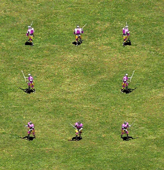
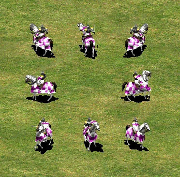
The models are colorful and have really complex patterns and details. The weapons, on the contrary, are quite small (or to be more accurate, similar to real life proportions) and almost invisible for some cases. Especially for the Knight line, where the sword is almost never seen except when attacking.
(Oh and the cavalier model has the actual armour in OP)
Does that harm readability? Not really. Units can still be separated by their stances, clothings, shield patterns, etc.
Though I’m not a design expert, I can feel there are multiple ways to improve readability, as long as models are distinct and contrast with the background well (which does not necessarily mean simple or oversized).
Seriously? A person complains about the realism of the armor and attaches a photo of tournament armor that he has not fought in, it is pompous, inconvenient and impractical. Oh yes, these photos were also taken obviously from the gatherings of amateur reenactors, who clearly did not set themselves the task of depicting the knight’s equipment as accurately as possible, even if it was a tournament one. There is no sense in the discussion.
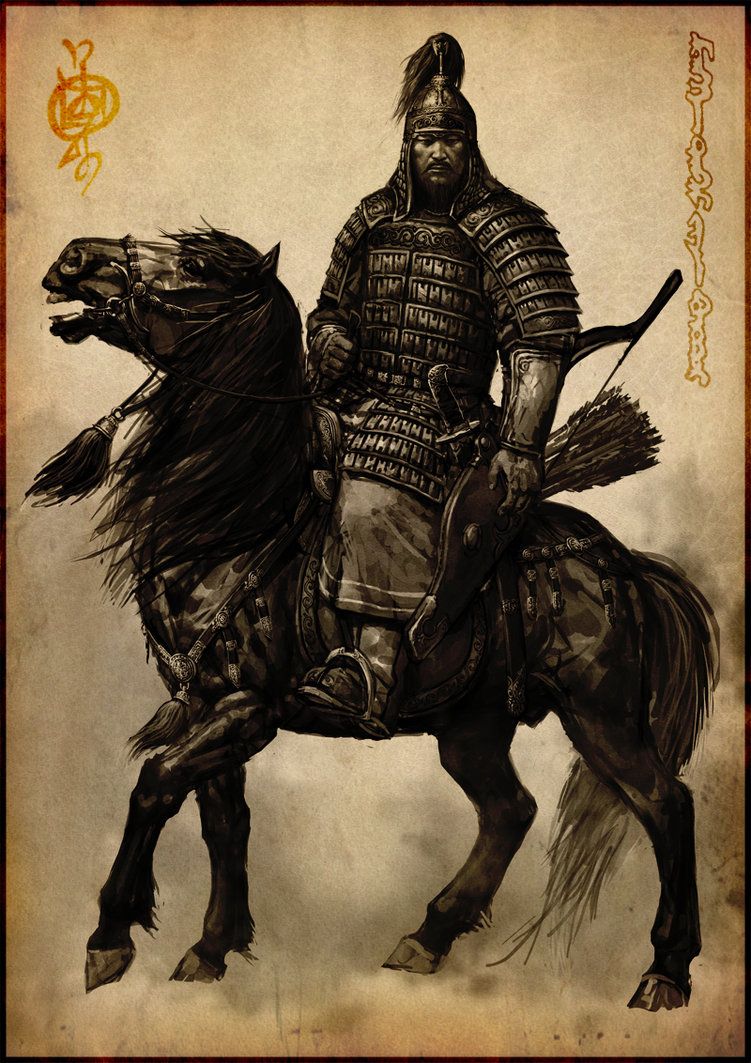
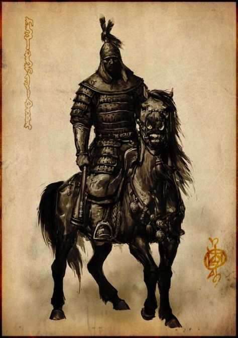
You can notice the Mongol cavalry and Chinese cavalry. The Mongols would be using much more decorated and the most valiant-looking armours during the 12-15th century in the world.
1st difference is the use of horsehair decoration on weapons and helmets.
The helmets would have a spearhead on top and are decorated with horsehair to make them look taller and much cooler.
Both pictures are Mongolian.
However, they do look similar to you bcse the Mongols later conquering much of China used its smithing skills to build armours in which later Chinese started using the same weapons and armours as the Mongols during Ming Dynasty. The main difference is the Chinese would use more “Feathers”, the Mongols would use more “horse hair” for decorations and meanings.
What are you talking about? These armors are among the best reconstitutions ever made. What’s more there was no substantial difference between war and tournament armors in the 13th century and those armors (in which I have already fought) aren’t impractical at all. Please refrain to post, especially with this unpleasant tone, when you literally don’t have a clue.
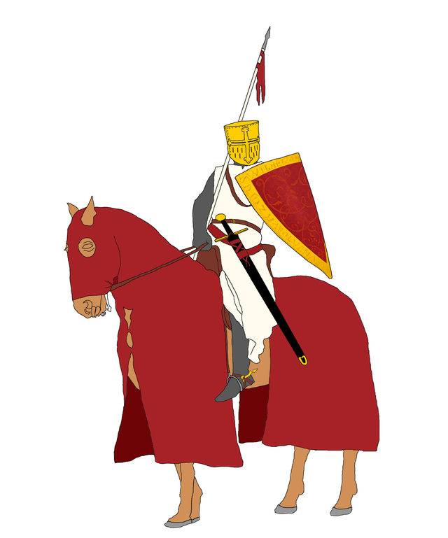
A quick drawing to show that historically accurate yet simple and readable units are possible.
This is supposed to be the Castle Age English knight/heavy horseman/cavalier or whatever it is called, based on mid-13th century Western European knightly armament. The player’s color is red. White, brown, gold and black are neutral colors.
That is, in your opinion, all these horns, capes and rags should be comfortable in battle? I advise you to see how the Swordsman Club from St. Petersburg, one of the best reenactor clubs specializing in the Middle Ages, does it. This is much better, and if you really want it to be more historical than what you show. Anticipating the claim, the club includes people who are not into history for fun, but have the appropriate degrees, including a doctor of science.
It is shame but devs use central asian turkic nations style from 18-19 centures for middle age mongols representation. And AOE4 mongols looks more cuman-like than mongols.
It is because they are the Mongols. They simply adopted foreign culture. If you study history, you will notice that the Mongols change a lot depending on their region. They didn’t force native people to change their lifestyle because those people had better and/or more advanced technology or knowledge, culture, etc. The Mongols at the beginning didn’t have much but their Tengri (the sky god) and its rules. But, after conquering they learned and loved the foreign culture and resulted in mixing cultures in which it caused mass cultural diversification and exchange.