So recently I was watching a lot of AoE 4 footage, and while I quite like the stylized look of the game, something that bothers me a lot is building recognizability. Archery range has no real distinguishable features and shapes, other than the practise targets that are lying all over the place. Stable building is very tiny, and more than 3/4ths of the building space are occupied by a tiny enclosure. People could easiely think that it is walkable, like the other gardens generating alongside houses. Its not very visually pleasing either. In this post, however, I wanted to focus on barracks in particular, and offer a few very rough mockups.
Barracks in AoE 2 and 3 have a very recognizable “U” shape. They are easy to spot even at a quick glance. This is still the case in AoE 4, atleast partially. The side wings have been very shortened, and instead two towers were placed in front of them, completly detached from the main building:
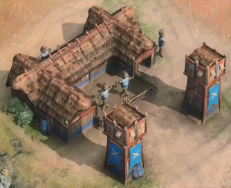
English dark age barracks
The towers, however, are in my opinion very problematic. Firstly, they could easiely confuse new players, who could mistake them for actual towers, or make new players thing that the barracks has some defensive capabilities, when it obviously has none. Furthermore, the space between the side wings and the towers is really wide for no reason, which could lead to players thinking that the area between is walkable, like many other auto-generated gardens and fences are. There really isnt much at all to suggest that the towers are part of the same building as the barracks itself. Lastly, it honestly just looks silly, and undermines the problem with scaling that this game has: the towers are really really tiny, despite the fact that they dont even need to exist, and the barracks main building could be made bigger instead. I tried to make a few mockups to try and fix the problem, without completly ruining the current aesthetics.
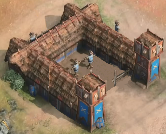
Concept A
In this first concept, I simply elongated the side wings to make it obvious that the space in between is not walkable. It also reinforces the iconic “U” shape for the barracks. The towers are now connected to the building, making it obvious that they arent standalone structures.
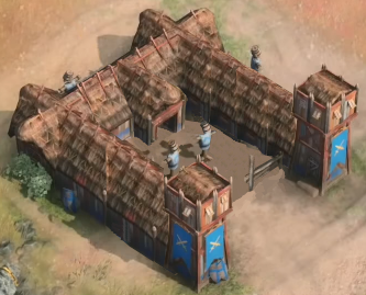
Concept B
Concept B is very similar to A, but adds an entrance to the building in the middle. This makes the building even more recognizable at a quick glance, but it can be argued that the building looks too cluttered now.
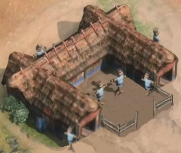
Concept C
Concept C is more simple than the other ones. The side wings are less elongated than in the previous concepts, making for a more aesthetically pleasing building. In this concept I decided to try if the building can still be recognizable and aesthetic even without the towers, and in my opinion the answer is a definitive yes. The training field with practice dummies has been made more visible and larger, making the function of the building more obvious. The bigger training field also helps use up some of the empty space of the building, which could otherwise cause confusion.
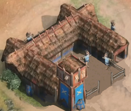
Concept D
Concept D is similar to C, however I have kept one of the towers still standing, to keep the original feel of the building. It is also no longer as symmetric, which could be more visually pleasing to some people, and adds a bit of complexity to the building. The training field also doesnt appear as large now, which can help to make it clear that its not walkable space.

Concept E
Concept E is the wildest one, but also the least realistic one. The building is now too large and could obscure vision and distract from action, however it has a very recognizable shape now. My goal with this one was to make it as close as possible to AoE 2 barracks without getting rid of the towers. Its more of a fun concept than a serious one.
Please tell me which of the concepts you liked the most, or if you are happy with the one in the game right now. Feel free to discuss other buildings aswell, or even units and icons and their readability and how easiely recognized are they. I will probably be making a new thread however, once I am done with a new set of redesigns. Next post will probably focus on stables.
