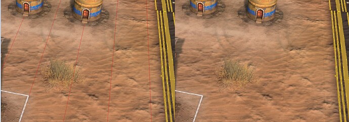
When selecting a building, a very faint transparent white grid appears across the map. It is very hard to see and the grid itself helps not in say, building due to how faint it is on the eyes. It also adds to visual clutter by “flashing” the player with a ever so slightly different saturation of the environment when selecting many units in a row.
This seems like a remnant of a feature that was considered at one point, and got forgotten somewhere during the production. It would be one thing if this was less transparent, functioning as a tool to tell the player “hey, you’re selecting something!”. But, as it stands, the player exclusively relies on the white square that appears around the selected unit itself as opposed to this variance in brightness.
Here are examples.
This could be intentional, but it strikes me more as a bug than a feature.
