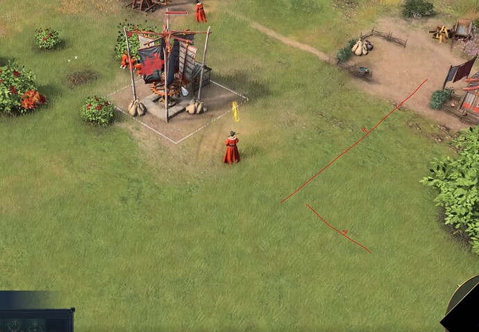
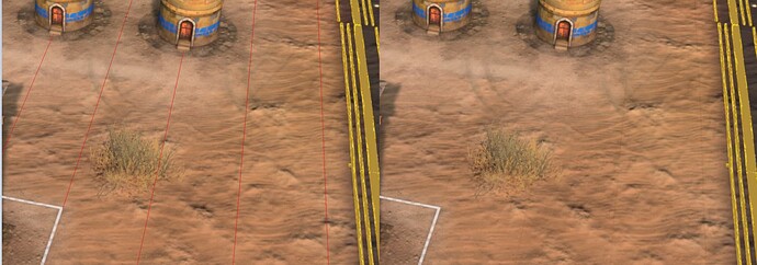
So if you didn’t know, when you select a building in AoE4, a very very faint white grid appears over everything.
It seemingly serves no actual function, and contributes to the talk about the game looking washed out as it happens everytime you select a building. Here is a clip.
Now, maybe there is a reason, and if I were to guess the function of this, it would be;
- To tell the player, “hey, you’re selecting a building!”. Creating a differentiation between selecting nothing.
- Maybe show the grid for some reason? Though it is more of a reverse-grid, as the lines are the “lack” of this white cover on the screen. Being extremely faint, I can’t see it really serving that nor see a reason to need it.
And maybe you can think of other reasons, but as for what I listed above; it does not do these things effectively. For the first point, it does not properly convey to the player in any impactful way that you’re in “build-select mode”, it is simply too visually faint for that. And the second reason doesn’t make sense either; whenever a player goes to build something, a PROPER grid shows up, with effects and everything.
But, maybe I am judging too harshly as this is what I truly believe to be the cause; I believe this was implemented very early on in development, and forgotten because of how difficult it is to notice, never being corrected by the team. It is so subtle in fact, that this has been mistaken for bugs on multiple occasions in this forum. Which is a massive problem in design, functions should never be misinterpreted as mistakes. And this one adds to that talk about the game looking washed out and foggy.
It is one of those things that you can easily ignore and get used to of course. This is not critical nor is it related to balance, but it is also something that should just not be in the game and I’m just hoping to bring some attention to this finally. Also, I’m curious if you think I should put this under Bugs, because on one hand, this was obviously designed and implemented, but it just seems so pointless and bad that I’m not sure I can expect them to treat it as a bug. So instead, I think you guys should have a look. What do you think?
EDIT: Here is an additional picture of how vague this grid is. It just seems so utterly pointless, right?
3 Likes
Agree about this white grid, it’s been more than year since release and still here.
It doesn’t give me anything useful except visual distraction, I already know if I click specific building by the other UI elements, so I don’t understand why I need thiis.
Should be option to turn it off.
1 Like
well certain crowd, yk the ones, thinks otherwise, and relic only hears those, unless your take perfectly aligns with what that crowd says, i’m going bit sarcastic here but tldr is this: it was highly likely kept there intentionally, maybe we get an option to disable this, but who knows, seems similar to no game score situation
Absolutely not. You said it doesn’t do it effectively, but god nows how many times I used it.
Build mode is different, I don’t think you really need to see the grids for clicking on a building when you are not building anything. Why would you?
I think you may have misunderstood the post?
I am not arguing to remove grids when you are trying to build something with a villager. But rather, as shown in the video above, clicking on any buildings on the map will overlay your screen with a very faint white grid for seemingly no purpose. I am suggesting that goes away.
No I understood your post perfectly well and I also answered accordingly. I apologize if I didn’t express myself very well.
I do use that “useless” white grid when selecting buildings, it helps me when I am using multiple blacksmiths or multiple mil production buildings with different production queues.
I believe you or someone else mentioned showing the grid when you click on a building, the second part of my comment was to that part.
1 Like
Ok I’m not fully grasping your comment so, help me understand.
I can’t personally see a use of it besides notifying you that you have indeed selected something; yet my point is that it does not do this effectively due to its faintness and should either be made more obvious or be removed.
You’ve stated that it is useful to you, but not how. How does the faint white overlay showed in the clip when selecting buildings help you with Blacksmihs and Mills?
1 Like
I can’t personally see a use of it besides notifying you that you have indeed selected something
Isn’t that its one of the functions? I think it does that well, does it not?
yet my point is that it does not do this effectively due to its faintness and should either be made more obvious or be removed
If you are saying that it does not do it effectively, I believe that is up for a debate. I don’t think it should be removed though. Maybe it should be made more obvious, that I can agree with.
You’ve stated that it is useful to you, but not how
What do you mean how? I mean I can see it, it works, it is not that faint in my opinion, I don’t really see what there is to explain here.
How does the faint white overlay showed in the clip when selecting buildings help you with Blacksmihs and Mills?
Maybe not the mills, as I do not build them in close proximity to each other and don’t often click on them. But for blacksmiths it is fairly visible to me and it has helped me differentiate between them. But sometimes when there are farms right next to each other and I click on them and there are many farms, there were occasions where I couldn’t really see which farm I clicked on. Maybe a faint glow up in addition to the white “outliner” (idk what its name is) could help solve the problem.
Hopefully this helps clear my opinion on the matter
1 Like
It does, and I agree in that it should be more obvious. As it stands it feels too faint.
I see this line in a very useful way, it’s something that doesn’t disturb anything visually, and it still confirms the selected structures, you may not see the usefulness, but it’s there
I don’t agree with removing it, but an option to disable it for those who want to believe that it is very welcome
2 Likes
Mhm. I wonder if I haven’t worded the post correctly.
It isn’t the white square around the object, but rather a very faint grid that appears above all things after selecting a building.
Here are some more observed examples of what is meant by above;
Here is the same image side by side with red lines to guide the eyes.
Holy moly. This is an extraordinary observation. I have never noticed that before. Maybe they had this in older versions of the Alpha/Beta and they forgot to change it? Or maybe it has an other reason for it to exist. How did you even catch this? I now understand what you mean, but it doesn’t bother me though
Can I like this thread a thousand times?
This “color washing grid” goes alongside “destroy landmarks/control sacred sites giant labels” as those things that should’ve been removed a long time ago.
The grid is useless because it’s so faint it’s almost invisible, but ironically you do notice the brightening/color desaturation more. To my eyes it seems to make the ground sort of translucent even, like if you’re seeing the polygons that make up the terrain geometry underneath.
1 Like
Yea, I definitely think it adds slightly to that washed out look. I made a bug thread about it and a developer stated it was both unintentional and not, so likely a leftover from development. Here is hoping they remove it at some point to for clarity sake. Though not important, I think we can live without this.
2 Likes

