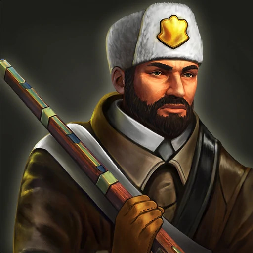
The new icon of Skirmisher is much prettier than the old one. In my opinion, the new Skirmisher icon is difficult to evaluate - it refers too much to Napoleon’s France. I wonder what the creators are going to do with the old icon of this unit (I hope that the new icon will be unique for the French civ).
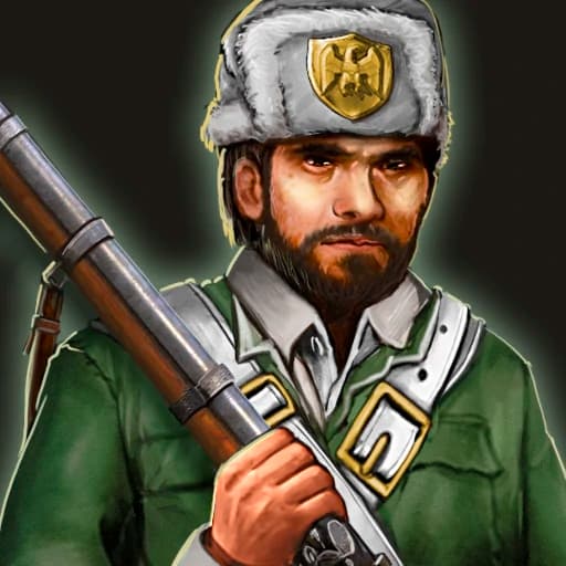
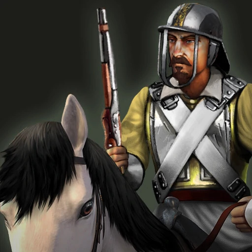
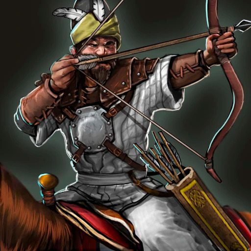
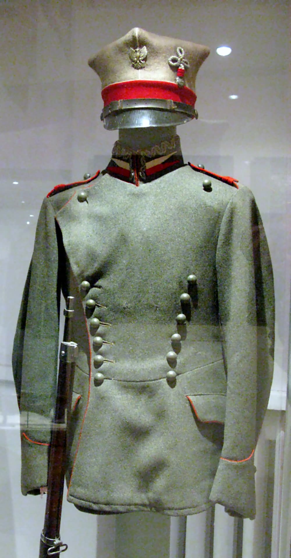
The new Uhlan icon strongly refers to Poland thanks to the placement of the Polish military eagle on the cap. An interesting fact is that the pattern of this Eagle was created during the partitions of the Congress Kingdom of Poland. It was also used in the Austro-Hungarian army. Could this be the announcement that the Polish-Lithuanian civ will be added in the future? I hope the new icon will be reserved for Poland-Lithuania civ. I wonder if the creators have any idea for the old icon - maybe it would stay for Germans civ. Potential civs such as Austria-Hungary and the Prussians could also have their own unique icon for the Uhlan.
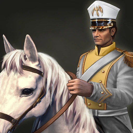
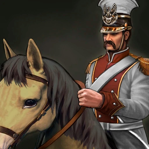
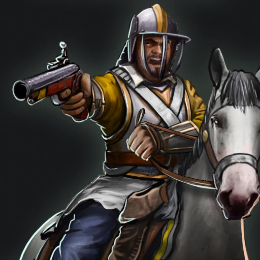
The new Harquebusier icon is so much better with a different perspective. Will the creators have an idea of what to do with the old icon or not?
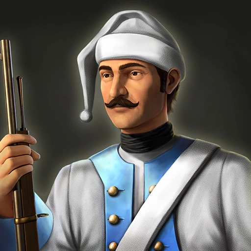
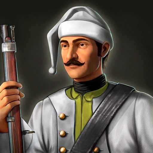
The changes to the Jaeger icon are very minor but correct. Maybe the creators will find use for the previous icon, e.g. in the new civ.
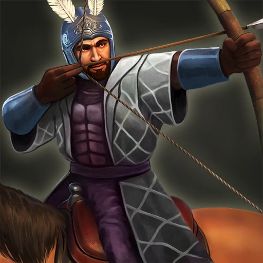
Finally, I left my favorite new icon. The Cavalry Archer icon looks like it’s from a completely different unit. The new icon is more “European” than the previous one. Maybe the old icon will be used for the new unit from the new Asian Civ? Potentially, this new icon would be unique to civ Russians - it’s very Russian.
What do you think about these changes? Are the new icons better than the previous ones?
Skirmisher - some elements are better, some maybe not. Hard to say. Perspective is a bit off, same with scale of the head.
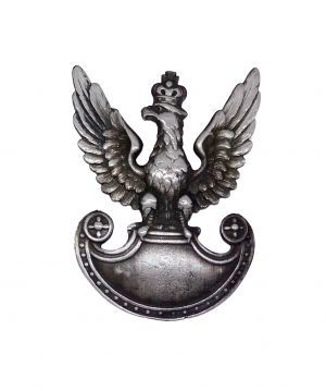
Uhlan - they’ve added an older version of the Polish white eagle on the cap, interesting. Orzeł II rp Uhlan - Wikipedia
Overall I like the changes to the color and more details like mentioned better eagle or moustache.
Harquebusier - looks like straight up improvement.
Jaeger - minor changes. Still I think unit clothes could use some rework, even if the material is somewhat accurate. But who cares. Looks ok. I’m sure weapon is more historically- accurate, tho I prefer that brass look in the previous version.
Cavalry Archer - I think it’s better, but that face is a bit goofy and general art style, just like with skirm, a bit out of place compared to the look of the original icons that were more clean and sleek. Looks ok but as with skirm there is a way to improve things. Things like arrowhead look a bit more… stylized, if not to say amateurish.
In my opinion, it is both better (more detailed uniform) and in a way weaker (very hairy face, high-lying thick cheeks, small eyes and a twisted nose). I would prefer this icon to be exclusively for civ French.
In my opinion, it’s just a Polish Uhlan. I think this icon should have been reserved for the potential Polish civ.
The cap from the old Uhlan icon is more like the one from the WW2 period worn by the Polish Uhlan.
The changes are small, but historically correct. In my opinion, they are a plus. In addition, this change is not as “new” as the other new icons.
In my opinion, the new Cavalry Archer icon is the best of all these new icons. Looking at it, you can see a very Eastern European climate. This icon is most suitable for the Russians civ, but the old icon was more suited to the Ottomans civ.
Exactly, but this icon is very Polish so this icon should be reserved for the Polish civ.
The German Uhlans (from Austria-Hungary, Prussia, Saxony, the German Empire, etc.) wore uniforms that were very similar to each other. So it would be possible to create a new Uhlan icon for the Germans.
It irritates me too. Uniform and weapons are nicely drawn, but the face is strange drawn.
Glow always has been present in the series. When done right it looks good.
In AoE1 it was reserved for elite, end of the line upgraded units, not just everyone.
And I think it’s a good way to do that. Units (Age of Empires) | Age of Empires Series Wiki | Fandom