1 more row makes it impossible for grid hotkeys ![]()
Yes, when MbL plays someone with only 1 hand.
1 more row makes it impossible for grid hotkeys ![]()
Yes, when MbL plays someone with only 1 hand.
Why?
My keyboard has easily 10+ rows of keys to use. I meany how else would it fit the buttons for 1234567890 next to each other.
Considering that you only need to research each technology once why not have a technology section more right on the grid?
If you only play with 1 hand you will likely use a mouse, right? Then you can just use the right click.
Or you want to make the game playable with 1 finger? Still easy to do a left and right click with 1 finger.
1234 are reserved for control groups?
Adding a row would require a shift key input, at which point, we are just back to another window in terms of usability.
Another column could feasably work but 6 columns is pushing the comfort and reach for some players. Everyone is going to have different preferences with how the games hotkeys are laid out.
might just be my affinity for starcrafts grids, but this looks fine to me. Im more concerned with forward planning and what happens if you need a feature that requires more space down the line? This feels like a very “fix it now” solution that will see us back here in a few years.
You mean columns?
In a treb war you may want to set gather point on enemy castle for the treb to spawn at an ideal location and start attacking instantly. You can’t do it with right click.
I really about this UI
Looks like the man have done it for the video
unfortunately that wouldn’t work super well with hot keys. the 5x3 grid matches the keys your left hand types.
would it be impossible to add more? no. but 15 is kind of a soft limit
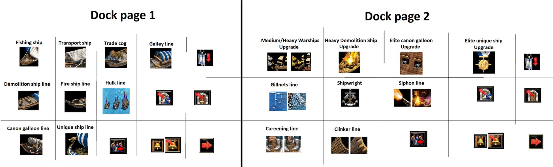
I think it’s a better solution because we have all the ship and naval technology in one building and all the ship are on the first page. Researching naval update in university is very counterintuitive and it’s better to research naval technology in the dock. We click on this red arrow since 26 years now and we know than we must go to the second page of the dock as usual. (Also we are doing this in the building menu of the villager)
Here my proposal. I put all the ship and technology on two page in the dock. Also I put some garrisoning button for the fishing ship and a bell button.
With this solution the Portuguese and the Viking will keep their access to the demolition ship line.
The first raw is the same as before.
For the second I copy the first two ship (demolition ship and incendiary ship) and put after the hulk in place of the canon galleon because we have the hulk in feudal age and the canon galleon only in imperial age.
On the third raw I put the cannon galleon and the unique ship unit.
On the right the red arrow to go to the other page and the four garrisoning button because now need the three garrisoning button for the fishing ship. Also i add a bell button only for fishing ship.
On the first raw the ship upgrade
On the second and third raw naval technology
On the right the red arrow to go to the other page and the four garrisoning button because now need the three garrisoning button for the fishing ship. Also i add a bell button only for fishing ship.second page** I put all the technology
The Hulk design looks stupid as duck. The hulk is not broken. There is a bug in the editor. It was in the subscript of the video.
These changes are pretty similar to how militia line was going before with addition of supplies and gambersons. Demos are definitley more intutive than Hulk throwing claws like vega from street fighter. If it worked like mortal kombat scorpion. It would have looked so cool. The gameplay should be made more simple. It is getting too complicated.
oh yes, unless you rotate your keyboard by 90°, lol
yeah right
Though it should probably be somewhere else in the UI. In AoE3 the buttons for gathering points (there are 2 different ones of them in AoE3) are outside of the grid for example.
AoE3DE has 6x3 and I have never seen anyone complain about that ever, and believe me I have seen so many different complaints about AoE3 from AoE2 players but not a single one has complainer about the gird being too large.

6x3 grid with buttons for gathering point, garrison, town bell, and cancel actions being outside of the grid.
But of course that would mean people would have to get used to a new layout, which many people would probably hate a lot.
Column, maybe, row, no way, it sucks in games like Galactic Battlegrounds and AoE3 where you have 4 rows on the UI and only 3 rows on your keyboard for the hotkeys
Another argument against putting naval technology in the university is that university cost more wood (200 wood) than dock (150 wood).
It’s cheaper to build another dock to research the naval technology and then you could still use the dock to train your naval units.
But you’re likely to build an uni anyway. Ballistics is very important, for a start.
This could be argued to be a good thing though. Some things should maybe not be that easy to get.
what about making it 3 pages long?
I wonder if many of these ideas could also be ported to AoE4.
People have been clamoring for something like Boarding Ships for a while, and AoE2 looks like it’s going to have them before AoE4.
While not everyone likes sea maps in AoE4, those of us who do wouldn’t mind some variety:
Well, let’s see how it fares in AoE2, whose bombard barbel is the closest thing to a front-firing war galley.
Don’t give them too much credit. These are not “boarding ships” they grappling hook ships. I don’t see anything even remotely resembling “boarding” here.
I actually like this approach, a ship that can convert other ships sounds like hella annoying to balance
Ok then in that case don’t bother adding it in. What’s the point of another ship that just does the same thing as the other ships: shoot at ships and sink them from a distance.
I mean, its not like ramming was being done in the middle ages often enough.
We needed a new shio and I think its a fine addition
Why not give us a Shipyard like Chronicles. Don’t be lazy to make new building architecture devs!