Firstly lets start with the source (This video is linked with the timestamp):
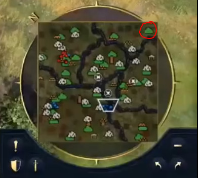
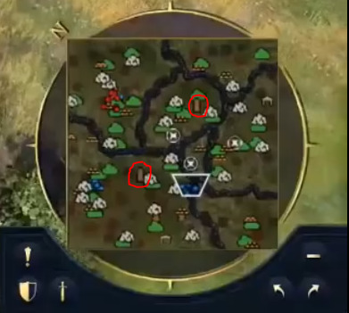
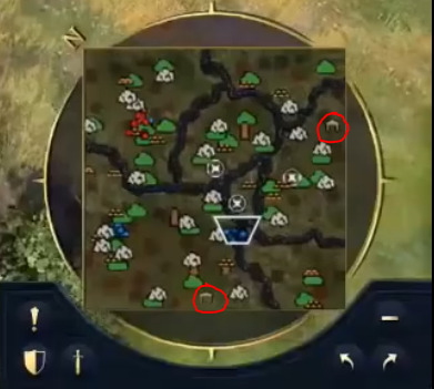
Bottom right hand corner you can see the minimap which is fully revealed (I don’t think this is the case in any of the videos posted through official channels), I think I have managed to derive a few things that are not be immediately obvious.
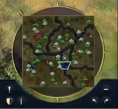
Resources:
-
Stone (Looks like a rock symbol)
-
Wood (Looks like 5 logs stacked, looks more rounded compared to the gold symbol)
-
Gold (Looks like 5 gold bars stacked, looks flatter compared to the wood symbol)
-
Berries (Green bush)
-
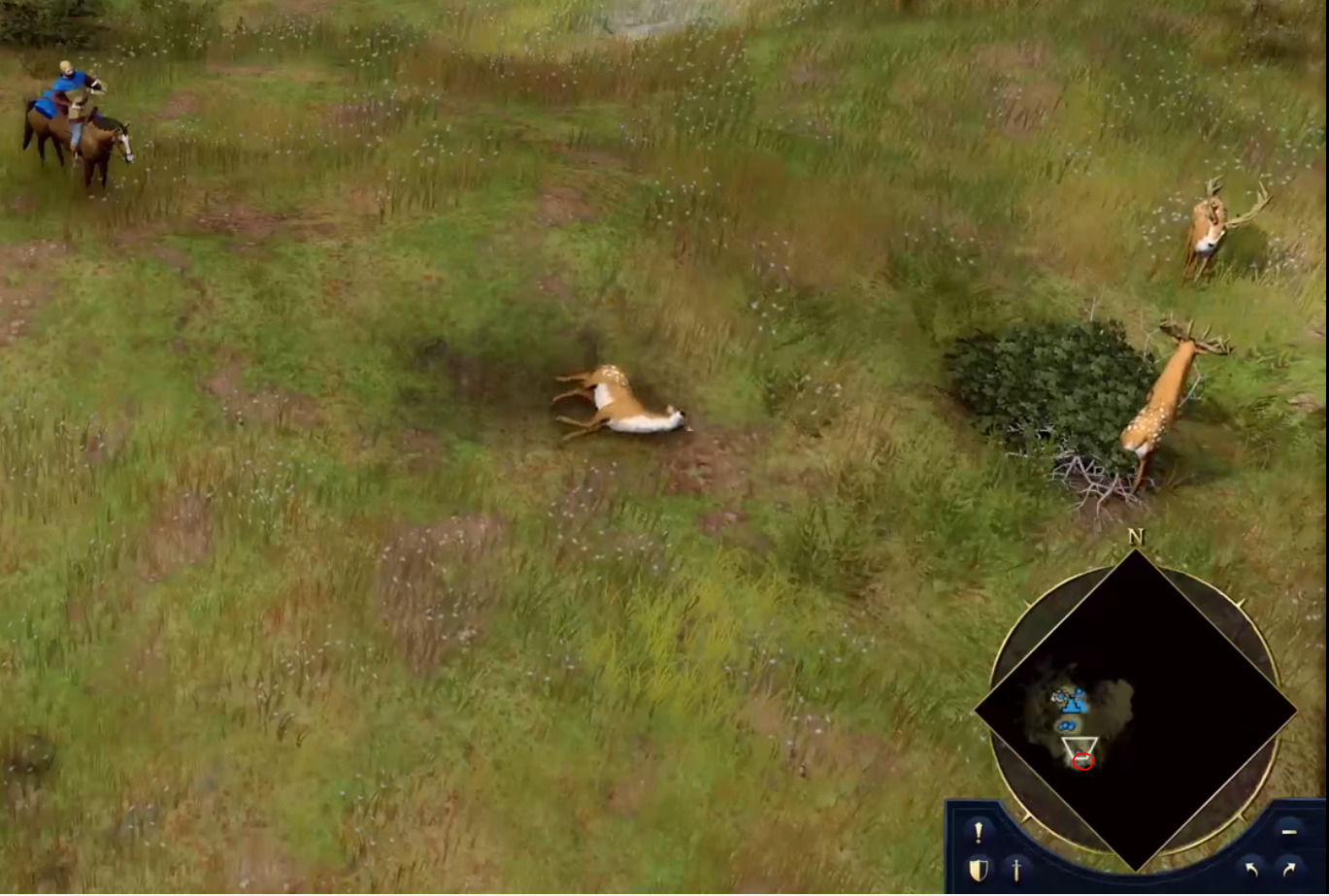
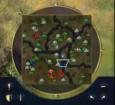
Game/Deer (Looks like a tanners symbol/ hunting location)
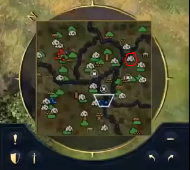
I think we can somewhat see this symbol again here, but due to the quality of the video I take the screenshot of it could be my eyes playing my games with me - but I think I can see this Game/ Deer symbol crossing over the border of the players vision window
-
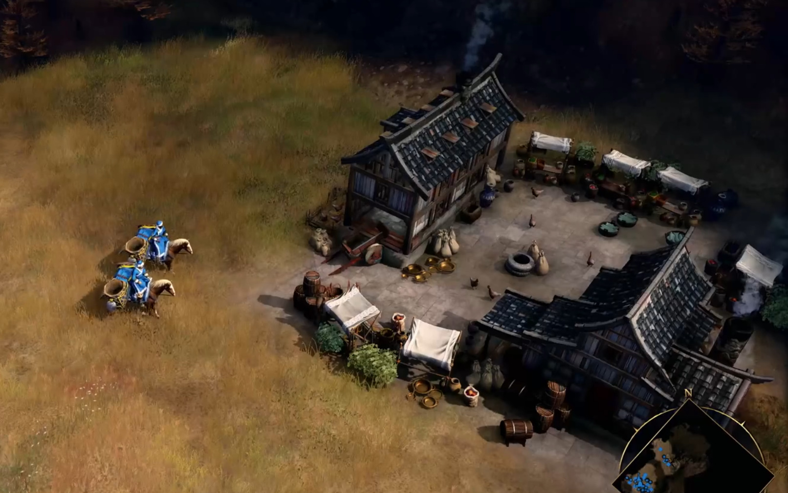
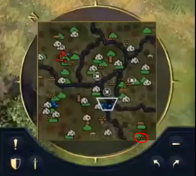
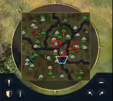
Neutral Markets/ Trade posts (?)
I think I have semi confirmed this theory with the following screenshot, note the market has no team colours:
-
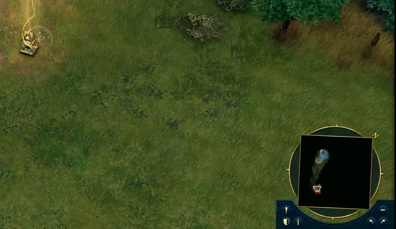
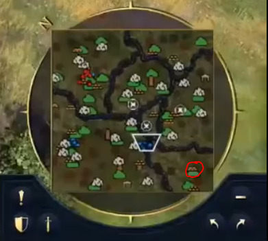
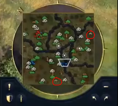
Relics
This is also confirmed with the following, you can’t really see it on the minimap unless you zoom in on the screenshot, but it looks like a similar relic symbol as per the screenshot above.
-
Obelisk(?) Sacred site(?) - I can only see two of these on the minimap which has led me to think these are possibly the sacred sites on the map with 1 within easy reach of each player OR this could be unique to a Civ that hasn’t been revealed yet?
What are your thoughts? I’m still in two minds about wood having specific areas where it can be chopped so I can’t but sure if I want this to be true…
13 Likes
The locations where wood is marked might just be thick forests that units cant pass through, or might be some kind of neutral lumber depot/camp
I doubt you would no longer be able to grab straggler trees
1 Like
The map readability is kind off bad, the colors should be one shade and I dont really understand why the resources are marked with pictures and not colors.
3 Likes
I somewhat agree with you, the contrast between colours isn’t terribly good but I do hope there will be functions similar to AOE2DE where you can change how the map looks depending on what information you want to see.
As for symbols and resources I think it makes sense for stone/ gold as they are singular nodes as a opposed to a patch of stone and gold, could have been a restriction of the times and it was easier to code a colour for resources back when AoE2 was developed as opposed to representing it with an image.
Singular Gold Node AoE34
Gold Patch AoE2DE
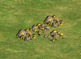
But I do agree having all the little images for resources makes the mini map look a little crowded and they seem to overlap too when they are close together.
2 Likes
The problem is that there are multiple resource icons with not simple shapes making the map very clouded, harder to read. The mini map should be a bit cartoonish as readability is priority. If you look at AoE III with also single gold its a nice simple and small circle icon, not making the map clouded.
4 Likes
Too many symbols, I fear…
AOM and AOE3 only have special icons for special units/buildings. AOE3 also marks treasures but they’re still a simple and small “X”.
I don’t know why they’re kind of giving each resource a special icon. Especially wood. Other resources could be concentrated on one point, but trees can be scattered almost everywhere. Or do trees only appear in the form of packs of forest? (like in Rise of Nations)?
Edit: it would be better if they can be toggled between unit/resource/combined views like in older AOEs. However the symbols are still too large and crowded.
Wooden symbols perhaps indicate forests where ambushes can be made
Pretty sure there are no wood symbols and that all those are gold symbols (five bars in a stack). The reason some of them appear flatter is due to recording/playback compression.
A few reasons:
-
forests are clearly marked by those dark patches; while the “five bars” symbols are always out in the open
-
the amount of “five bars” symbols relative to the amount of stone symbols match what you would expect from a gold/stone ratio in all other AoE games
-
having designated points for forests ( stealth forests or otherwise ) makes zero sense since the shape of each forest is strategically relevant.
-
take note of the finer details on the stone symbols, particularly the one straight south of player red, and notice that it too is flattened ( compared to the other stone symbols ) due to compression.
2 Likes
Even if its just gold symbol its too big compared to player stuff, it should be about the same size as one unit pixel. The wood is also too similarly coloured to the map to easily distinguish, and the water combined its just very dark and not easy to read. Also what would the green be?
Yea I am hoping this is the case with the gold symbols - the recording/ playback compression seems like the main reason as to why they looks different in a few cases - if everyone else is happy with that general consensus I will amend the OP so that forests are represented as “Darker Patches”
1 Like
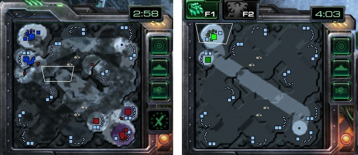
Very much in agreement here, there was a good article about the SC2 map and how too many textures can make the minimap quite hard to read and a user went ahead and showed how simplifying the map could great increase readability
On the left we have the mini map containing all the textures and on the right with textures removed
Same example but with Zerg Creep, left no texture, right with textures:
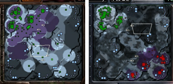
Source:
https://tl.net/forum/starcraft-2/516014-suggestion-minimap-with-no-textures
This is one area I think the AoE4 minimap could improve but I would like to see the minimap in its current form without the recording/ playback compression affecting the clarity.
3 Likes
Sure, however AoE’s resources are always thrown all over the place and aren’t neatly packed like in SC.
And forests work both as impassable terrain and resource, so you need those patches to show up on the minimap in another colour.
The problem with AoE4 minimap’s icons is that they have a black outline, so they don’t blend in.
Only buildings and units should have an outline around them.
Imagine going up against a player with green or white colours, and spotting all his/her units and buildings dotted around resources on the minimap MarZhill7801 has linked:
i think this could be like the special map layer that only allow to see resources on map . ( i hope so )
2 Likes
How about automatically changing the minimap on age up?
In the first Age there won’t be many units on the field and most of the map is still black so big resource icons are helpful but in later Ages more of the map gets revealed and more units and buildings are on the map so the resource icons can get smaller or even disappear.