I saw that, but then why would you say they’re favoring new content. The game only released 1 paid DLC in 3 years. And a very fairly priced one.
All games favor selling new contents.
Update to existing contents is one way of keeping the players. It does not generate additional profits. Its payoff is slow and long-term. It does not attract new players by itself. So they need to couple it with big events and advertising campaigns to attract new players and make sure such work pays off.
For games without microtransactions, it is even more difficult. That goes back to the previous topic.
I played all of AOE games since their launch. I’m not biased, this Is my point of view After player all games of the serie. There are many other people here that could Say the same.
U4 had some problema but U5 Will be the future for RTS. Many RTS developers are going to use It.
Stormgate have been developed with U5 but Frostgiant made a mess with it. There are a lot of criticism.
No, it’s not true. The main questions Is: how many contents or game modes are available for casual players? Beside campaigns and some skirmish at launch, AOE4 didn’t offer much to casual players.
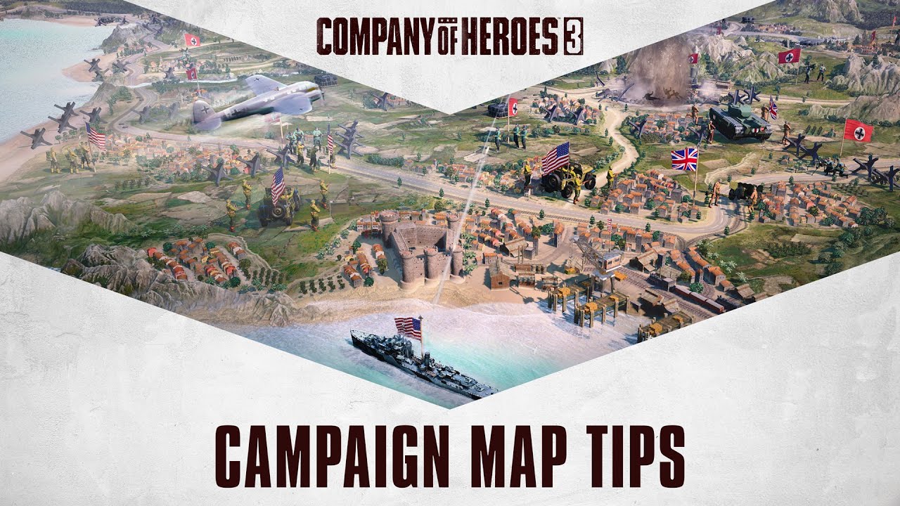
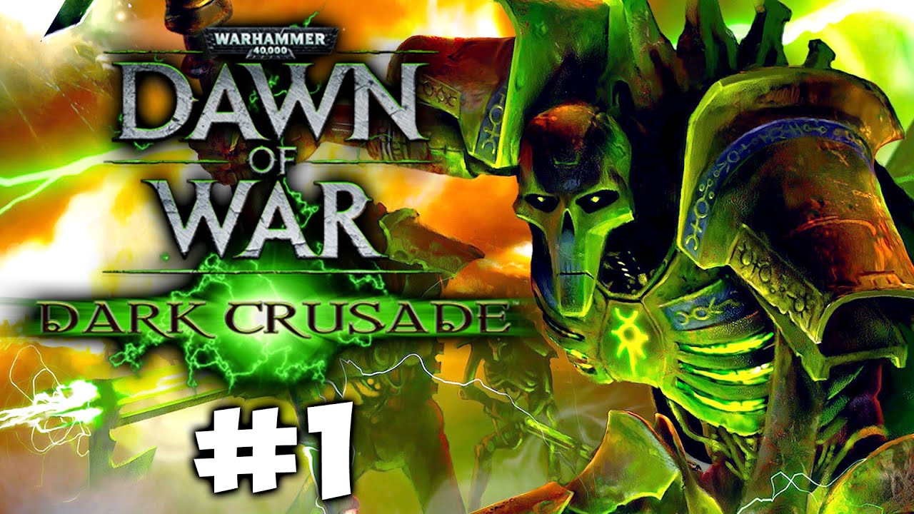
Developers should introduce new modality as “Dynamic Campaign” seen in Company of Heroes 3 or a "World conquest map similare to Battle for the middle earth or Warhammer Dark crusade
(From minute 4:50)
(From minute 1:30)
I can assure you that casual players Will play a lot with AOE4 because these gameplay mode offer a lot of replayability
Perhaps we could determine what is objective (measurable) about the graphics, what is subjective (more personal preference) and make a comparison between the games. If there is something you disagree on what is measurable or not let me know.
-
Objective: Resolution, Frame Rate, Textures, 3D Models, Lighting, Effects/Special Effects and smoothness of animations.
-
Subjective: Artistic Style, Color Palette, Design of the units/characters/maps/UI and Visual Coherence (although this one has some objective values too as the internal coherence within a civilization).
You could make a relevant evaluation and the comparison will be clearer.
P.S: Honestly, I think AoE4’s graphics engine has more potential (and it’s more modern) than AoE3 DE, it’s a matter of continuing to polish it further.
I don’t see the point unless one is suggesting what another game could do better and even in those cases it just devolves into a flame war and this forum has enough problems with unhelpful discourse.
All it really comes down to is preference. I don’t think either game blows the other out of the water in overall graphics as they both have strengths and weaknesses and again, many of them seem to be what people prefer visually. I find both games visually pleasing in different areas.
I didn’t care too much for AoEIVs art style initially but these days I don’t mind it at all nor would I say AoE3s is superior. Where AoE3 excels are the small things like how the bayonets glint and objects that add nothing more than eye candy like turtles and vultures. Elevation in AoEIV is much better than 3DE to me. But I get it, people are going to nitpick, and it can make for interesting discussions.
Both AoEIV and AoE3 players (also those who play both) agree on things that IV could improve upon like more gaia, improvements to siege, static horses, etc. As you said, 3DE isn’t going to improve visually at this stage. 3DE did add manned fishing boats in a pretty cool update.
I have to say though, while 3DE did update the graphics a bit I remain quite impressed people are going back and forth over a game (AoE3) that came out in 2005 vs 2021. I am just as amazed by the ragdoll physics now as I was in 2005.
AoE3DE didn’t come out in 2005. It came out 1 year before AoE4. It’s just built in an older engine.
It’s because efforts were made in the Development of aoe3 and aoe4 is a cheap budget game, fullstop.
Underwhelming graphics in general, static horse in buildings, no siege crew, extremely poor siege animations, extremely poor pathing/animations of units.
Did you notice how cavalry weightlessly glides around in fights and when they charge and strike it feels like they are weightless cardboard?
In aoe3 you can feel the heaviness of cavalry and that the strikes have impact, the body has weight.
And as you mentioned, the physics and ragdoll effects are just lightyears ahead of the pisspoor disappointment we got with aoe4.
I don’t even understand how gaming magazines did not destroy aoe4 on release…
Everything feels like it was made in a hurry with tiny budget by amateurs.
No siege crews is the best example.
But even more the missing physics/ragdoll effects, super poor pathing, massive response delay and weightless cardboard units give me eyecancer.
I wanna cry when I think about aoe4 being the game that we had waited for since 2005, 16 years!!!
How can a game be SO MUCH worse in almost every aspect compared to its 16 years (!!!) older predecessor?
Like wtf
Was it made by only amateurs?
Was the budget the one of a makeshift mobile game?
Did the managers f*** up big time in all their decisions and did not listen to the opinion of the Devs and community?
Who ###### ## so badly there?
Following the greatness of aoe3, aoe4 is a disappointment BEYOND imagination for me.
Aoe4 had one job, do everything aoe3 did and upgrade the graphics even further.
Learn from all the experience from aoe3.
But what happened?
A freaking MASSIVE step back in every single way.
Gameplay-wise, graphically, technically (response delay).
The micro in this game is also a mess and so is the countersystem.
I am talking about AoE3 which did come out in 2005. All 3DE did was update the graphics a little, the graphical foundation was already in place, hence 3DE being a remaster.
Gonna edit it so it is more clear.
Isn’t it a remaster? I know they also added new civs. I’d say that’s more than a remaster. Anyway that’s what people compare AoE4 to, not the 2005 game. Let’s not be disingenuous.
You don’t see it.
Suggesting how AOE4 itself can do better is legal (though sometimes it’s not).
BUT the moment you list some other game (especially the other game) as a positive example, or even just use it as a demonstration of how it could possibly be achieved, for one single aspect——warning, you are now the fan of that game who only comes to hate AOE4.
There are technical aspects measurable in some graphics as well as subjective aspects.
It is already comparing the games and I do not see anything bad, as long as it is with respect, I don’t care.
Although several times you comment in these threads in a radical way, we must not be unfair in all aspects.
The graphics engine is modern compared to other AOE, proof of this are the images that you have surely looked at CoH3.
The fluidity of the animation I would say that AoE4 is better (even the pathfinding) with respect to other AOE, another different thing are the battles or physics, where technically they can take a step further. The optimization of AoE4 is better than AoE3 DE. It is also something technical that is siege crews, something that goes along with a visual coherence (building proportions too).
Regarding the rest, it’s your frustration and there I’m not going to get involved, but always not getting to cross the lines, you know.
That’s because we find it ridiculous for someone to say AoE3 looks better, unless they’re a fan of that game. And in your case, most of your posts confirm you are.
Yes, AoE3 was incredibly ambitious, and devs at that time overall were much more ambitious and less focused on profit. But it’s obvious to anyone with a pair of eyes that even remastered it doesn’t look better. If you find it does, I have no issues with that and you can play what looks better to you, but I will call it out if you come to AoE4 forums claiming it does.
There is only one thing I agree looks better in that game, and that’s water. Objectively, it looks better. They went above and beyond making it look almost like the real thing.
Technically the models and textures are better in AoE 3 DE. Maybe you don’t see it better because of the color palette, terrain or other aspects?
I was saying AoE3 regarding its remaster, not AoE4 or maybe I misinterpreted it.
Looking at the images, there are things where AoE4 technically can improve (I put it above) and others where AoE4 can be better.
Regarding the art style, color palette, etc, I like AoE4 quite a bit.
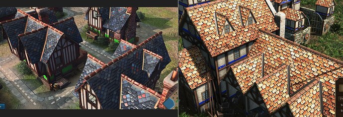
I went and made some screenshots in both games. Some of the unit models in AoE3DE do look very nicely detailed, Forgotten Empires did an amazing job there. I have a problem with the noisy textures. I don’t understand why they’d make the roof tiles have so much variation in color. That’s not how roof tiles look like, and it just adds unnecessary noise. Same for the terrain, I much prefer the cleaner look of AoE4. Foliage texture is straight up better in AoE4. Water texture is incredible in AoE3. World detail is straight up better in AoE3.
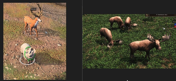
Left is AoE4.
Left is AoE4.
Left is AoE4.
Left is AoE4.
Right is AoE4.
Left is AoE4.
Left is AoE4.
Again this is a comparison with the remastered edition of AoE3, released 1 year before AoE4.
They’re also pictures and don’t take into account idle animations, where there isn’t even a comparison. AoM Retold also looks gorgeous in pictures, but when you play it you realize the importance of good animations.
Another thing I like about AoE4 is how the terrain doesn’t conflict with buildings/units. AoE3’s terrain is too noisy and the units get lost in it. AoE4 units and buildings pop out. There is a clear hierarchy between what’s front and center and what’s in the background.
And your “we” consider this as appropriate and fair way to dIsCuS?
Tells a lot about that “we” you consider yourself as a part of.
Oh, was it just me you were talking about? I didn’t realize. My apologies.
There is no doubt there are some things that they did right. But, there are a lot of wrongs too. Most biomes look the same due to overusing of the same assets, additionally half of them are a vague grassland which just doesn’t help (there is so much out in the world, why limit it to this?).
Fauna should be an obvious one too. The wolf and deer barely look the part, but more importantly, the game lacks animals in general. It feels very cheap, why skimp out on something like this?
The game featuring only three types of walls. Malian, Chinese and French–each given to western, eastern and southern nations. The funny thing here is that they’ve even made a wooden version for Rus, but didn’t include it likely for “visibility” reasons (same as weapons like Spears). I doubt the trained professional with 7 thousand hours has any issues recognizing these things even if they were changed. So in other words, theres a stubborn individual thinking they are the mozart of game design preventing this from being implemented.
The lack of special effects is a big one too. Relic is behind this, so you’d think they would put in some elbow grease as it should be an area they are great in. Yet, besides smoke, most arrows/gunpowder animations are rough looking. Cannonballs, arrows doing a very polygonal arc before suddenly dropping on enemies. The lack of physics. The lack of weathering on buildings. The lack of footsteps, or any interaction of army and environment. Feels like the bare minimum.
Lighting is a big one too. The engine is capable. The players are wanting. Yet, we’re doomed to live with this gray, overcast, depressing looking top down toronto lighting. This, mind you, should be one of the STRENGTHS of going 3D over its 2D predescessor. To use technology to enhance the experience.
Lastly, I’ll add that unit textures feel like they are 1 quality lower than they should be. I get tha# it is a top down angle RTS game, but it feels as though they never even wanted players to zoom in and just take in the aesthetics. They are clearly capable of adding more, as shown with most rider units (people riding horses/elephants/camels) having way higher texture than regular ground units, despite being the same size and all. They’ve simply chosen to not give us that option, and that just feels cheap.


![BFME2 1.09 HD - War of the Ring - Good vs. Evil [#1]](https://forums.ageofempires.com/uploads/default/original/3X/0/5/054faf63244beed8dbadfc817fb13977c3012217.jpeg)


