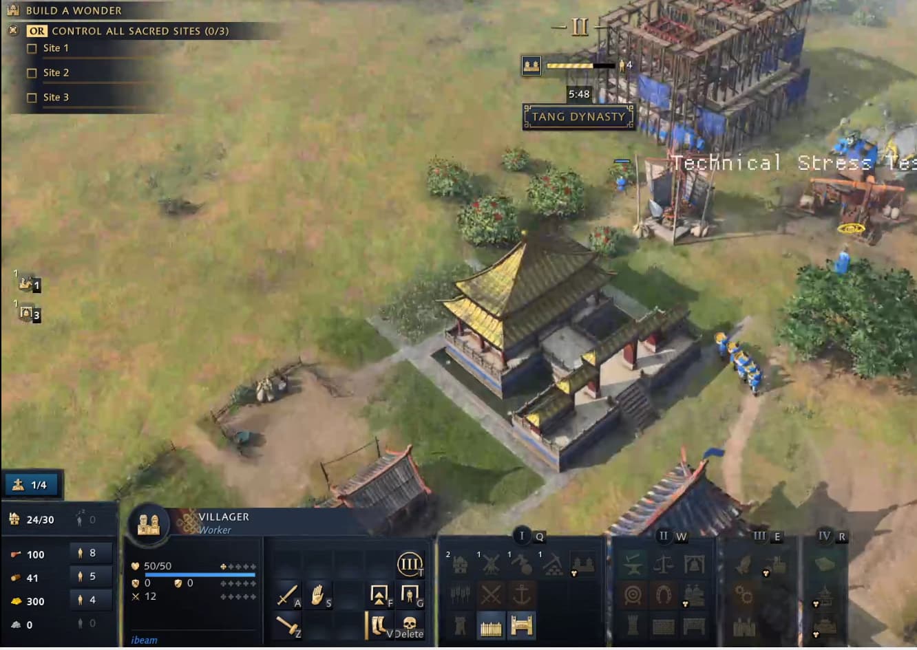
Dynasty menu in the center of the player’s screen that blocks inputs is an obvious one. The completely unnecessary excess information in the top left corner was just as annoying to me, tho. Serves 0 purpose and blocks a chunk of screen real estate. If you want to keep the 2 lines for wonder and sacred site, that’s fine, but WHY IS THERE 3 EXTRA LINES OF SCREEN-BLOCKING TEXT right below those?? There is legitimately 0 purpose in having each site listed individually, goal should be to have a clean, un-obstructed view of the gameplay unless the information is of vital importance, right? Maybe there’d even be room for a global queue on the screen if this text was removed.
Game was amazingly fun btw, low hanging fruit like this really needs to be cleaned up prior to launch tho, don’t want there to be easy excuses to bash a good game.