Hospitaller - art & models [criticism]

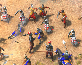
They’ve created a nicely made DLC, with lots of really good looking models. The sentinels, armored pistoleers and winged hussars among my favorites, but there is plenty of amazing content to explore.

But despite all that effort, the hospitaller knight got little love.

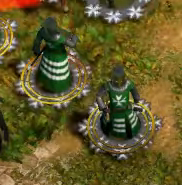
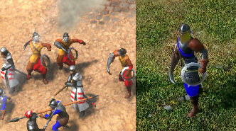
First of this is the non-upgraded hospitaller, which is fine as it is a throwback to the campaign and you’d expect it to look more upgraded later on. Like the sentinels in this very same screenshot.
non-upgraded

This is the “Guard upgrade”, I couldn’t find any good screens from this or the veteran upgrade. But as you can see it is a simple little color change and an added greathelmet. For the industrial era hospitaller, feels a bit lackluster and you’d expect more of a change.
Guard_hospitallers

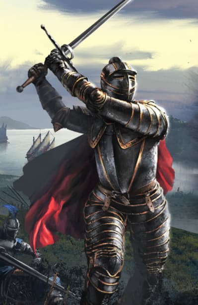
Now to the biggest offender in my eyes. The imperial upgrade, which at the very very least could have been the elite and imperial looking hospitaller knight.

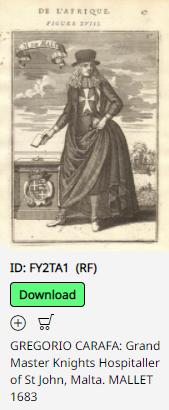
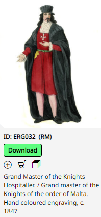
What you’d expect it to look like.

And… What we actually got…
Imperial_hospitaller

It has to be that the art isn’t finished for the hospitallers, I can’t find another reason for the lack of effort on them. Compare it to the sentinels, that look a lot more refined and has a clear defined upgraded silhouette.

Industrial era sentinels.

Even the “hoop thrower/fire thrower” has an upgraded appearance with more differences.

Non-upgraded vs imperial upgrade.
firethrower_compare

Lastly, I know this is a post focused on one unit and its details, but the hospitaller is supposed to be one of the unique units for a new civ. It feels lazy and as said, everything else is very well put together, but for one of the unique units of the new civ, they really didn’t give it any love. It could be that the art isn’t finished or implemented. But on the hospitallers it feels like they went with a lazy approach.

The rest of the DLC looks great! Best regards to you all!

7 Likes

I’ll admit the imperial upgrade with the hat looks a bit odd lol but the other designs I really like especially the unupgraded look, I’ll probably never see the imperial look much anyway as I just do 1v1.

The sentinels look amazing though.

2 Likes

I agree the unupgraded look is something that I like aswell! I’m mostly “complaining” about the guard and imperial looks!

At least for most of us we’ll barely ever see the imperial look, only treaty players will see it with any frequency I guess.

On another note the explorer customizations look great.

Grand master 1683
Grand master 1847

The designs seem based on a 17th century engraving of the Grand Master.

3 Likes

That looks like it should be an explorer skin, not a model for an imperial unit.

2 Likes

I fully agree that, altough maybe historical, I would prefer a black knight skin.

1 Like

Maybe if the hat wasn’t so big, it would look better?

1 Like

Totally! But even here, the rest of the attire/clothes are different! That is why it looks out of place.

It is probably more the mismatch of maille coif → 1200s surcoat and a later period hat combo!

1 Like

Yeah drop the hat and maybe just have a full helmet. Something like the Black Rider.

2 Likes

The guard and imperial, should atleast have some kind of plate on them, in my opinion or even fancier clothes. Something that doesn’t scream 1200s.

Even if historical accuracy wouldn’t be the argument. For the sake of progression, like have us get something that atleast looks like it gets better over the ages :smiley: !

Even the “poster” image of the expansion kinda fronts it as the hospitaller knight vs the papal guard. A symbol for the Maltese vs Italians, the two NEW civs!

1 Like