Hello,
There is a big issue in the game, 40% of the screen is useless. The content on the bottom of the screen is to much zoom in to be usable (a TC fill half of the width of the screen) and on the top of the screen it’s the opposite. Objects are to small to be see clearly and be easily select.
The three ways to patch that:
- 3D isometric (like AOE2) it’s mean an object have the same size if it’s on the bottom or the top of the screen. It’s the most efficient for players but not the most beautifull, it’s look to much to a 2D game.
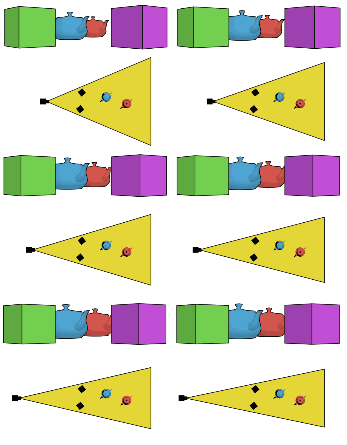
- Dolly zoom is use in movies, they use that for effects. The camera go backward and zoom in to compensate the fact that the camera go backward. Why it can help in AOE4? With this effect the percpective is modify. Object on bottom will be less zoom in and object on top will be less zoom out. This effect won’t effect the visual design of the game. (If the dolly zoom is infinite it’s 3D isometric)
- Change the angle of the camera, if the camera is more aerial the difference of the size of object on top and bottom will be smaller but it will be less beautifull and also destroy the work of designer.
For me the best is dolly zoom!
Dolly zoom: