I’ve always felt the UI of this game is a bit underwhelming, i mean, if you think about other games, as soon as you launch them you feel immersed in that world. When i launch aoe4 or play a match, i just don’t feel i’m in the middle ages.
I mean compare this to other stuff

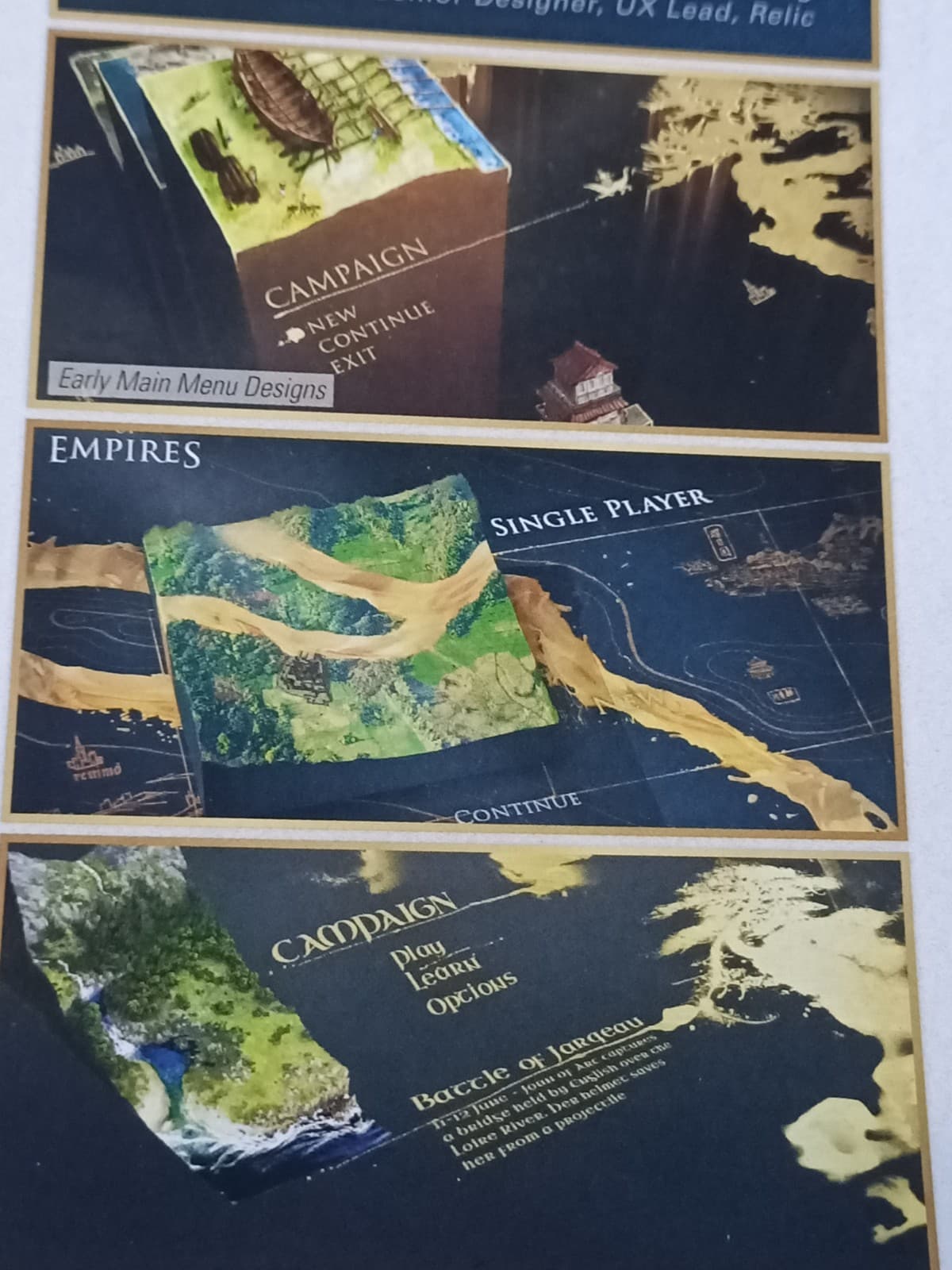
This is from aoe 2

Starcraft 2 ranked screen

Warcraft 3 ranked screen

Warhammer 2 total war launch & campaign screen


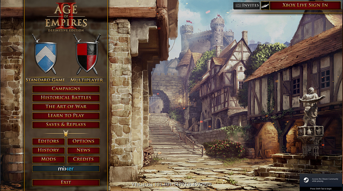
For medieval stuff, this is Thrones of Britannia, look at those unit icons that remind medieval miniatures


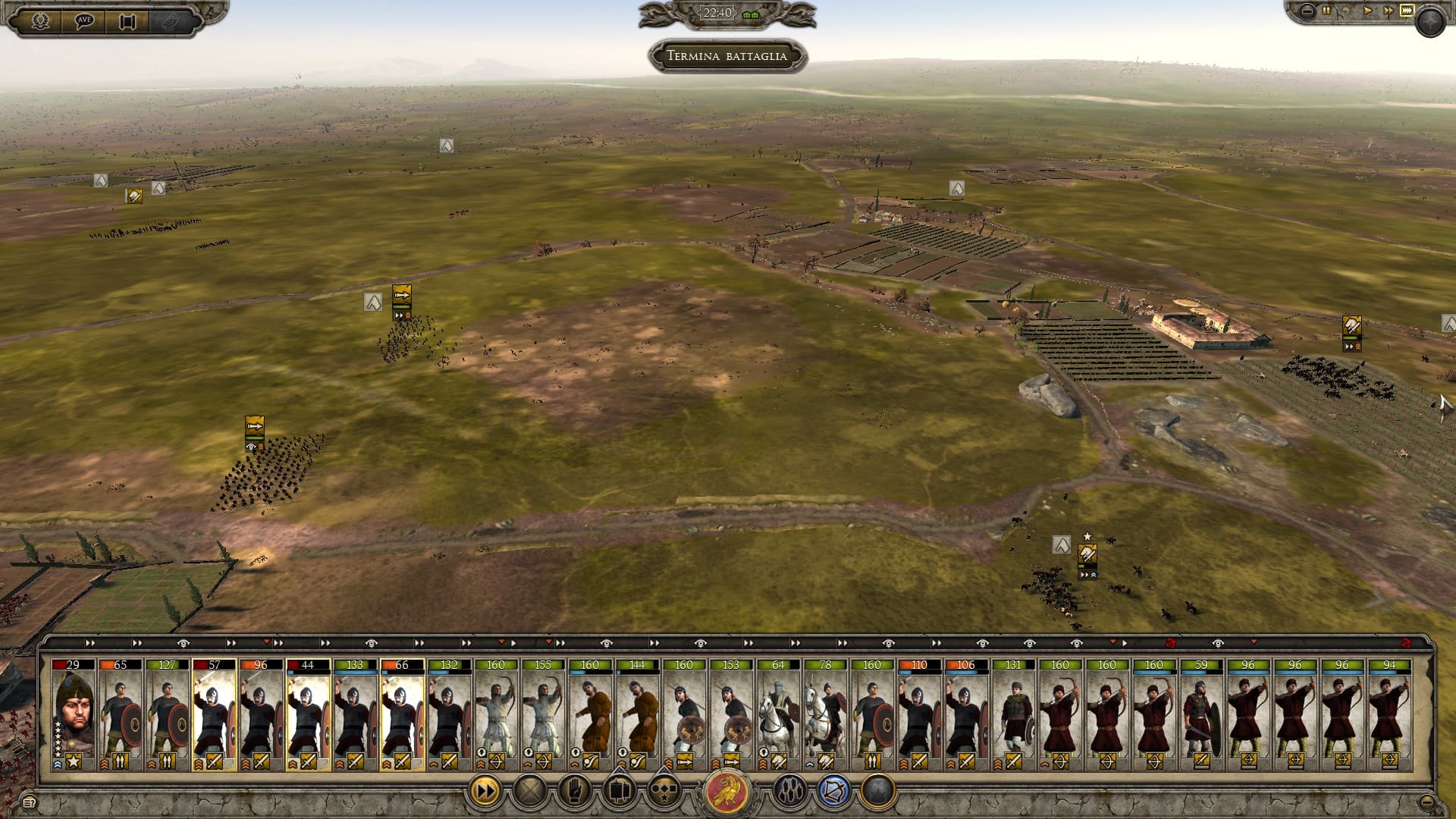
Other cool unit icons from Attila total war, and its launch screen


I do really hope this game will someday have graphic and art syle improvements for its screens, unit icons and UI. It just doesn’t feel immersive, and that whole “blue and gold” concept, I don’t know, do you guys like it?
I’d like to hear your opinion on this topic