Could the UI be improved? Currently it looks half done. Half of the game is in a oldskool theme, the other half is in a much more modern theme. It looks very weird to see these two theme. Can’t the just decides which theme is the best and redo the full UI in that theme?
2 Likes
The best solution is to bring back the old main menu, or make it as a option ( beside than unofficial mods what are the only solution right now)
1 Like
Do you mean from when DE was first released? I much prefer the current one, but I think it would be fine as an option.
Yes when was released the de, te current looks like a mobile game, with all this big pictures.
If someone is interested:
1 Like
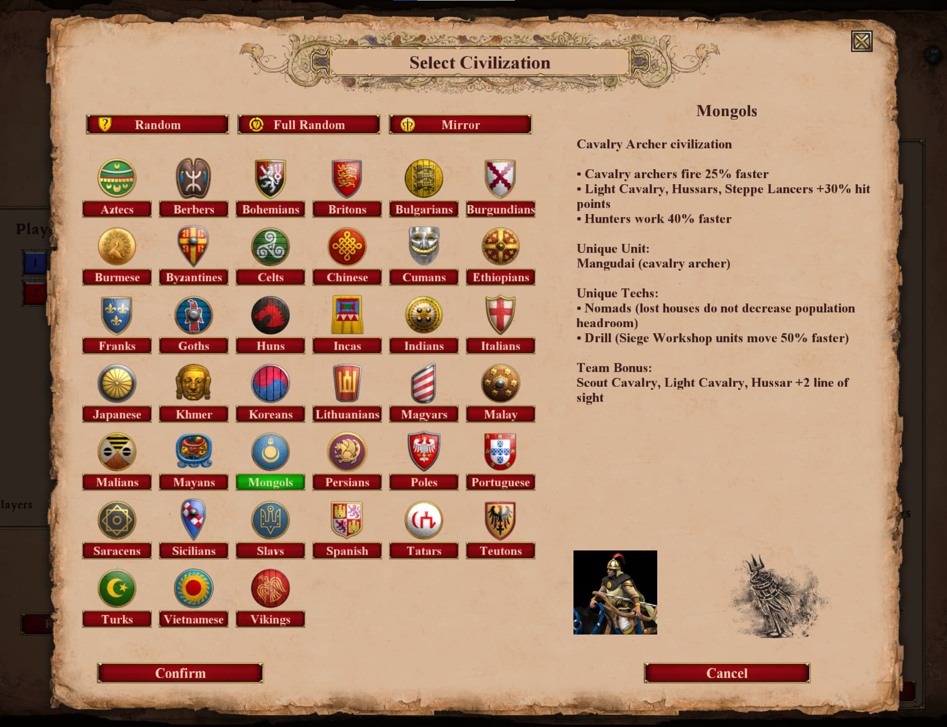
It looks like the game is first designed in the following style:

I did call this the oldskool style. This style is pretty much fitting by the theme of the game itself.
Then it looks like that designer left the game and another designer starts designing the game without any knowledge of the current style. He gave its own look and feel to the design, which is much more modern. Screens like quick play and select civ are designed in this new style:
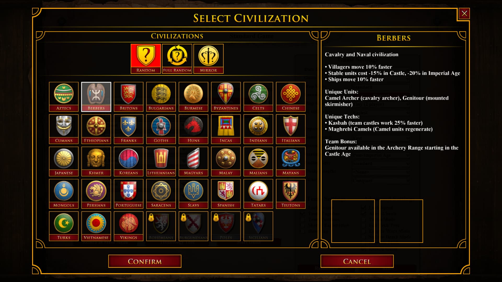
So we have two different kind of styles, instead of just one. That makes the UI uglyl to me. Who thought it was a good idea to have to completely different styles as UI in the same game? A good designed UI has just one style for the full game.
I wont advocate for one of the two, it is up to the devs to make that decision. For me it is fine if the go back to the oldskool UI and use that for every screen. It is also fine if they decide to use the modern look and feel for everything. As long as they just use only one style for the full game.
I just ask the devs to make up their mind and pick one of the two styles and design the full UI according that style.
2 Likes
The current UI is terrible. There was a big thread about this in the past. It was even pinned. But the devs didn’t do anything about all the complaints.
3 Likes
The original civ selection was a dropdown list in what you refer as oldskool style.
The recent civ selection panel is done by a different GUI artist, but it was needed and fulfills it’s purpose.
It doesn’t break the game.
I don’t even think that the recent GUI is terrible either.
Still prefer the GUI on release tho.
I am not talking about the GUI UX only.
I prefer to flame about the ridiculous crashes and the broken tg ladder.
2 Likes
My main issue is that both screens have a different style. I understand why the remake the civ selection screen, but why not stick to the style of most of the game?
Both screens are just examples of both styles. If you really want to compare the styles: Look at the Ranked MM and Quick play MM. Both almost function identically, but the looks are completely different. Currently you can easily switch between ranked and the lobby and the other tabs, but Quick play is missing, since that page has a completely different style. It is no unified experience at all.
It is not about such difference, but about the style of the UI. One is like written on old papers, the other has the looks of a mobile game to me. Just pick one of these styles and use it everywhere. That is my main point.
1 Like
Why not have both and let people choose in options? That seems like the best of both worlds.
1 Like
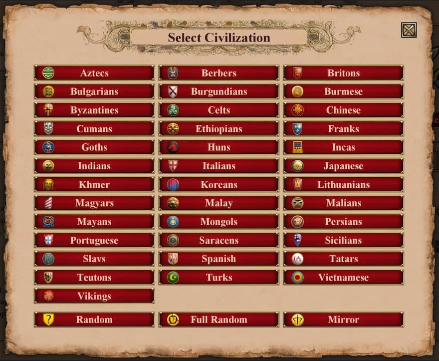
I started working on a mod some time ago to make the civ selection screen look like the oldschool design. It’s not quite finished and there are still some things missing (like the brown background boxes) but I’m pretty satisfied wih how it looks so far. If I find the time, I will finish and release it.
In my opinion, the whole UI should be redesigned to look like the oldschool design.
By brown background boxes I mean this:
6 Likes
It’s interesting, but I feel like there isn’t enough differentiation between the different civ icons. I prefer the current design right now, with the black background, and the civ icons in a box if I’m being honest. Unless you plan on doing that behind the civs, then it’s fine.
Nice. I made a simpler version last year: Classic Civ Picker
3 Likes
I much rather have 1 good UI then 2 meh UIs.
1 Like
No. Two good UIs. The current one, and an old-school version, and players can pick between them in settings. Then we have two good UIs and you each pick the one you like most.
1 Like
Is what I’m using right now, in combination with th classic history section. Thanks.
1 Like
Looks good, way better than the current version of the default civ selection.
Does anyone know if there is a mod that removes or moves from the center of the screen the Pause Game pop up?
Also, any mod that shows more stats of the selected unit? Not only attack and armor but speed, RoF and attack bonuses, etc
Thanks
I wish this was an in-game option. Being able to turn of Advanced Unit stats, and then the tech tree shows all the stats of the unit, and when you hover over the unit stats, it shows you the full breakdown of them.
1 Like
That’s what I want
Do you know any mod that shows these stats in-game?
Currently the devs arent able to make 1 one good UI. The dev have started to make the new modern UI, but never finished to update the UI. So the current UI is a mesh between a new modern UI and a oldskool UI. The devs should make one good UI first before they could try to add a second UI.