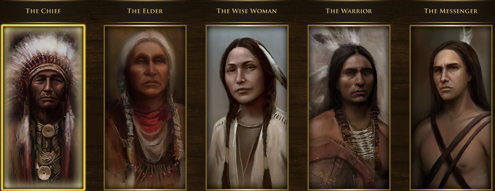
I figured out why these new Inca portraits, implemented in the Definitive Edition, fail to meet the standard set by the other civs in the group:
Color: The Inca portraits are too colorful, especially the backgrounds. The others have a more muted and stoic color scheme.
Detail: The Inca portraits seem to have been done with very broad strokes. The others look much more detailed; despite the fading effect they have.
Pose: The portraits for the others have neutral and sober poses and expressions. The ones in the Inca portraits are much more dynamic and expressive, some also showing their arms, which doesn’t match the others.
Depth: The original portraits have a sense of depth because of the fading effect. On the other hand, the Inca portraits feel almost flat by comparison.
Quality: The facial features and body proportions in the Inca portraits look more cartoonish than the others by far.
Scope: The Inca portraits are far too zoomed out, including some unnecessary items in frame (such as the Elder’s oversized golden qiru), but giving much less room for overall detail.
After seeing the beautiful portraits for the Alliances the African civs have available to them, I believe that the developers have capability to bring the Inca portraits up to standard. We’ve already seen unit portraits being reworked in recent updates, and I believe larger portraits shouldn’t be out of the question.
Not bad art by any means imo. Just in a different style than the lakota. Compared to the aztec it doesn’t look too out of place apart from the color of the backgrounds but that’s a tad nitpicky and the colors allow for them to all look more visually distinct. All in all, I’d rather not make anyone redo any work this time-consuming unless something is seriously wrong.
Making them all similar-looking would result in some people saying they blend together (which they would) and there would be no distinction between them and that would be a disservice to their cultures, they would look boring etc.
You know Warchiefs came out in 2006, Ensemble Studios was closed down in 2009?
Incas were introduced in 2020 in DE, completely different people (and that includes artists) worked on that version.
With enough of money everything can be made better. At worst- they are good enough. These are not real-life portraits, but hypothetical figures and representations of ideas and ways to govern, just a small flavor touch. Coloured backgrounds alone make them easier to quickly distinguish.
While I agree that nothing is seriously wrong, I think there are other ways portraits can be made distinct apart from using highly contrasting background colors. All of the native civilizations in the game have very distinct cultures, so making them look distinguishable from each other and among themselves will never be an issue, provided adequate research has been done.
My points are pretty much nitpicks, but something felt off when I first saw the art use for the Incas. It gives a different atmosphere to them compared to the other native civs. It feels further apart from the stoic portrayal of the rest and fit more into comic-style. There’s nothing fundamentally wrong with it, but it makes it feel like the odd one out of the 4.
There are ways to make characters distinct while resembling the artstyle of the original TWC portraits, here’s one I found: https://www.artstation.com/frankabarcaorbegoso/albums/all
Regardless of the individual artist’s style, using the artwork of the legacy game as a guideline should be always be considered when making new art for the game. For a Definitive Edition, things like these prevent the game from looking like a patchwork of content piled on top of one another haphazardly.
The pompom placed over the Messenger’s head, Chaski’s, was actually white, not gold, nor was it a golden crescent, similar to a tumi, but it was a
white pompom made of camelid wool, and in the shape of an umbrella. This symbol that was hanging in front of the band that was on the forehead, was the symbol of the Chaskis. I don’t remember if, during the game, the chaski also has this white headdress. The headdress of the Inca explorer is also wrong, although it is this wrong headdress worn by the actor dressed as an Inca emperor during the Inti Raymi. The headdress of the Inca emperor was the Mascaipaicha, or mascaypacha. It looked like this: in front of it there was a square woven of vicuña wool woven in red, in the shape of squares, with some gold threads interwoven into the vicuña wool. from the underside of this woven square, there were small golden tubes, which underneath released threads, forming a red fringe on the forehead, the greatest symbol of authority of the Incas was this red fringe on the forehead. From the top of the square rose a reed, I don’t know what it was, maybe gold, and on top of it, a pompom similar to that of the chaskis, which looked like a vicuña’s wool umbrella, but red. On top of this pompom would be two small black and white caracara feathers. The woven square was attached to the llautu, a headdress made of strips of fabric woven together and wrapped around the forehead, like a sash, or turban that would leave the top of the head bare. The llautu featured designs, patterns and could be of many colors. There is a picture in which there are motifs in lozenges on the Inca’s Toque, it was a picture of the marriage of an Inca noblewoman with a Spanish nobleman. Garcilaso Inca de la Vega and some other chronicler told that in everyday life the emperors wore black robes, because black meant perfection. This comes from an observation that white llamas have black paws or snouts, but black llamas are completely black, thus looking more “perfect”. That’s why there was a festival where only black llamas could be sacrificed to the sun. But on feast days, or in wars, the impsetter wore colorful clothes, similar to those in the game, with symbols usually smaller. Apart from the headdress, the Inca’s mascaypacha, the explorer’s appearance as an Inca noble is correct. The nobles even dressed very similarly to the emperor, not only wearing red mascaypacha, but in other colors, not even a few symbols, which only the emperor could use.
I love the warrior with the Kunkakuchuna halberd. In fact, this halberd is only present in the explorer. It would be really cool if there was a way to produce a special unit of Inca halberdiers. Perhaps it would replace the Chimu maceman, as a slightly faster heavy noble warrior. It could be the towncenter’s protective militia instead of the feathered spearmen. Out of nowhere a group of Inca nobles running in their light cotton armor and intertwined reed helmets, with golden suns and silver moons on their chests, perhaps even pure bronze, would come out with their bronze halberds from the towncenter, to make a fine defense. It’s cooler than allowing the most unique, interesting and versatile Inca polearm to be represented only in the explorer.