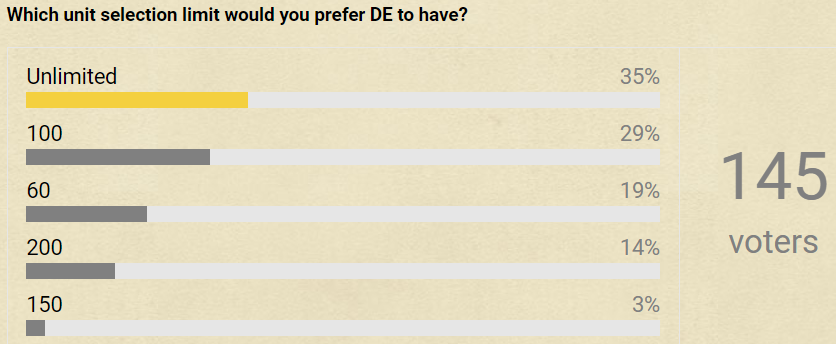
Idea of increasing unit selection limit has been very popular among players throughout the years. It would make it much easier to manage large armies. Recently it received positive reception in Reddit and in beta forums:
Developer Neros tested selection limit of 200 during beta and found, that it caused no noticeable performance impact, so there are no reasons to worry about performance.
Main problem is how to fit very many selected unit thumbnails into UI. Might solve it how Starcraft 2 has done it - with tabs. Here player has selected unit thumbnails grouped into 3 tabs, between which he can switch.
Easiest way to switch between tabs would be by making them scrollable by mouse wheel when cursor is hovering in section of selected unit thumbnails.
So when player has 130 units selected, then he would have 3 tabs - 60, 60 and 10 units. He could quickly switch from first tab to third tab by placing mouse cursor in section of selected unit thumbnails and scrolling mouse wheel down by 2 ticks.
It would be helpful if selected unit thumbnails would be sorted according to formation order (intuitive). Currently they are sorted by type, but those types are sorted randomly (unintuitive). If those types would be sorted by formation order, then it would help to easily identify for example when being in second tab, whether crossbowmen, monks, heroes, etc can be found from first or third tab. So there would be less need to search for units from tabs.
Please give feedback on how you like this solution and any other ideas how to fit selected unit thumbnails into UI
No noticeable performance impact on their available setups, let’s state that. From the launche, a fair amount of issues weren’t detected by the teams due to them not having tests with weakest hardware.
I like this idea a lot, anyway. Specially if we take in consideration how bad double clicking units works on packs of units larger than 60.
On the UI side, another solution would be using icons simmilar to the control group icons, with the unit avatar accompained with the number of units in the group.
Or even quite simmilar to how it already is with showing selected units on the UI, but when past 60 units select instead of showing a portrait for each, a colored outline frames the unit icon with the unit amount. When clicked, the portrait expands to every unit on the pack with a scroll bar.
they should totally increase the limit… make it like 100. if its unlimited it will surely cause lag issues on pc’s where people are running at the very limit (remember you can have 500 pop games)
Or that hotkey for selecting all military units doesn’t select all military units if there are more than 60
If collapsed icons will be used, then these definitely need to be uncollapseable, so that player can select/unselect individual units and find units with low amount of health. Although I don’t think, that collapsed icons would be a good idea, because it would in any case make it much harder to quickly browse through individual units to find those with low amount of health, etc.
For example if player has selected knights, crossbowmen, monks, rams and villagers, then he would have 5 collapsed icons and he would have to open each one in order to find wounded units from each. And if he does something else in meantime and then selects those units again, then he would again need to open all 5 collapsed icons. This would be really uncomfortable. In campaigns player will often be given units of many different types and he could have even 10 collapsed icons.
In my solution player could very quickly browse through selected unit tabs by moving mouse into section of selected unit thumbnails and scrolling mouse wheel up and down. This way player could quickly have overview over all his selected units. Scrolling mouse wheel seems much more comfortable and faster thing to do, than clicking on each collapsed unit icon.
Amount of unit thumbnails in each tab could be customizable in options. If player chooses to have less thumbnails in each tab (for example 40), then could display thumbnails in bigger size. Their current size is okay for me, but yes, smaller size might be preferred by some people.
It is impossible for us to predict what effect larger unit selection limit would have on performance. It is up to the developers to test this and find suitable compromise
Do formations work fine at those amounts anymore though? Formations and pathfinding together? I mean, I’d like it in a sense, but can it really work is something that needs to be properly considered. There’s probably a reason why such a QoL change was not added into the game. (I was not in the Beta, so I don’t know if there were discussions about it)
Also I agree that the UI portraits are too small even at max UI scale.
Hmm, AFAIK only issue is fitting more than 60 thumbnails of selected units into UI. There were discussions about increasing unit selection limit in beta forums and people were generally very positive about it. Pathfinding has been improved a lot from HD, so I see no reason why we should not be given possibility to maneuver large army in one group
I would like if developers would prioritize implementing QOL features more. This and many other QOL features would positively affect both singleplayers and multiplayers - something good for the whole community.
Another aspects of AOE2 not allowing more units to be controlled at the same time is to slow down flooding. SC1 was hard mostly because of its 12 unit selection limit, making units like zergling very hard to navigate around, and the impact in mid-to-late game is going to be limited. SC2 removes that limit, and players can just build a large army as soon as possible and f2-a to win in low league (platinum and below). I can imagine in TG or FFA where people controls 100 paladin at once and swing them to kill other players or destroy bases etc. With that being said, I definitely welcome dev to remove unit selection limits.
This is basically how unit selection is done in Age of Mythology and in Aoe3. The problem here is that in Aoe2 it’s common to Ctrl+Click individual units to deselect them from the UI, to remove low HP units, to deselect Monks when trying to convert using a group, etc. It’s also useful to get “at a glance” knowledge of how much HP an army has (e.g. to view how much HP Scouts have lost after being poked by a couple of Spearmen or how much HP Crossbowmen have lost after tanking a Mangonel shot). This information is still useful to see for large groups of units.
Perhaps this would work only for army groups of larger than 60 units (which are pretty rare outside of campaigns or high-population AI games), but I’m not sold on it yet as a solution. When I play Aoe3 I find that I end up missing the ability to select/deselect individual units manually by their portraits. It could also be fairly awkward to have a large army selected in the UI, then have the UI suddenly condense to this form when adding one more unit to the selection.