Basically the title, the icon for each progressive armory upgrade doesn’t even change. They just put the word “Elite” or “Hardened” in front of each unit to call them upgraded. It’s really, really boring.
It’s not only that. The whole game is a snoozefest.
This is the priced paid for going back to an old and tired Medieval era setting. The four civilizations they had in the technical stress test were so low energy I uninstalled it after two matches.
i think you are refering to : The UI
Yeah upgrading units is boring. It just feels like they don’t change at all. They barely even look different
i dont agree .
HRE is basically : english but improved
English : is the main civ
Chinease is the asymetric one , it haves the landmark system
Abbasid dynasty is so fun to play and have the house of wisdom
I cant talk about others civs but i do agree that HRE is really similar to the english one.
And also , we did knew that this game was going to be about medieval since 2 years ago , so why complain now?
I agree but I blame the civ design not the era. The era is fascinating. But not by giving every civ the same units and slapping a couple unique units on and calling it asymmetry. Hard pass.
Yeah I cant say Im particularly impressed by civ and unit design either. And how units and upgrades are portrayed in the UI is definitely not impressive either.
The game has potential, but the absence of details in so many aspects is enormous.
I don’t think this is the cause of the problem.
In the UI and also in game, weapons look bery low detailed and like plastic, as instance men at arms from HRE…
Feedback on this was provided years ago when they first showed gameplay, yet things remained the same. So imagine how worthless feedback provided now so close to launch is.
Basically the title, the icon for each progressive armory upgrade doesn’t even change. They just put the word “Elite” or “Hardened” in front of each unit to call them upgraded. It’s really, really boring.
It has been that way for every games after AoE 2 and there is nothing wrong with it.
It would be much cooler to have something like in AoE3 where the British musketeer advanced into the Redcoat or something like that. The upgrades to hardened and elite just seem robotic. I had a blast with the game, but some things like this are clearly lacking. I just really hope they do more to improve on the game. I preordered and I will play over a couple hundred hours nevertheless, but I just really hope it becomes something that can be as good as AoE2 or 3.
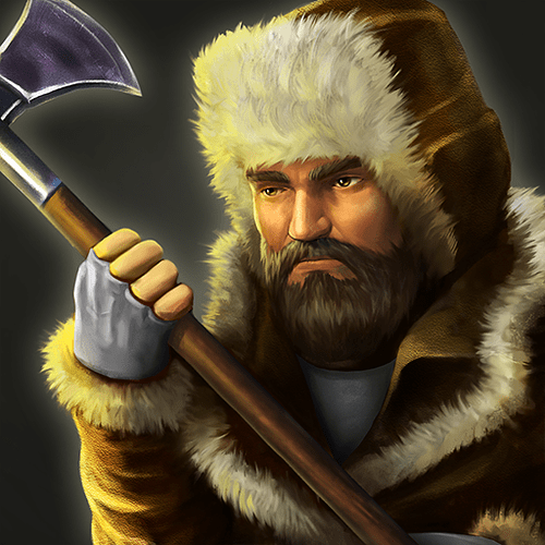
Another thing that would aid this specific subject is the devs adding unit portraits to the UI. The UI is lacking, and the portraits would give both personality and improvement to its style. Like, when I look at a strelet in AoE3 this is what I see:
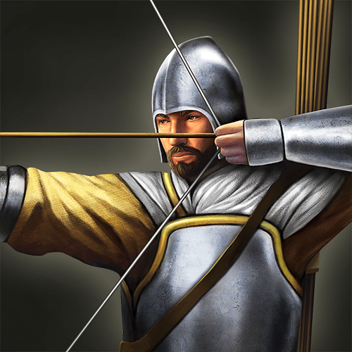
And this AoE2 Longbowman:
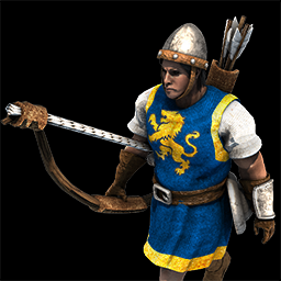
3DE Longbowman
Even mediocre portraits would be better than no portraits at all. They could even make them using that filter with gold outlines. Anything really that would add personality to the game. For me they are as important as sounds of units and they became engraved in my mind the same way.
![]()
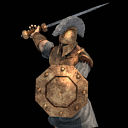

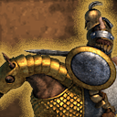
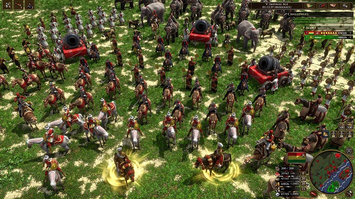
Units in game, especially early on when they aren’t covered in advanced armor, are just big blobs of (boring, and it doesn’t look like there will be color customization) player color. I believe the percentage of unit texture that is dedicated to player color is larger than in previous games.
It’s like a person designing them was afraid that, for some reason, battles will be unclear to read for observers or newcomers and overreacted. I never heard any complaints that it’s hard to distinguish unit allegiance in AoE II or III. Units there have often a large portion of their body dedicated to showing player color, but somehow it feels like it was handled better.
As I’ve said it gets better with upgrades but overall they are still much more simplistic than I’d like to see.
Overall personality and atmosphere took a massive hit in IV.
No unique GUI for civs.
No taunts.
No cheat codes at least on launch (and so no unique, fun, hidden units).
We haven’t seen anything that would suggest there will be player profile customizability - banners and flags, avatars, color customization, some backplates or medals etc.
Researchable technologies with basic and boring icons, no interesing flavor text etc.
Very light approach to dedication to history and overall weirdly mild tone that is neither here or there. I know we haven’t seen any campaigns, but hardly anything I’ve seen is exciting, epic or amazing for anyone willing to call himself a ‘history buff’.
If I have to be brutally honest - William Wallace tutorial from Age of Kings was much more interesting and atmospheric than tutorial in IV. Not only they had pretty much the same general design of what is meant to be taught, but on top of that interesting historical background, great voice acting, timeless animations and drawings that still hold up.
Age of Empires 2 HD William Wallace Campaign Cutscenes (English Ver.) - YouTube
It’s like they are afraid to have any real-world references. Tough sell in a game that is meant to be grounded in history.
What do you mean “after AOE-2 everything has been like this”?
Just refreshed YT and saw a short upload from SamRev about the impressiveness of the combat, here- comparison of the impact of heavy bombard cannons. The feeling of boredom and letdown comes primarily from the gameplay, not small graphical elements or even raw stat numbers. And well…
AoE 2005 vs 2021 Bombards - YouTube
It means every games after AoE 2, upgrading only change the units prefix (veteran/guard/imperial) instead of changing completely to a different weapon type
Well, in AOE-3 many units evolve visually and in practice.
Many of them change their appearance as they get better. Some units in the imperial era change their name as well. For example, the musketeers change to red hunters.
The Musketeers start without a bayonet and you must make the upgrade in the arsenal.
Some with cards or upgrades acquire new abilities. (Janizaros can build military buildings).
Although they remain essentially the same units as they were originally, they change a lot over time.
Also, if it were made like previous games, it would be as if the crossbowman, when improved in the age of the fortresses, became a skirmisher, and the pikeman became a musketeer. Instead of doing that, they give us the 2 obtions at the same time.
AoE 4 also has visual changed when upgrading units, most notable imo is the Knight. AoE 4 certainly isn’t lacking in visual differentiation.
The age of empires 2 upgrades have really nice visuals and kick to it, each upgraded unit looks nicely armored and and stronger ready to do more damage.
In AOM when you perform armor or weapon that’s also reflected in game…
