We are currently aware that some text in the game may be difficult to read due to size or font style. We are continuing to review this. Please post examples to this thread including the following information:
Build number
Platform (Steam or Microsoft Store)
Do you have any options enabled which may impact the text? (Such as UI font size slider, or a colorblind mode)
Location of text (Is it in a game menu, lobby, etc? Is it in a campaign, if so, which mission and what triggers the text?)
A screenshot of the text highlighting the readability issue
Description of what aspect of the text is difficult to read (Too small, blurry, etc)
Maybe the bottom-right corner of the screen would be a better place for that information. On the one hand, the background is darker there, on the other hand, usually this technical piece of information shouldn’t really be important, so it should not be in a central location in my opinion (and could use a smaller font).
Rendering of the serif font is all sorts of messed up, particularly for italics. Some letters appear to sit above the baseline (see the i in will) and some letters seem to be more “italic” than others (see the m in Lumber Camp).
Overall the font just looks really ugly, but I’m unsure what part of that is rendering issues and what part of that is an intentional choice.
Version 101.101.32708.0 0 from the Microsoft Store
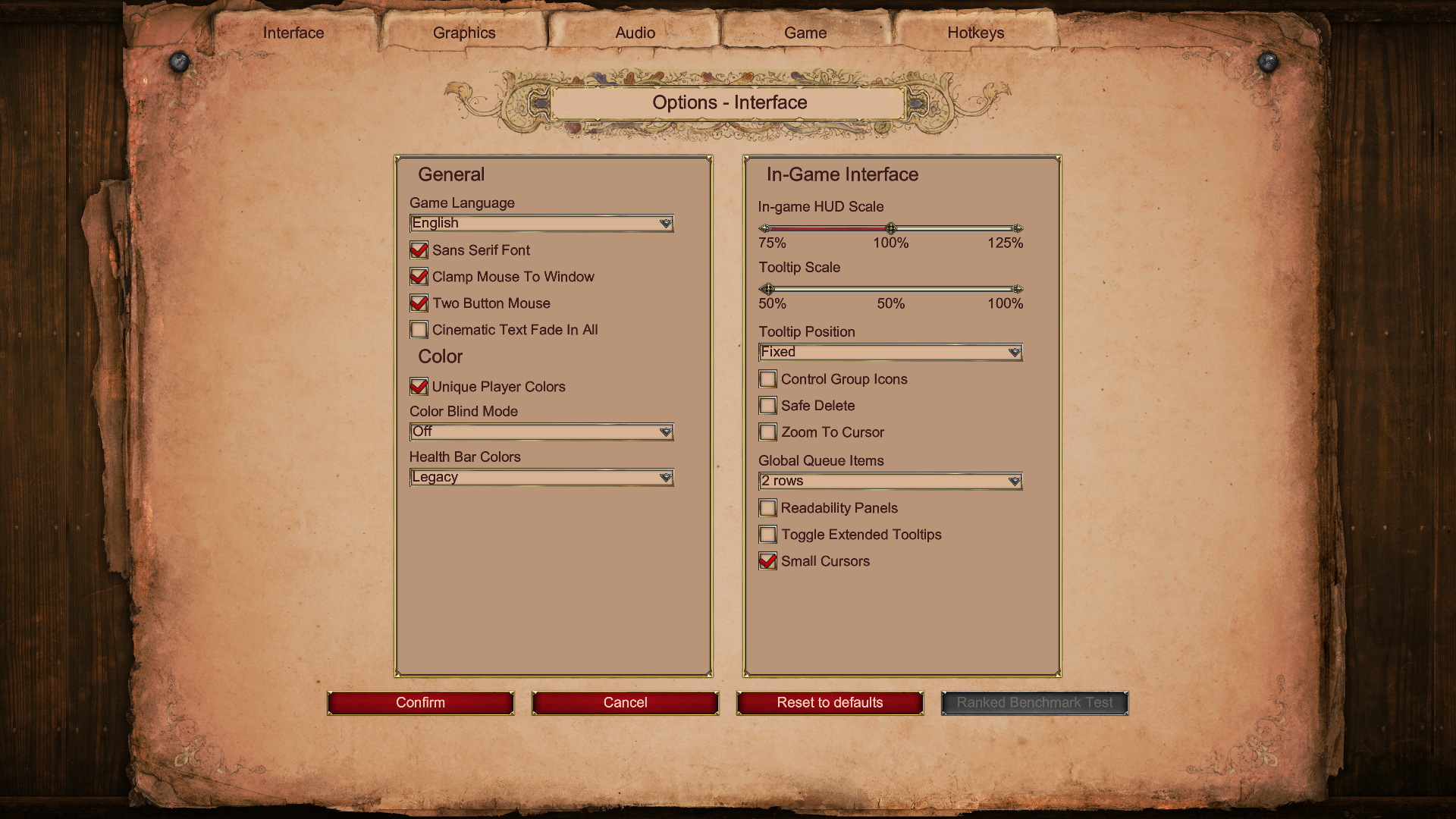
Tooltips at 50% size (although issues still appear at 100%)
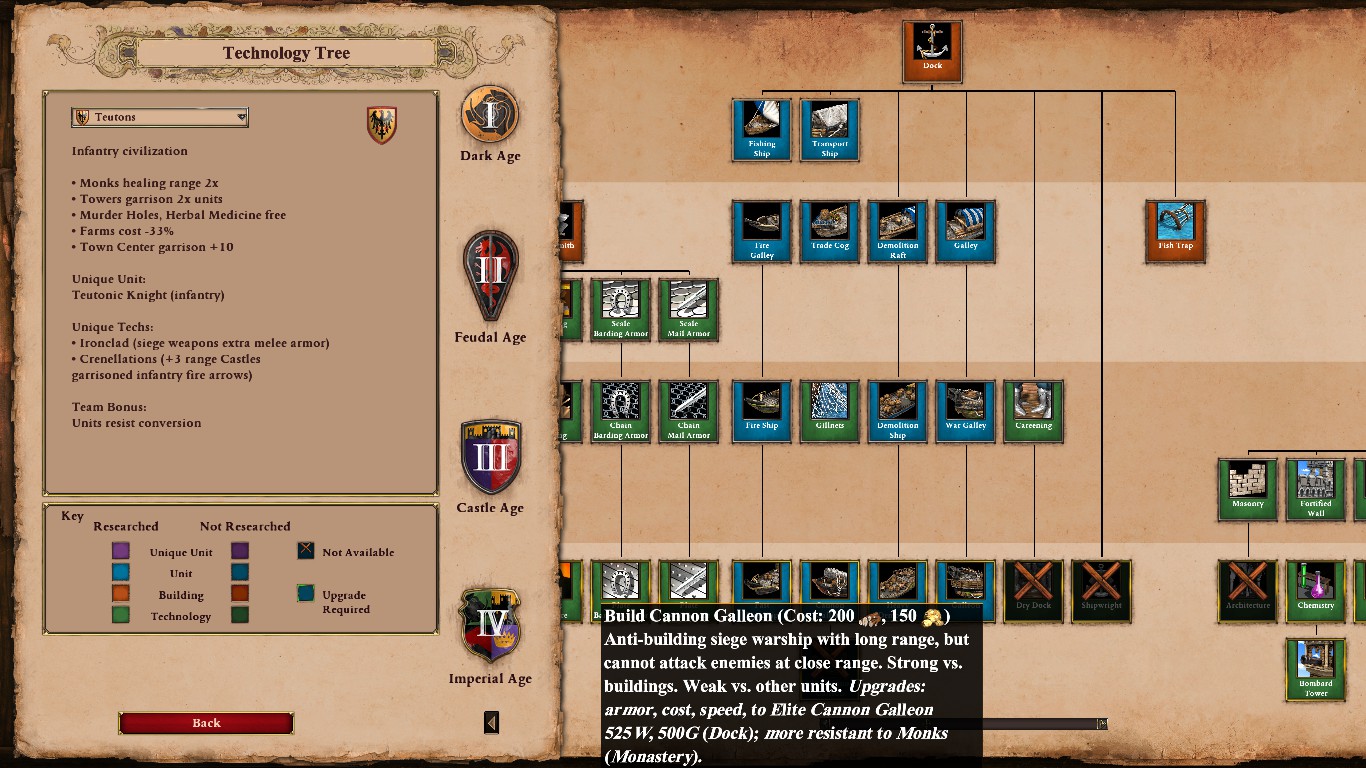
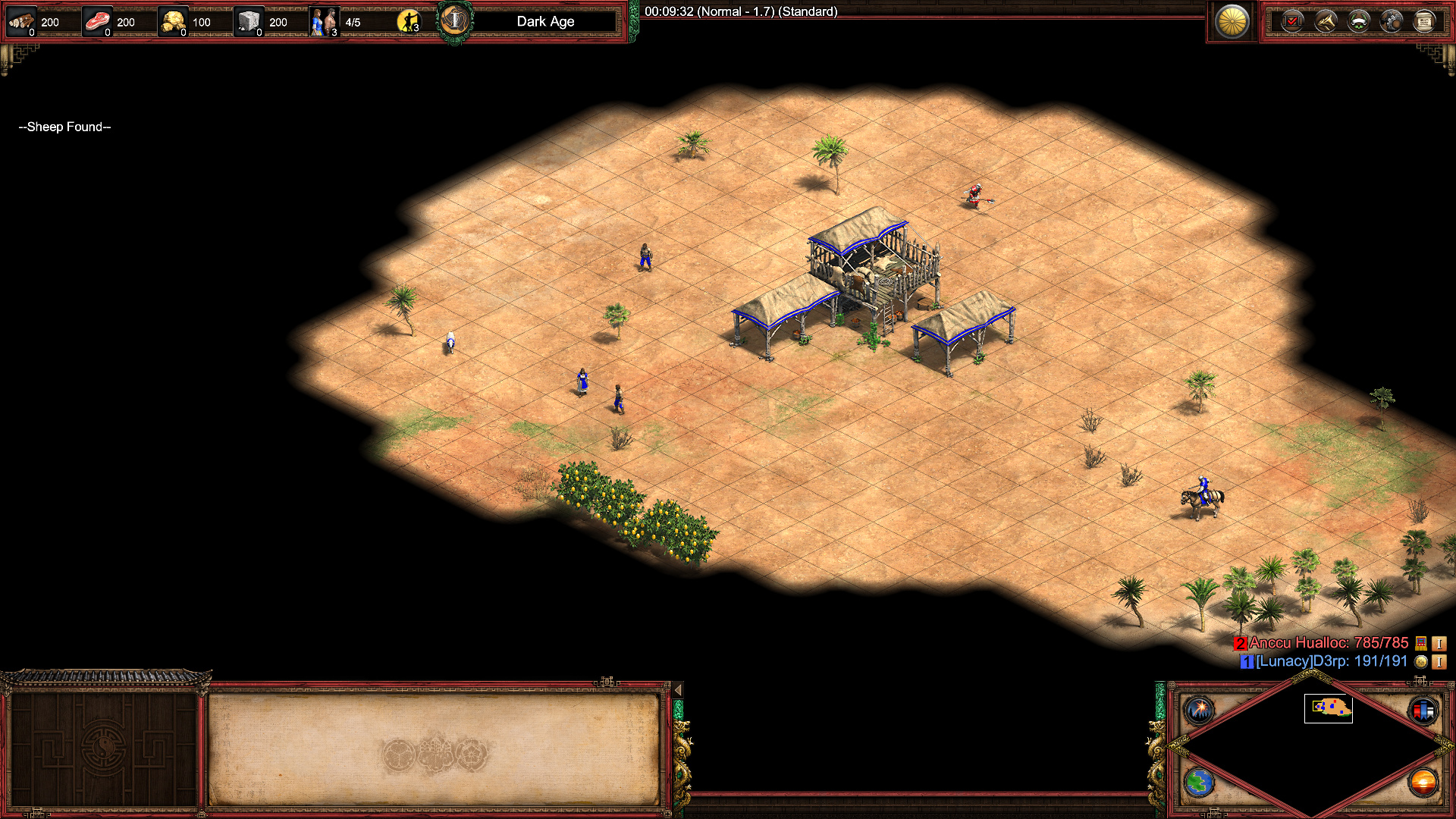
So there are some things, for example cannon galleon, that you cannot read the full description of because the box showing the information goes out of the picture of the game. In the screenshot you can see most of the cannon galleons text box, but not it’s stats in form of HP, atk, range and so on. This goes for some of the other things in the techtree as well.
I play on Steam with the version 101.101.32911.0 4395365
Menus and post-game dialogs don’t obey sans serif setting. Also similarly to the above, “Elite Battle Elephant” does not fit in the unit box in the tech tree. At least at 3240x2160.
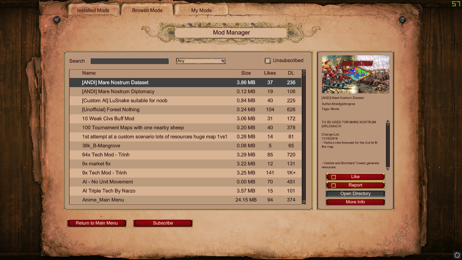
The font is overall VERY HARD to read (everything is blurry), the hardest being descriptions of mods. It’s literally illegible. Too small, to blurry.
Steam, version 101.101.32911.0 4395365
Build Number: 101.101.32911.0.4395365
Platform: Steam
Location of text: in a DeathMatch mode
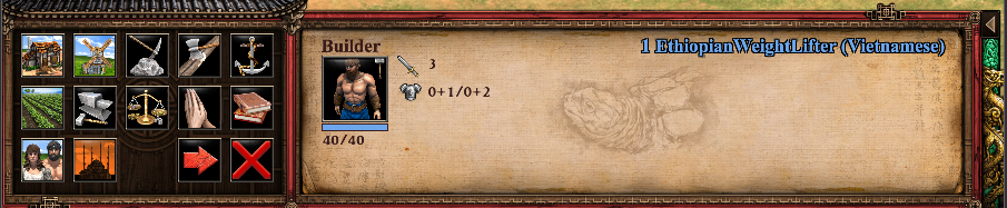
The letters on “Ethiopian WeightLifter” look like they are pixelating.
And if you look at the action images on the left, I am having a hard time seeing what I am looking at. Particularly, the images of House, Windmill and new Town Center are very low quality.
I am Italian and I write through the translator, I hope you read my comment. Thank you in advance.
I can’t read any writing, the basic descriptions are too small during a game.
Could you solve this problem?
Alternatively I would be forced to ask for a refund.
I Think this is a new one, i just activated my enhanced gfx pack and i love it but for some reason my control group numbers are super small (see image 1 and 2), its somewhat readable totally zoomed in but zoomed out they are just gone.
My problem is that as you can see I’m having some obvious visual issues. The red border around my options seems to not be there. This is my second day having DE, and the first time I opened it, it seemed to be fine, but since then it’s been like this making it really hard to find drop down boxes and such. When I am spectating games I don’t even see the box to change the perspective of who I am spectating. any suggestions?
Some UI mods are not compatible with newest game update. Mod authors must update them before they work properly. Try to disable them temporarily to see whether they cause issues.
Someone in Steam community said: “It’s a bug. For some reason the Windows 10’s accessibility mode is permanently enabled in this game, making the text look huge, blurry and ugly.”
I don’t know the details of Windows 10’s accessibility mode, but the text IS huge, blurry, huge, ugly, and pixelated. Maybe it is a bug.