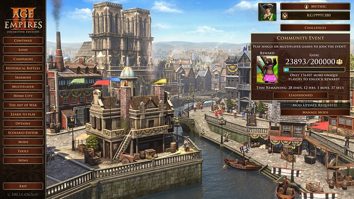
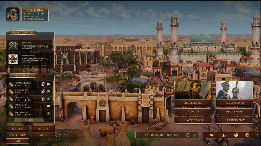
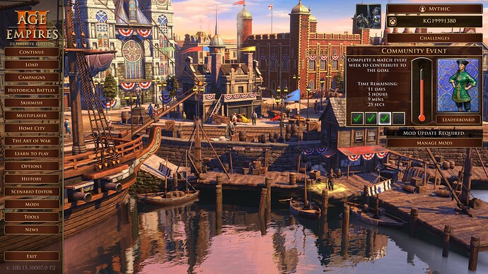
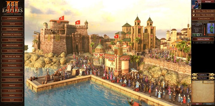
So i’ve decided to play around with main menu for fun, here’s what i ended up putting together, this is fully functional, part of my offline branch of aoe2 DE UI mod, and i’d like to hear some feedback if i should put this up as is or play around with it some more
I think you should customize it a bit further. For now it is identical except you brought 3 buttons on the main screen instead of them being in the ‘tools’ section.
A possible modification:
This is just an example.
problem i encountered is this image is a mockup and was never actually achieved ingame to my knowledge, to be fair, i do agree with the idea but i ran into a bunch of problems trying to take it this far, if i don’t follow existing structure directly enough (i can swap assets to change visual look) it blocks ranked multiplayer at minimum
long story short: more experimentation is needed with these UI files, some stuff, like friends list, do not work outside of multiplayer panels
changing visuals shouldn’t affect the ranked lobby
hence why i said i can swap visuals, but above requires structure change
in fact, i already made mods with lunar new year and spring decorations from official events, so ik it can be done
Neiher do triggers or scenarios, but subscribing to those mods, will prevent you from playing
bit of an update on this, i’ve played around with idea like this but i want to do it in steps and for now not change art of the menu buttons, to prevent doing too much too quickly
I like so much this main menu concept ![]()
![]()
its still very much early days, but i’ll experiment to see what can be achieved
focus rn being reworking the left menu to smt different
also smt i learned in last months, you can move the whole thing around to wherever, but it requires like 50% of the code to be rewritten for new orientation, translation, getting it to look even remotely right, talking just layout, will take a while before its release ready
I would absolutely hate if we got a Main Menu looking like that. That is not a improvement over what we already have that is a mess with so many buttons and stuff in various places. If they ever make changes to main menu I hope they make it so you can choose to keep the current one it is my favorite from any AoE game by far.
It’s definitely an improvement:
you have all the various ‘aspects’ of the game seperated, yet in the same page. Single player and Multiplayer have each inherently 3 buttons that they are releated into.
Ranked search is in the background so you can still do other stuff. Editors/Mods/Compendium are in the same ‘section’, i would even move compendium to singleplayers and make another row like single player called ‘tools’.
Then you have freind list visible, allowing you to communicate with your friends (chats)
News and update isn’t updated so that can be changed to the different challenges.
Exactly!
And could be improved upon that section categorization!
Multiplayer UI could be improved too!
That main menu will take extra clicks to get into things like a Skirmish and Historic Battle for example while the current one is one click and you are where you want to be.
Something like that where you take what we have and improve it is the best thing rather then a total redesign especially one like you posted that has extra clicks to do things and has any icons for buttons instead of simple words on a button not to mention so much of beautiful home city being covered up.
You can just add additional button under campaign ‘historical battles’ and add another one under multiplayer, taking you directly into lobbies or ranked page.
Like
Single player Multiplayer
Skirmish Ranked
Campaign Lobbies
Historical battles Challenges
Load game Learn to play (art of war)
this, fewer extra clicks the better, a well designed menu is the one that doesn’t get in the way
also important, this menu is already available via age of empires II DE UI mod for anyone that wants to take a look, once enabled, open historical battles screen then just go back to main menu, that applies it


