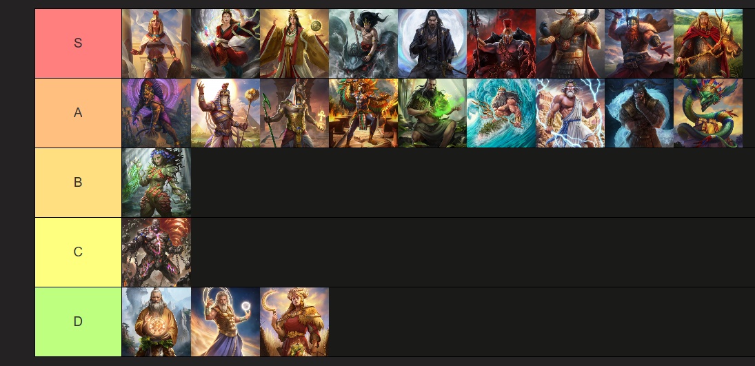
This is just regarding the overall look/design/vibe of the portraits and how much they represent the major god (for me at least).
Discussion is welcome.
3 Likes
I think I more or less agree.
I would put Zeus into C tier, especially when compared to his original portrait. All the other gods put more focus on their godly domain or their symbols, but Zeus is an oiled up bodybuilder first and the god of lightning second. I don’t mind them being beefed up, but it looks weird to have it be the focus. Additionally, I always found the o% body fat type of muscular to be off putting.
I’d put Demeter in B or A tier. I don’t have major criticisms, portrait’s good.
2 Likes
I agree with most of yours. Isis would be A (her Beta is better). I’d drop Gaia and Ra to D tier (way too cartoonish). I’d raise Demeter to B. Quez would be B too (not snake-like enough). Fuxi looks fine, but his depiction is weak. Oranos looks like Dustin Hoffman. They are D for definitely. Kronos would be a B for me.
I’m personally not a fan of any of the Retold god portraits, but if I had to name a few that are quite decent, I’d say Zeus and Hades. The painted portraits of the gods in the original game are the best and, in my opinion, impossible for any modern artist to reproduce. Huge credit to David Cherry, that’s what I call a true artist. Looking at his work feels like going back in time to that mythological era.
1 Like
I wish Demeter looked like the other greek gods, glowing eyes and an aura of authority rather than an angry mother in law, which well fitting fails to capture her divinity
1 Like
i can see tha reasoning. and i also kinda understand: [quote=“ChippyLaMonk, post:2, topic:286326”]
Additionally, I always found the o% body fat type of muscular to be off putting.
[/quote]
i disagree with this:
cause of this:
i understand what you mean with the “going back in time” and i partly agree even i don’t like some of the old portraits either like Ares and Ptah for example.
i think all Isis portraits are great and S tier from old portrait to beta and the latest one.
ah i can see what you mean yeah some of the portrait feel a bit “cartoonish” in a way i wouldn’t say Gaia looks that cartoonish tho but i kinda agree more with Ra even tho i think the essense/identity is greatly captures in his portrait but the artstyle looks a bit too “disney” is a way i can see that.
i agree Fuxi has also like Ra a great idenity in his image but looks less “cartoonish” i just put him that low not cause of the quality but that he is an elderly human when his twinsister is a young snake-hybrid (how it should be IMO)
that made me giggle ngl. but you’re right! ![]()
Kronos looks badass but also too “cartoonish” for me and i wish he wouldn’t be purple but either burned dark or more like sand coloured.
Never got the glowy eyes complaint with demeter. Freyr also broke the trend of the norse gods having glowy eyes and his demeanor is more disapproving than aggressive.
They have basically the same portrait and they’re both pretty good.
The only one that is an improvement imo is Odin. I always thought his portrait in the original game was ugly.
1 Like
“Discussion is welcome.” Thank you mylord for writing this on a forum.
LMAO. xd i just want to show that ppl can have different opinions. i guess you are one of those who write their opinion and don’t write “thats my opinion” cause its “obvious your opinion”? i personalyl understand where you are coming from and i thought so too a while back but the internet and disputes changed me a bit.
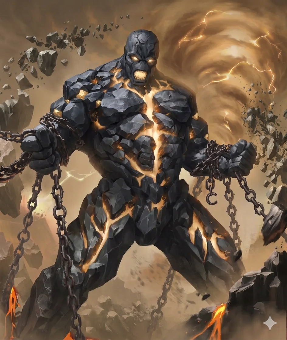
Putting Chronos Portrait below Gaia´s one is pretty savage
what can i say, i am not the biggest fan of purple especially if its on a guy and especially if the guy has other better fitting colours to use.
if the portrait would look like this:
or this:
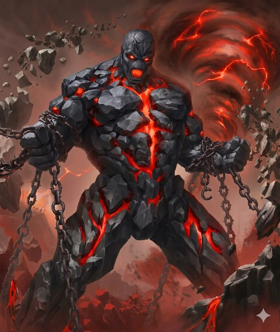
he would be easily above gaia and maybe even S tier.
(what i let gemini do: changed the pruple to a different colour, made the rocky parts darker and removed the nose cause the nose looks odd.)
1 Like
some simple quick adjustments how the portraits could look even better. (very happy with the aztec minor god portraits and the major god ones are solid but could be slightly better.)
Main focus per god:
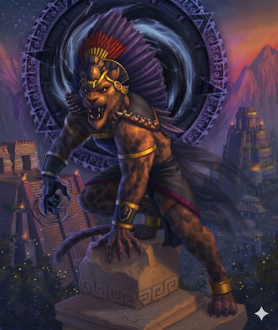
Tezcat:
- slightly less purple more black, dark and a few ice-blue notes
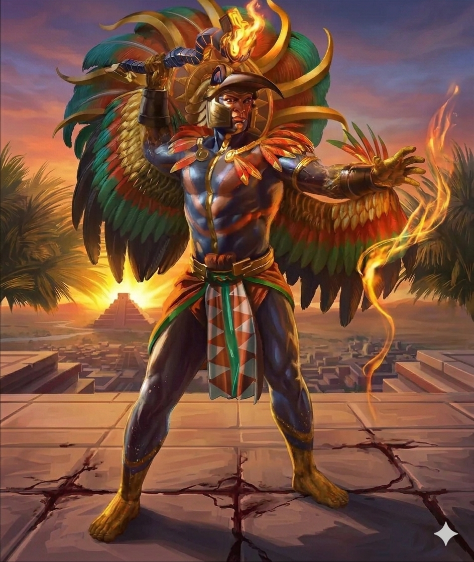
- Huitzil has way less going on in the image removed bracers/rocks, less fire, more sunlight, visual higher place
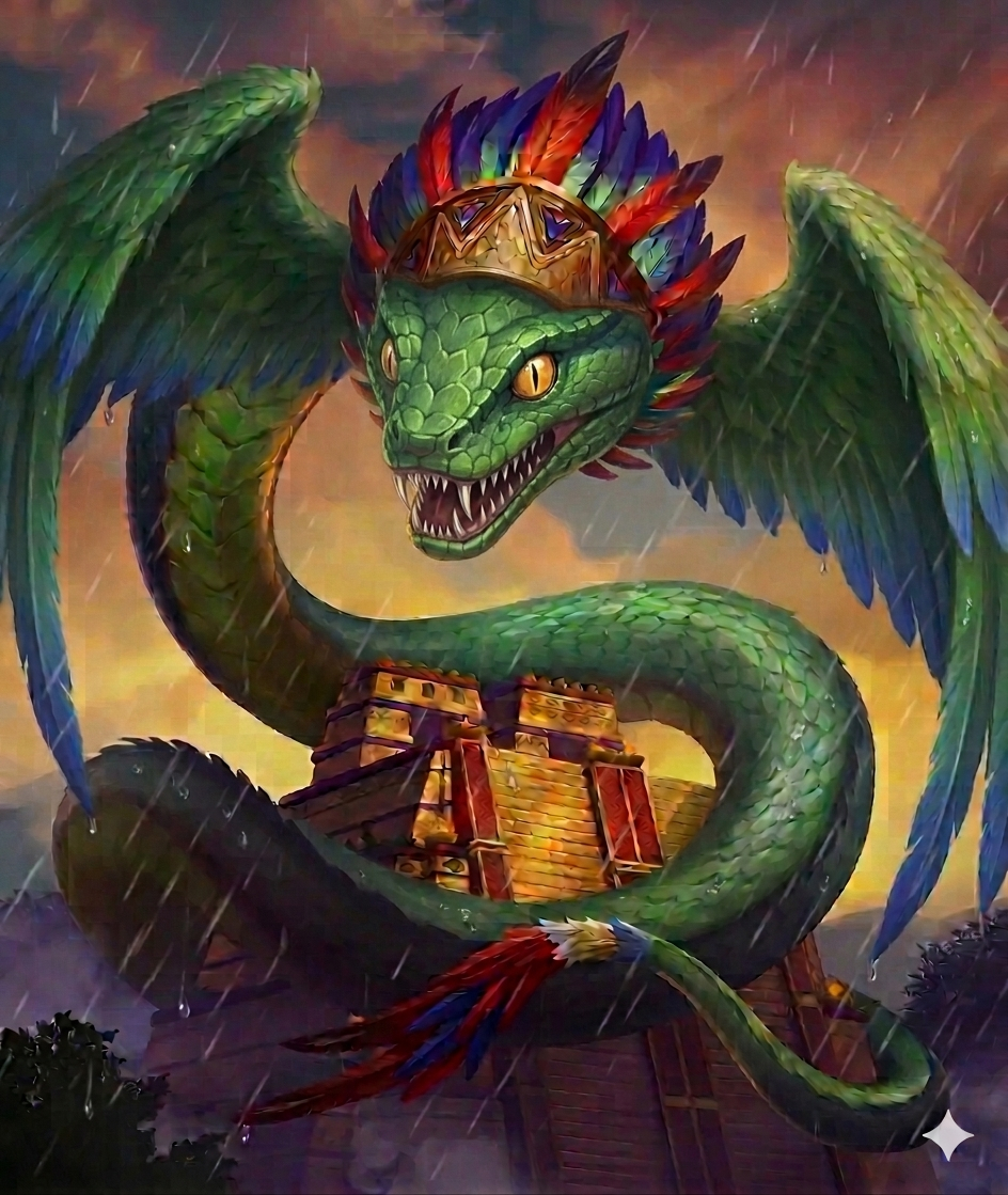
- Quetzal has a more serpent snout and bigger wings.
tl;dr: Tezcat was the focus on colours, Huitzil the focus on the background and ground, Quetzal the focus on a few model parts
Am i tripping or is the leg on the right positioned going forward but his foot behind
i mean ig he’s a god so he can do that
1 Like
I like Huitzilopochtli more. It’s less busy and he is more the focus. It’s cleaner. The Quetzalcoatl is better, but it still isn’t right. I think he should have less of a snout. He looks too crocodilian or dragon now. Nose should be a sharper V shape.
2 Likes
your comment made me giggle. you are completely right.
i let Ai fix it hopefully its better now.
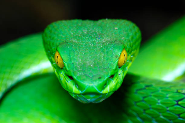
i understand what you mean. well some portraits/scultupres show the head of Quezt not fully in shape of a snake. maybe thats why the devs when with its (more like the shape and style of the titan) but i like your idea and eah i mean its basically in its name. so i tried to let AI fix it more with your great pic of a snake in mind.
the fixed images replaced the old ones in my previous post.
2 Likes