Japan units are too hard to read in fights (visual clarity + selection issue)
When a game is hard because you made a decision too slowly, that’s fair.
When it’s hard because the screen becomes unreadable and units are painful to select, that’s not “difficulty” — it’s visual/UI friction.
What I’m experiencing
-
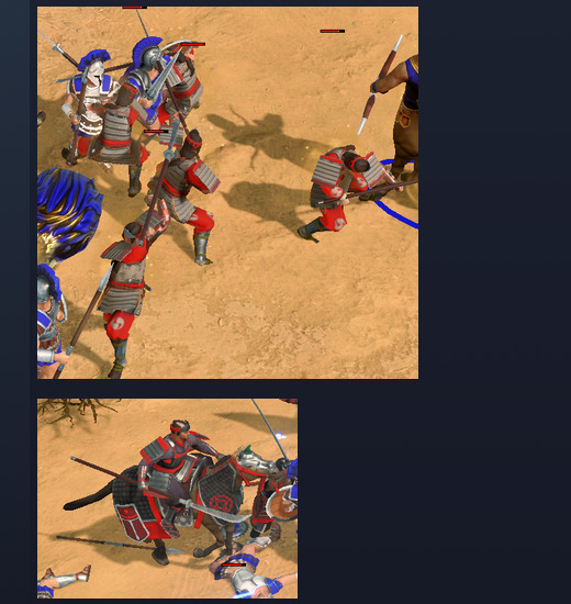
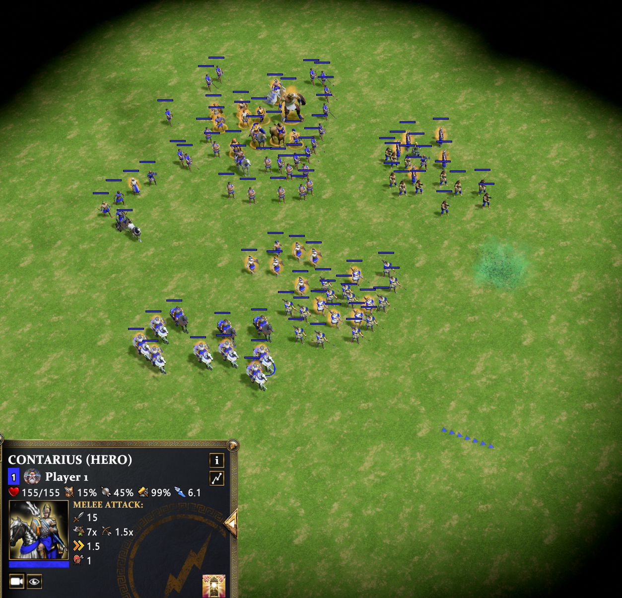
Greek heroes are readable in a fight. Chiron and Achilles stand out clearly and can be tracked quickly.
-
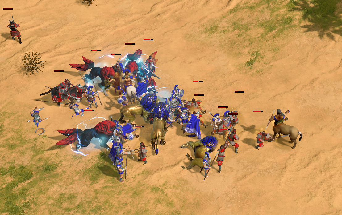
Japan is the opposite: too many infantry units — including heroes — visually blend together, especially in large clumps.
-
Yellow glow effects don’t help. They often blend into bright terrain (sand/white backgrounds), making readability worse rather than better.
-
The result is that in a couple of seconds, a fight can be decided simply because I can’t reliably identify or select the right targets in the chaos.
Screenshot (zoomed): Greek hero readability vs Japan heroes blending into the blob.
The selection problem gets amplified by knock-ups
This is what really pushes it over the edge:
-
Japan has multiple tools that repeatedly launch units into the air.
-
The CC effect itself is fine mechanically — but lifting models off the ground makes them much harder to click or box-select during the exact moments where fast micro matters most.
-
This isn’t just “I got outplayed.” It’s the game making my inputs unreliable at critical moments.
What makes this especially frustrating is that when one faction has strong visual disruption tools, the player on the receiving end often gets criticized for “poor micro” — even though the UI and presentation are actively working against them.
Unit silhouettes are too similar
A clear example is Naginata Rider vs Onna-musha. At a glance — especially when lumped in with 40–50 units — they look far too similar.
When units share:
-
similar armor
-
similar silhouettes
-
similar colors
combat turns into guesswork instead of micro.
(Insert screenshot set here: Naginata Rider / Onna-musha / Daimyo comparison.)
Balance note (related, but secondary)
Even setting visuals aside, Japan’s fights often feel overly swingy because:
-
Shockwaves and knock-ups stack heavily
-
Onna-musha’s special attack feels overtuned relative to how difficult the situation is to visually parse
I’m not asking to remove Japan’s identity — I’m asking for fights that are readable and controllable on both sides.
What I’m asking for (solutions)
Best-case: dev-side improvements
-
Stronger hero/elite readability for Japan (silhouette, armor accents, contrast, iconography)
-
Better effect-to-terrain contrast so glows remain readable across all maps
-
Improved selection reliability on airborne units (keep the effect, make selection clearer)
If modding is possible
-
Optional high-contrast outlines or tints for heroes and key unit types
-
Slightly increased hero size or clearer nameplate/icon treatment
-
When units are knocked up: keep the animation, but keep the selection footprint grounded or expanded so micro still works
Bottom line
Right now, the game often feels like it’s decided by who creates the biggest visual mess, not who makes better decisions. When one side has more tools to disrupt readability, the other side shouldn’t be labeled “unskilled” for struggling to interact with an unreadable fight.
That’s not fun — and it’s fixable.