Since the devs haven’t given us any information since the closed beta about their roadmap or what will be implemented post-launch, I will kindly remind you to consider the following feature requests (click on the points to see more):
More Zoom options
After the closed beta feedback you decided to increase the max zoom out level, but also decrease the max zoom in level. On top of that, the increased zoom is barely noticeable, you still can’t have a trebuchet and its target in the same frame. This discussion is getting tiresome, I’d like you to take inspiration from AOE3DE and add far and very far zoom options while allowing players to zoom in more. Also, there should be an option to have control over the camera tilt too. Really, the fact that so many players have to discuss this with you is worrying for the future development of this game.
Queues and production
- Add a global queue (apparently it will come post launch)
- Show production queue as number instead of single entities
- Add a shortcut to cancel the last unit in queue
- You should be able to set the gather point to the building itself just like in AOE2, resulting in units garrisoned inside the building. This way you can deploy them in batch instead of getting killed off one by one.
UI Improvements, Unit/Building Selection, Player Info, Waypoints and Minimap
- Add a button to bring up the menu, currently only possible by pressing ESC/F10
- Improve the visual difference between techs/units that can`t be built because of insufficient resources and those with tech or age up requirements
- Show the total amount of villagers you have permanently, currently only visible via tooltip
- Show resources generated by holy sites
- Show building/units stats when units are garrisoned inside the selected building
- Show market prices without the need to hover over the buttons
- You should be able to shift click market and tribute transactions
- Improve the tech tree with detailed information and all exact bonuses
- You should be able to deselect individual units via UI
- F1-F4 should show all units and techs available instead of currently mixing them
- Give every player a player number for better communication (So players can say “Attack P1”)
- Add a permanently visible info in the corner displaying player names, faction, player number and current age
- Show waypoints (units and buildings) on the map & minimap
- Move Dynasty Button, it is too easy to click on in the middle
- Show unit firing range number on panel instead of tooltip, I want to immediately see if the same enemy unit has more range than mine
- Add Minimap modes to switch between military and economic info (alternatively let the minimap switch contextually depending on the selected unit)
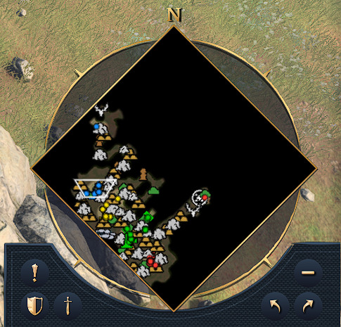
- Enhance readability of the minimap by making the icons smaller, it is unreadable on bigger maps (see screenshot section)
Construction, Shortcuts, Intelligent Selection, Advanced Unit Controls
- Placing harbors and mills should absolutely not delete nearby resources like fish and berries
- More shortcuts and fully customizable (mouse) hotkeys (for example hotkey to select all TCs, barracks etc)
- Add an option to use WASD instead of arrow keys to move around (works when no unit selected)
- Add an option to use the right mouse button instead of scroll wheel to drag the camera (works when no unit selected)
- Fix intelligent selection, it should only select villagers when there are no military units in the selection box. This selection can also be inversed while holding down a button to only select villagers (see AOE2:DE).
- Add an option to prevent units being a part of multiple control groups, rearranging control groups is difficult this way
- Improve current shortcut behavior like jumping to scattered control groups (should jump to where most units of that group are instead of the middle) and F1-F4 Buildings (should select with one click, double clicking should jump to location)
- Garrisoned units that get ejected should move to the building’s rally point
- Unit commands like follow and patrol are missing
- Unit stances like do not fire, aggressive, defensive are missing
- There should be an option for “Stand ground” to not deactivate when repositioning
- Add an option to deactivate “right-click to garrison”
- Give players the ability to ungarrison individual units
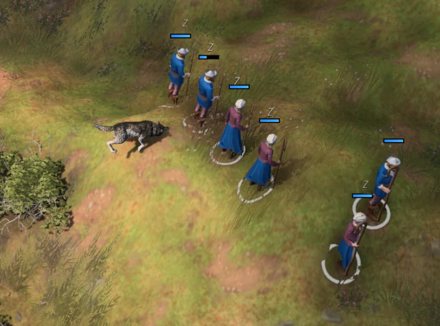
- Improve unit behavior to defend against neutral units that attack you (neutral players, wolves)(see screenshot section)
- Improve input delay when giving units orders, it completely eliminates any possibility for micro
Lobby, Spectate, Post-Match, Chat and Loading Screen Options
- Allow mouse scrolling in the lobby/spectate browser
- Add in-game diplomacy (ally/neutral/enemy)
- Add selectable higher population limits
- Add larger map sizes
- Add an option to change the game speed in custom lobbies and singleplayer like AOE2
- Add an option to select a random civilization for the player and AI players
- Add a setting to display player scores in custom lobbies and singleplayer
- Sort the score with teams grouped together, then in order best to worst
- Introduce a system to pick your color in lobbies (either like former AOE games have or a preferred color picker used in games like RISK)
- Allow pausing, saving and loading/restoring games in multiplayer and singleplayer
- Players in custom games starting in later ages should be able to build landmarks from previous ages
- Revamp the spectator UI: Take inspiration from AOE2 Capture Age (Population comparison panel and Gaia/neutral player for example are missing)!
- Allow spectators to see the in-game chat
- Fix the bug where everyone wins after one player is defeated in FFA
- Allow players to see the entire map post-match
- Rearrange the statistics screen so you don’t have to scroll left and right
- Chat from the match should carry over to the post-game chat
- Add Taunts for players to give the AI commands and for better communication with teammates
- Give players an option turn off the chat filter
- Improve the chat delay
- Loading screen should show the current map so you know what map you are loading in to
Visuals and Scaling
- Units are hard to tell apart from their upgraded versions
- Knights and riders are still difficult to distinguish as they both have pointy things pointing upwards
- Siege weapons are difficult to distinguish when moving in carriages as they are too dark and samey looking
- Ships should have water reflections and wave physics/animations when moving
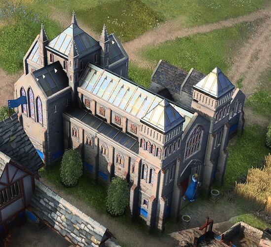
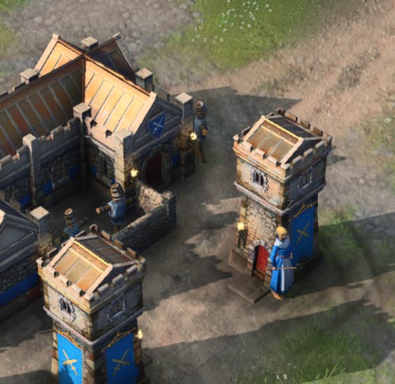
- Improve the immersion breaking scaling: Could you please give us an option to switch to the original 2019 reveal trailer scaling? Will you impose competitive design on scenario/single player/casual players? In AOE2DE you could enhance readability through options & mods (see screenshot section)!
Population Limit and Victory Conditions
- Increase the pop cap to 250 due to units eating up multiple housing slots (especially navy)
- Your teammates should stay alive until all your team‘s landmarks are destroyed to allow comebacks
- Add a button to minimize objectives, they are always visible even when irrelevant and take up too much space
New Features and game modes
- Add King regicide mode from AOE2
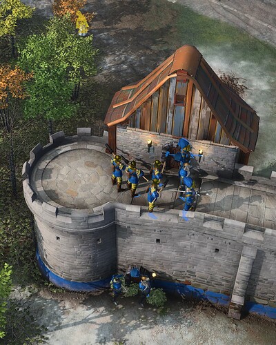
- Players should be able to build or place siege units on walls
- Players should be able to connect their walls with allied walls and castles
- Consider adding a bonus/penalty for units fighting/moving downhill/uphill
Scenario Editor
Just reminding you that it absolutely has to come with triggers and advanced configuration options, not as a simple multiplayer map maker
(Under investigation to see if something changed from the closed beta)
- Improving the “attack move” command so it properly prioritizes units
- Improving building selection areas (TC’s selection area is all over the place)
- Improving unit hitboxes (it is almost impossible to single out a converting priest during battle)
- Improving unit selection feedback (there is no clear indication I am attacking said priest)
- Perfect archer accuracy
