strong text
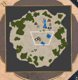
The mini map icons are too small. When you change the zoom from 100 to the other larger ones, the size of the icons d remains the same. This should be proportionate.
strong text
The mini map icons are too small. When you change the zoom from 100 to the other larger ones, the size of the icons d remains the same. This should be proportionate.
In particular, each unit is a point and that point is still tiny.
Also, I noticed that in the biome similar to a desert the white dots of the unit are not very distinguishable, in Windows I use the configuration so that the color of the mouse depends on the contrast, something similar in that biome would work


If anything those points for units should be made even smaller. The main reason we got the minimap zoom is to be able to see things especially in team games in which those “small points” hid everything even enemy units inside your base were hard to see on the minimap. It was literally possible for relics and gold mines to be invisible on the minimap due to that.
Many people are happy with the minimap scaling without having a scaling for units/icons we want to have enough space on the minimap to spot “units” moving among other things.
If we scale everything up we go back to the previous state of horrible minimap.
that’s why I’m interested in enlarging it just a little bit, it’s obvious that’s why I didn’t specify it