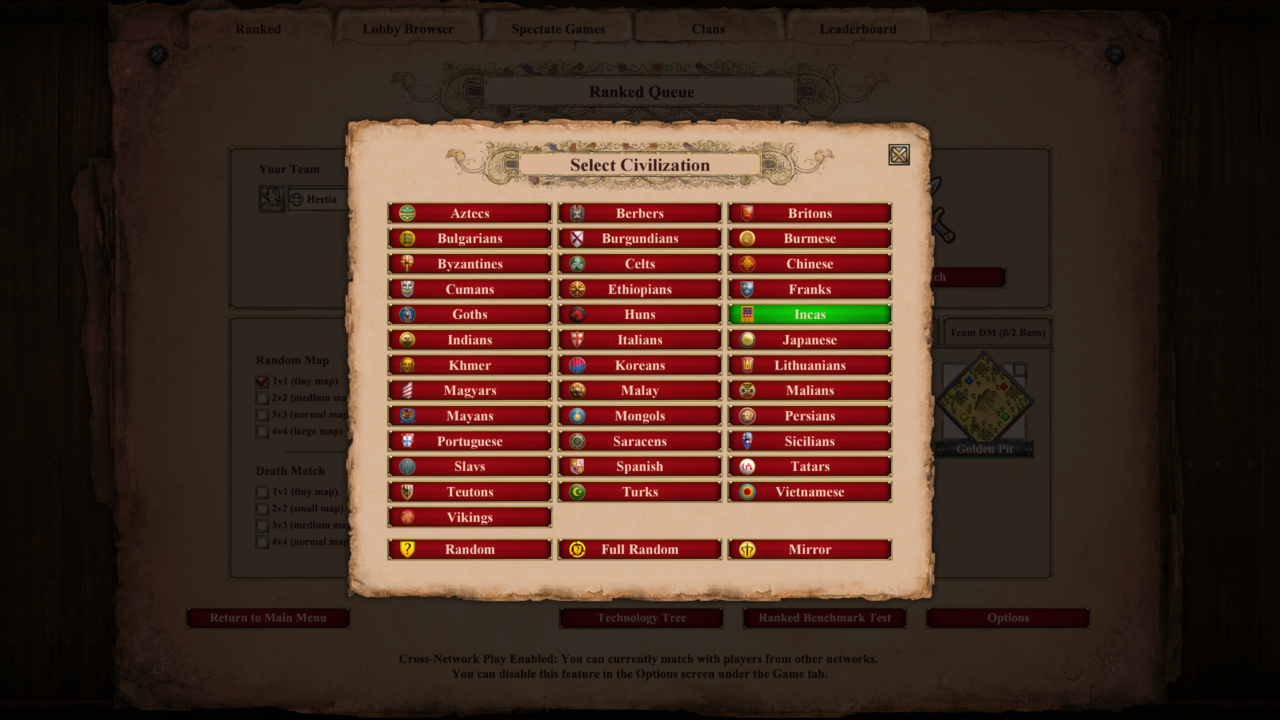
Since the anniversary update we have an awkward civ select screen that is very laggy. So I tried to bring back the cleaner looking old civ select screen. Here’s what it looks like:
The way it interacts is, a red civ button would turn green when you single click, and a double click confirms the civ. Due to official limits the 3 random buttons won’t change color when clicked, but hopefully that is not a problem as a quick double click still confirms it.
I don’t have an accurate measure, but it feels a bit faster than the current screen with my experience. I hope this mod also makes your civ pick smoother. Any feedback welcome
You’ve been putting some time into getting good at UI modding eh? hahaha
I have a friend who really misses the old civ picker. He will love this one. Thank you buddy.
Looks great. Are you using some kind of visual tool to edit the layout files? The language looks like WPF, so I would assume there is some kind of editor in Visual Studio. Or do you edit them manually in a text editor?