There needs to be way more color options for the banners. I can’t imagine it would be difficult to implement more and it would help in giving player banners more distinction between each other. There is also the issue that complex sigils like the seal of ivan are difficult to make out because the color options present are not bold and clear enough to help it pop out.
I very much agree. The crappy pastels and distinct LACK of primary colors makes the very cool banner/sigil/coat of arms idea very much LESS enjoyable than it otherwise could be.
There should be a normal color picker. There are reasons for sticking to a moderated selection, but in IV banners are cosmetic, minor elements with no impact on gameplay.
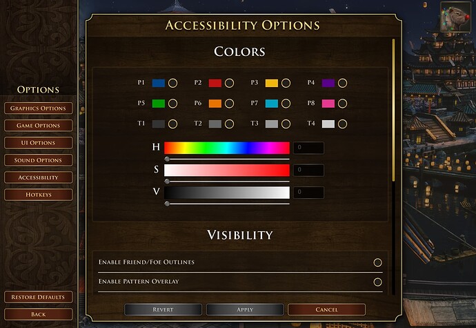
There should be a normal HSV color picker, like for player colours in AoE III.
And since I’ve mentioned it - have they patched in player colour selection? I literally can not believe the game shipped without it. Even during beta it was unreal to not have it and the fact that pretty much all major AoE YTrs are letting it slide is just outrageous.
Perhaps it also automatically attempts to pick a similar color for your civilization as well. Maybe they could also try to put the banners on outposts, towncenters, and keeps.
