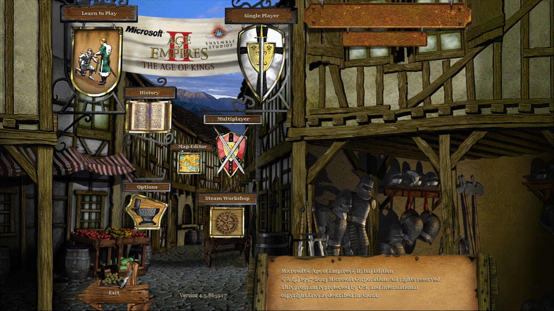
Something like this? I mean, it doesn’t sound bad, but the artwork matters a lot when considering changes like these.
The classic one looks something like this:
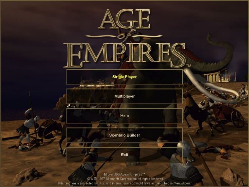
While I like the background (and the font style a lot, which is missing in the Definitive Edition for some reason!!), I still prefer the new background and user interface in general terms. Though, it is nice to have some feedback on the current state of visuals in this game, as it still needs a revision, no matter how little.