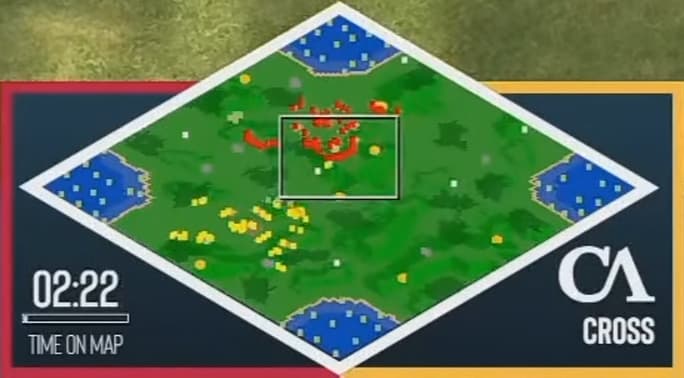
Interesting. But now I wonder, looking back at the screenshot of the game of HERA vs LIEREYY, there is no terrain indicator in the minimap even though ingame there are some elevation differences. Maybe there are different types of elevation and this does not yet count as high ground?
1 Like
No it does show it, its just I think the compression is killing it a little in the exact screen shot you’ve posted. The white boxes for the screen and attack indicator are not helping in this exact instance either.
Interestingly Capture age does this too - as key upgrades are researched they appear on the right I believe, side by side for both players.
I have to straight disagree with you on this one. The relative population bars for military and economy and idles in the upper-centre of the screen for aoe2 dominates the number representation chosen in SC2. Furthermore, exact numbers are still present for extra info, and in symmetrical and close arrangement.
This is true, there is definitely more eye movement for somethings, but certainly not all, another thing to note is the bottom vs top use of the screen - both games use both edges of the screen. If eye movement is so important, why isnt the production queue in SC2 on the bottom right? That was UI would only be on the bottom edge and eye movement to the top of the screen minimised?
I think having “like” information close to its other information is more important. Interestinyl CaptureAge strikes a good balance of keeping ‘Like’ information close, also note the bottom right of the screen which cycles through various stats where comparing between players is important.
I have to say SC2 is fine, and its clean, but its certainly not “perfect”, I don’t think Age4 needs to copy it at all, and should instead lean towards captureAge for the majority of its inspiration.
Finally I would like to point out that everyone describes the current Age4 spectator tool as barebones… and I think it quite obviously is. Its the literal bare minimum, which to me says this is certainly not the final iteration/product we will get - maybe not at release - but certainly with the modding and scenario tools early next I have no doubt there will be a well fleshed out and powerful spectator tool similar to CA.
2 Likes
There is too, but I will admit it is a bit hard to see when YouTube is compressing.
Look a the southeast part of the map, the stone and gold there are on top of hills.
1 Like
As mentioned in the OP, symbol on the left is worker population, symbol on the right is military.
Team → Player → Age → Villager Population → Military Population → Buildings constructing → Technology researching → Units training
This may be controversial, but I prefer SC2 replay UI than AOE2 capture age. I place a very high importance on UI being minimalist, but having the option to show things. Unfortunately capture age creates a significant amount of dead space on the screen (marked in yellow):
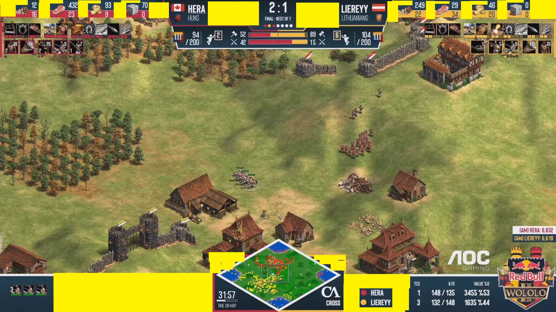
I completely understand the design aspect of it, and think for the direction they’ve gone, it really is 10/10 - just my subjective opinion that the LESS pixels taken up by the UI, the better.
I think SC2 does their UI very well, with the observer being able to control a significant amount of stats that appear in the top left of screen. I think this is 100% the best way to go, which is a huge plus considering that’s already the design for AoE4.
4 Likes
I’m not familiar with how AoE2’s Observer Hotkeys work, but MAN Can I just say that the Observer Hotkeys in AoE 4 needed a LOT of work.
Starcraft to go to a player I just press 1 2 3 4 5 6 7 etc and it will swap to whatever player that is in the list.
AoE 4 you can press [ or ] to cycle through them one at a time or click the drop down list. And while yeah you can rebind it, there is no Hotkey to go to player 3 or to go to player 7 with 1 button press. For Observing team games it is pretty nice to have this, and for 1v1 I liked knowing ok this guy is always 1 this guy is always 2.
AoE 4 Also could have hotkeys for each of the drop downs on the info they have in the top left. Like SC2 I press D and it opens production tab. R key brings up Resources. Ctrl + R would bring up a larger graphic with more information on units killed in the game etc. Also a larger Zoom specifically for observing is pretty important. I don’t care to play at a larger Zoom, but for obs it is nice to see everything. Being able to watch a replay with a friend is also nice, I liked sharing the observations and having a shared observer chat.
And Finally - We need Spectator Chat!! Not Seeing GG’s is really sad for a pro scene… The game seems to just suddenly end and one player goes white and ur like wtf who won? But if you saw someone type a GG then you know. Sometimes players had really bad GG timings like IdrA vs MMA in MLG… Or the meme by Huk at MLG where he typed you know u weren’t loss.
2 Likes
Not only that, but CaptureAge has a confusing amount of stats on display, some of which are not even intuitive. It’s great as a replay analysis tool, but terrible imho as a game observing UI.
AoE4 observer UI is a joke. It looks like they have no clue about esports. They might as well remove the top left tabs entirely, as they just occupy screen space.
1 Like
I like your changes.
I’d prefer to watch one ^^
Why should that be difficult? Other non-gaming software does that for a long time now. Having a bit of control over docking, scaling and highlighting certain UI elements without creating a tank driver window in the center is not a new concept.
Could be done of anyone cared ![]()
![]()
![]()
1 Like