Proposed Spectator UI Rework

Hello all,

I write this thread to bring attention to the required changes for the spectator UI. Can I start by saying that what we have currently got in-game is sufficient to be able to achieve most of what needs to be achieved, but there are significant improvements that, IMO, must be made to enable a truly AAA spectator experience.

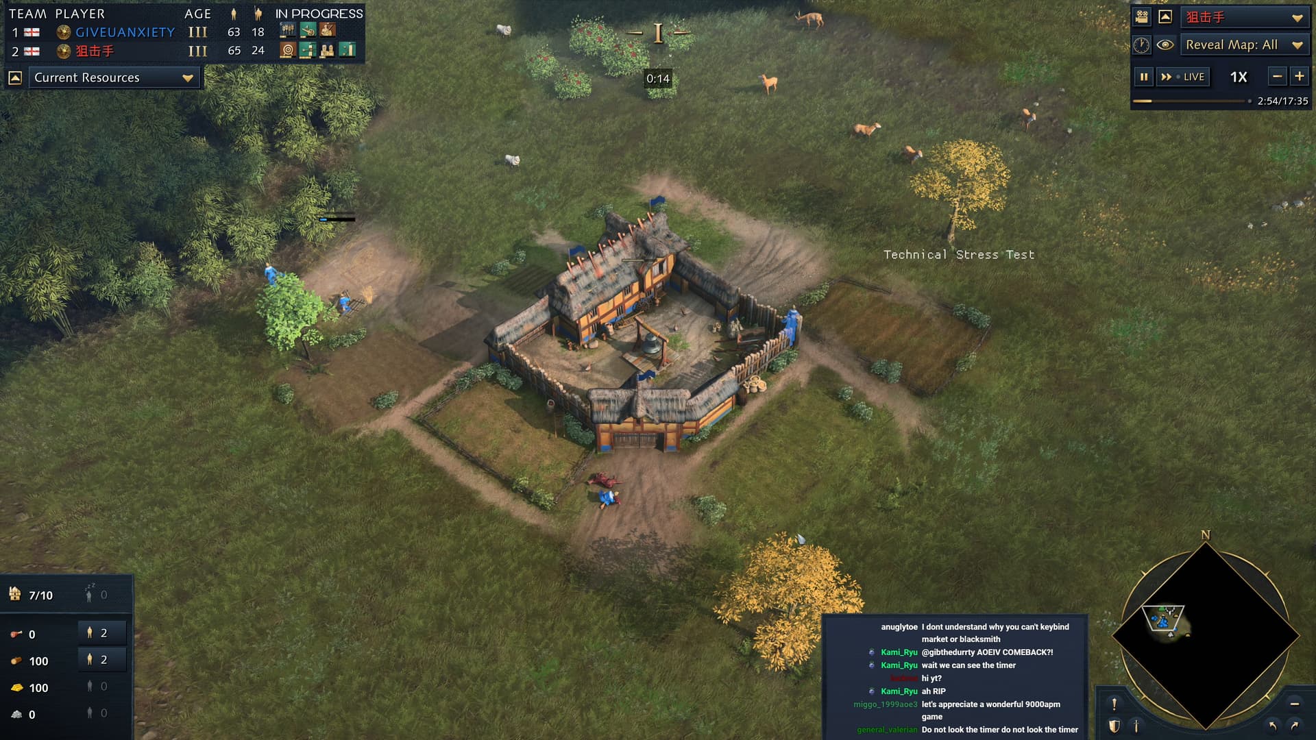
Part 1: Top left and Top Right UI elements

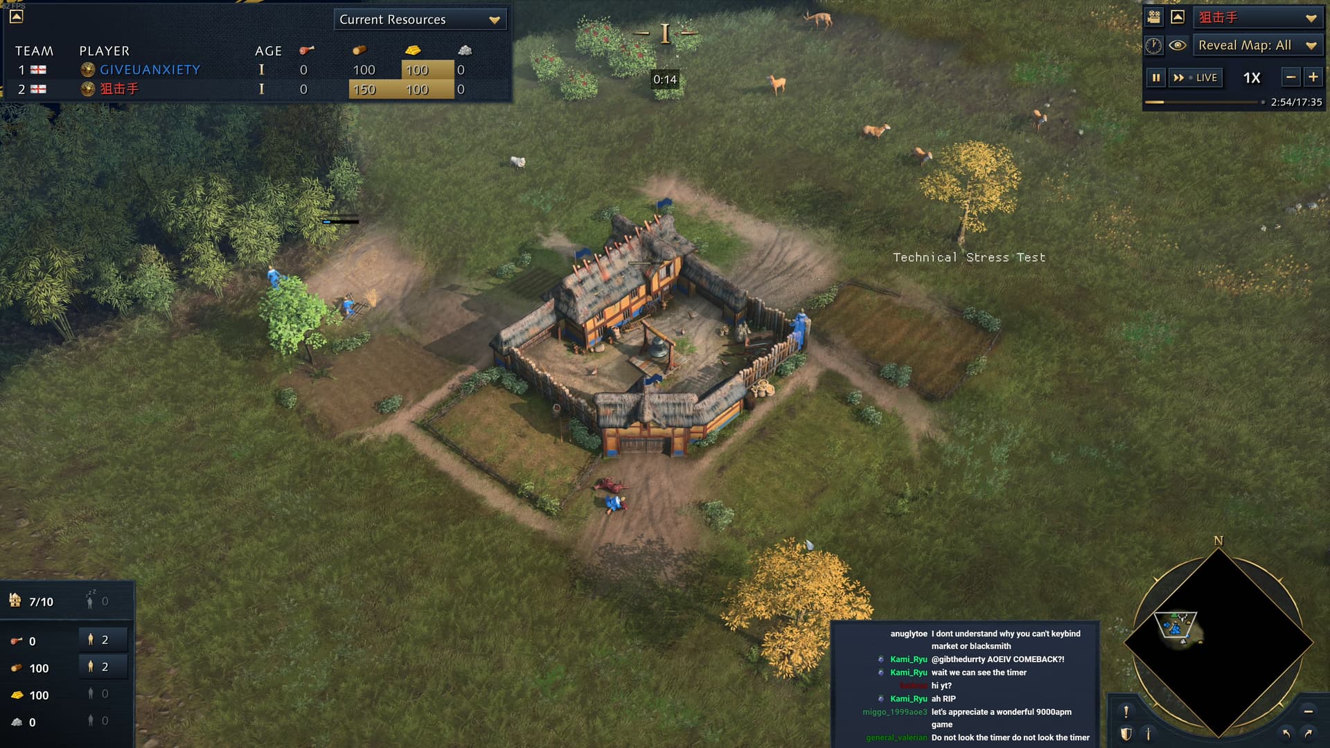
I’ll show you some mock-ups that I’ve worked on. The first thing is getting rid of dead space on the UI.

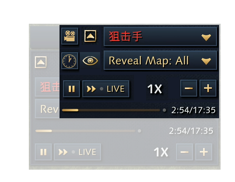
I’ve mocked up a change that I would like to see for the top right hand corner, in addition to adding a button to hide the game length timer, it changes the “free camera” into an icon, as well as puts “Cinematic mode” into an Icon. These would have hover over text similar to any other aspect of the UI so that people opening the spectator mode would know what they are clicking when they hover their mouse over it.

The footprint of this change is significantly smaller, meaning more space on screen to see the action (and subsequently higher levels of immersion).

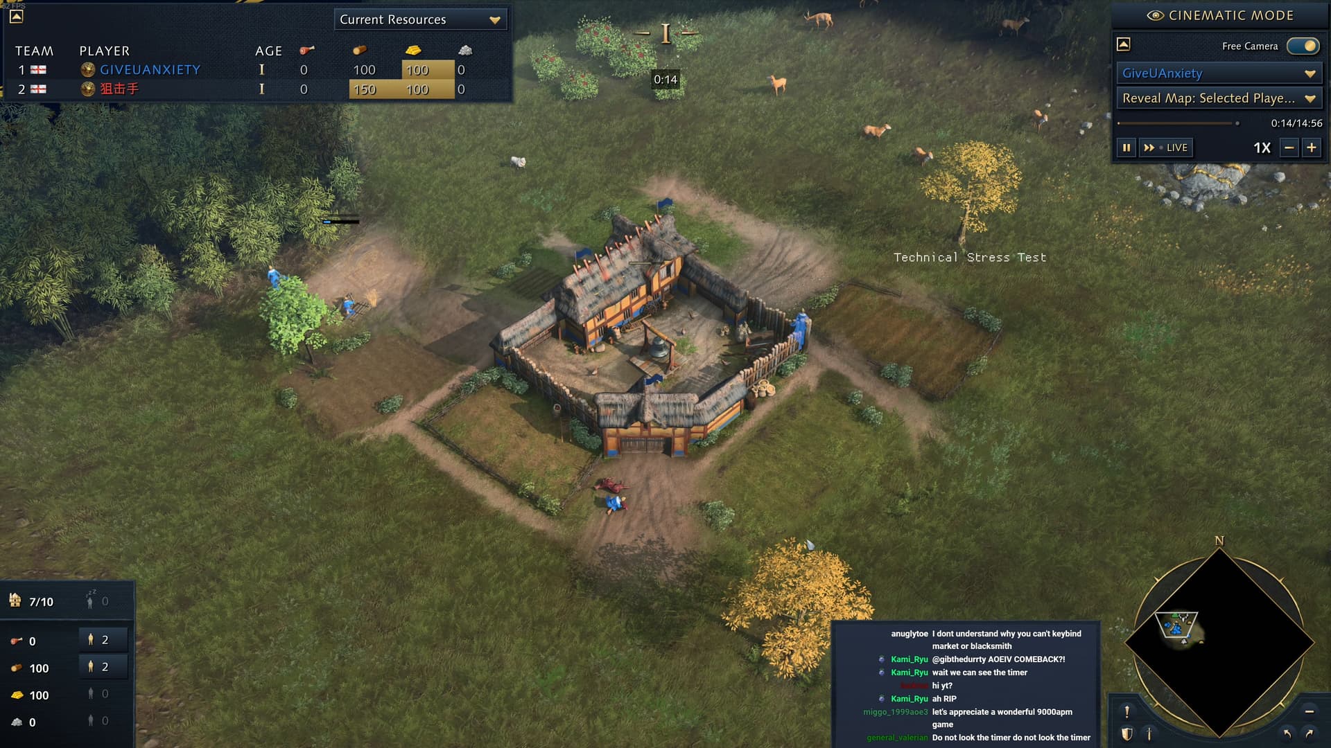
The second change focuses on the top left piece of UI, and looks again, to remove deadspace by bringing the “minimise” button underneath, and the “current resource” drop down along with it. It also shortens the player name bar depending on the length of the longest name in the game.

Again, the footprint here is significantly smaller

Part 2: An independent observer

Currently, there is no way to have an independent observer, meaning observation must be from one of two player perspectives. This is undesirable for a number of reasons, but primarily due to sound and UI triggers. For example, the scouts calling in the early game is triggered once every 10 seconds when they have line of sight of an enemy, and this interrupts the caster significantly if the caster is attempting to speak. UI triggers also include population capacity warnings, attack warnings, and many other pieces of information that aren’t particularly useful above the mini-map.

In addition to this, it also provides information in the bottom left hand corner (resources, villagers) that for all intents and purposes, can be much better placed and formatted, and ties into the first point of removing elements on the UI that do not need to be there.

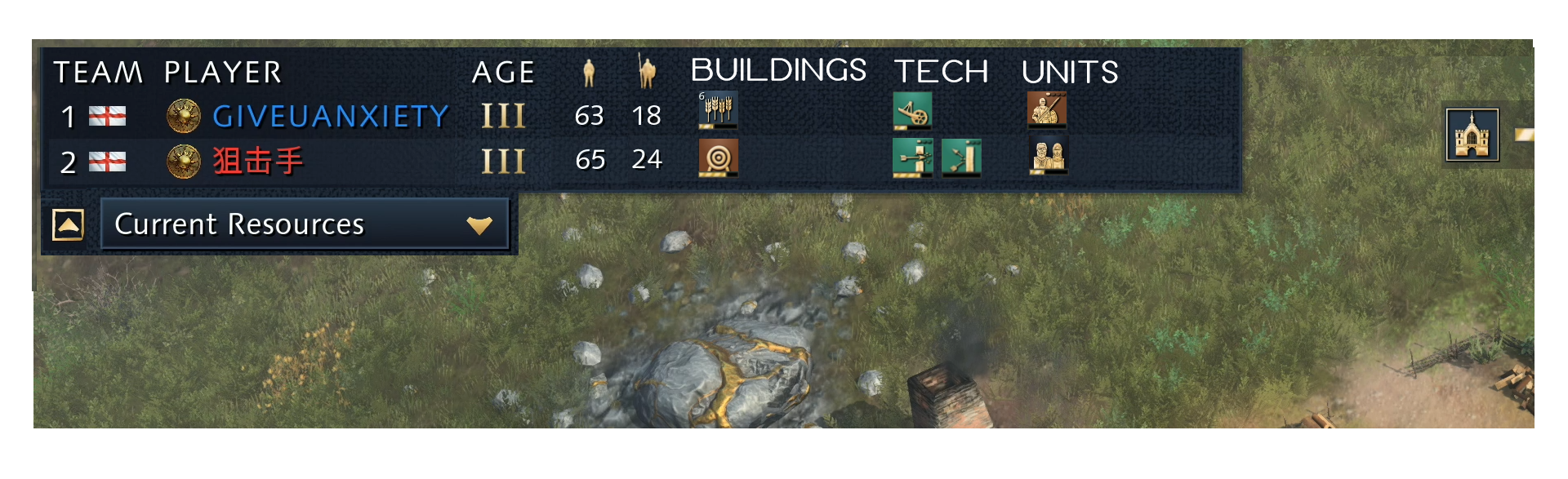
Part 3: Top Left UI element overhaul

A lot of the drop down options are… to be quite honest, not at all useful. One that would be very useful would be the following:

Team → Player → Age → Villager Population → Military Population → Buildings constructing → Technology researching → Units training

The builings/tech/units can also be combined into a color coded single stream that is sorted by time remaining :

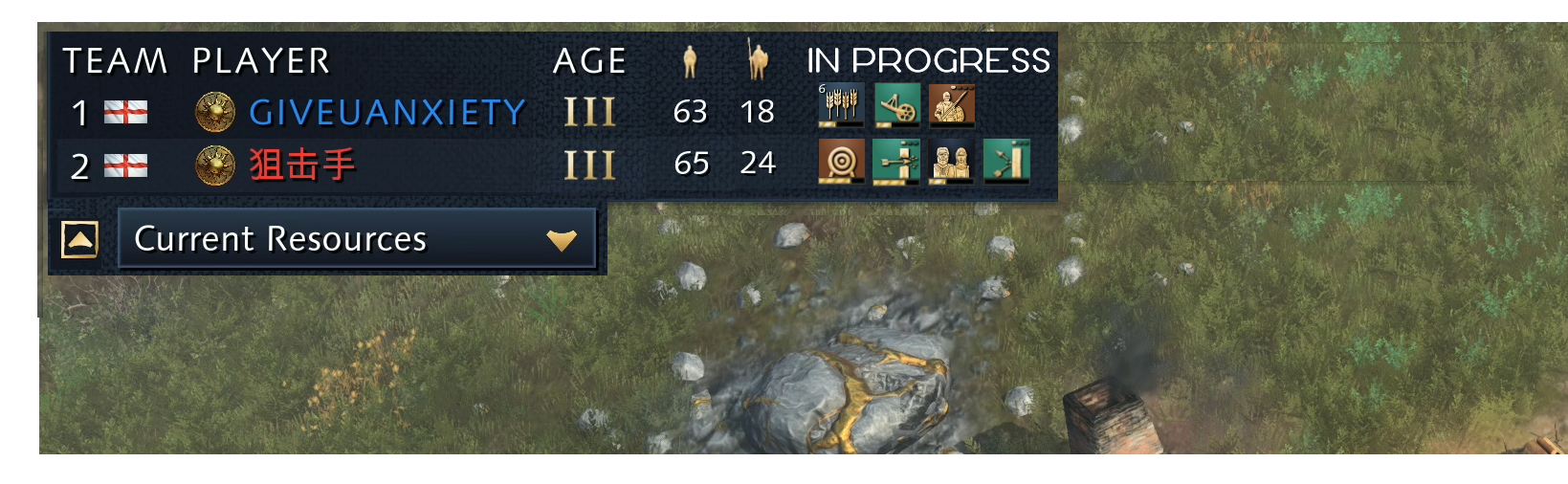
Together, these changes would look like this:

Once again, I write this thread hoping to bring attention to this issue, and look forward to an official response from the development team that this is on their radar. I appreciate that this may take time to implement, and don’t expect to see these changes upon release, but to at least know that the team has it on the radar would be wonderful, because these changes would be very beneficial to the community.

Thanks.

41 Likes

My sweet, innocent Drongo.

15 Likes

I would prefer not to make a video lol

2 Likes

Great points there, agreed.
I also miss a population tab that lists how much eco and military pop each player has and how much each player has killed/lost in one statistic similar to AOE2:DE.

6 Likes

Really like your UI design, hope they can improve it before release.

One of things I would like to see in the spectator UI is relic store for each player, there should be an indication of the amount of relic kept by player.

3 Likes

That is a really great thread with very simple changes, I really like them

1 Like

The Spectator features are barebones for a 2021 game.
Basic stuff such as when someone is starting to age up and what landmark are they building should be showed. Global queues for players, number of villagers without having to hover over some icon and being able to see one of the players at a time.
It’s simply atrocious.

The sad part is that they already have all the tools that were already developed for Age II to know what’s needed for a good spectator UI.

All those things will probably be added in 2022 when ladder and mod tools get released with the first season, at the earliest.

3 Likes

Hoping that in the event it remains barebones, at least modding will be able to fix it up. Heck, I’d probably pay someone four figures to actually make a decent spectator UI. Looking at you @aiz11

3 Likes

Yeah they should look at capture age for some good ideas on how to implement a spectator UI.

1 Like

Capture age have done a great job with AoE2 - one of the things I’d love to see is the ability to customize UI, but I suspect having this is going to be difficult to do.

1 Like

Why not? :slight_smile:

In all seriousness though, I agree with this post overall. The current spec mode is barebones - functional for streaming maybe, but not tournament-ready at all. I hope they’ll refine this and especially add customization options down the line.

That said, my subjective gripe with the current design is that everything seems to be all over the place with random sizes and shapes. A bit of symmetry on at least some elements would vastly improve how the game looks from an observer’s POV.

1 Like

you don’t need to make video about everything. just because you have opinion doesn’t mean you need make long video which takes much longer than reading this post

The devs can also take some inspiration from the watch tab of Dota 2 as well.

What exactly is that man symbol on the left supposed to mean? Total population? And the one on the right is army units I suppose?

Why make it complicated like this? All the devs have to do is almost copy paste the best observer UI in the world- the one from Starcraft 2.

Worker and Army supply should be shown as numbers. That means, not total supply, worker supply as in total supply minus army supply. This should be shown next to current ressources and next to income aswell when selected. Because its nice to see current income, but you must also show army and worker supply together with it.

Also a “units lost” tab needs to be a thing so we can see if a player has lost multiple prelates in the earlygame for example.

1 Like

What happens if you make a video?

We just need CaptureAge to work on a new tool for AoE4. I might be wrong but weren’t they sponsored by Microsoft, they might already be working on AoE4.

I’m sorry but assuming I looked up the correct video (don’t play SC2), Capture Age for AOE2:DE is the way to go.


vs

But I guess we all agree that the spec UI for AOE4 needs to be improved.

4 Likes

The SC2 UI is superiour. Lets take some examples:

Take a look at the production tab.

In Starcraft 2, its easy to see which upgrades are being researched, all you have to do is look at the top left. In Aoe2, the top left and top right are cluttered with a ton of upgrades. I cannot directly compare the upgrade process unless I move my eyes from the left to the right. This is much more complicated. Also Aoe2 seems to have way more upgrades than SC2 has.

And lets not forget Starcraft 2 will automatically show key upgrades as a seperate icon on the right side of the screen when there are 15 seconds or less until the upgrade is researched as a countdown timer. Its not visible in this screenshot.

Take a look at the minimap.
We have yellow and red on a green background. Everyone who has given a presentation in school or university should know, you never want red on green ever. Because of red-green colour blindness. A fatal mistake that could easily have been avoided by proper colour selection. Furthermore, the minimap in Aoe2 does not show any high or lowground unlike SC2 minimap. The SC2 minimap also shows ressources on the map. The Aoe2 minimap does not.

Take a look at the worker and army supply.
Again, SC2 UI design is superiour and follows the exact same pattern as the production tab. You have both worker and army supply in one spot and can compare them directly. But ontop of that, we also see current ressources. In Aoe2, the worker and army supply are closer together this time, an improvement compared to the production tab. However, the current ressources are at the left and right side of the screen which forces you to move your eyes to the left and right for a direct comparison. This is again poor design and the exact same mistake as we see in the production tab earlier.

Some issues like the minimap or upgrades cluttering the screen are not something a proper UI design can fix.

But if Aoe4 truly wants to have great UI design, the developers must learn from SC2 and reduce the amount of eye movement for the viewer, just like SC2 designers have done.

5 Likes

Thank you for the explanation, I now understand where you are coming from.

Just to correct some points you made:

They are relevant because for example a player with knights won’t take on another player with knights if he has more armor than him. Also techs like thumb ring and ballistics are critical since they can change strategies with and against archers entirely.

That’s good to know, seems like a nice feature.

It does:
image
In this map for example the players start in the middle and are surrounded by high ground.
Things like the gold color on the map is gold, grey is stone, dark green is wood, white are relics etc.

Good point.

2 Likes