 GAME INFORMATION
![]() These details are CRITICAL; DO NOT skip them or your issue may not be reviewed.
These details are CRITICAL; DO NOT skip them or your issue may not be reviewed.
- GAME BUILD #: latest
- GAME PLATFORM: Steam
- OPERATING SYSTEM: Windows 10
 ISSUE EXPERIENCED
![]() DESCRIBE THE ISSUE IN DETAIL (below). LIMIT TO ONE BUG PER THREAD.
DESCRIBE THE ISSUE IN DETAIL (below). LIMIT TO ONE BUG PER THREAD.
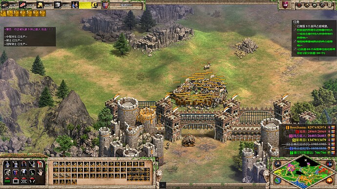
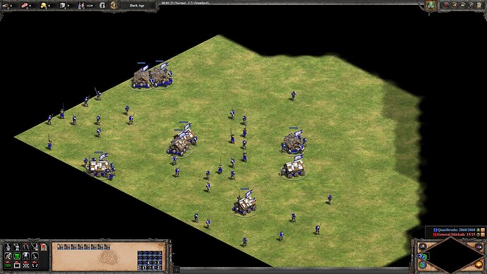
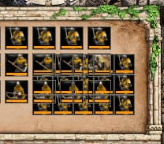
when select multiple troops including ram, the troops in the ram will shows in description
 FREQUENCY OF ISSUE
![]() How often does the issue occur? CHOSE ONE; DELETE THE REST!
How often does the issue occur? CHOSE ONE; DELETE THE REST!
- 100% of the time / matches I play (ALWAYS)
 REPRODUCTION STEPS
![]() List CLEAR and DETAILED STEPS we can take to reproduce the issue ourselves… Be descriptive!
List CLEAR and DETAILED STEPS we can take to reproduce the issue ourselves… Be descriptive!
Here’s the steps to reproduce the issue:
 EXPECTED RESULT
![]() What was SUPPOSED to happen if the bug you encountered were not present?
What was SUPPOSED to happen if the bug you encountered were not present?
only show the ram icon
 IMAGE
IMAGE
![]() ALWAYS attach a PICTURE (.jpg, .png, .gif) or VIDEO (.mp4, YouTube link) that highlights the problem.
ALWAYS attach a PICTURE (.jpg, .png, .gif) or VIDEO (.mp4, YouTube link) that highlights the problem.
 GAME FILES (SAVE / RECORDING)
![]() Attach a SAVE GAME (.aoe2spgame) or GAME RECORDING (.aoe2record) of the match where you encountered the issue. Link it below if using an external file service.
Attach a SAVE GAME (.aoe2spgame) or GAME RECORDING (.aoe2record) of the match where you encountered the issue. Link it below if using an external file service.


