Blast Furnace icon is hard to tell if you can afford to research or not, imo. It’s quite orange to begin with, and the red semi-transparent overlay when you can’t afford doesn’t change its color much.
Is it possible to make the red overlay a bit more opaque for this specific icon or something?
- I like the existing overlay for all other icons, so I’d just want Blast Furnace to get revised treatment, if possible.
In the heat of a match when you only look for a fraction of a second, it could be made more obvious, imo.
After screenshotting both states and posting here (see icon in upper-left of each), I now know how I can better distinguish on-the-fly, but I still think it should be darker red, or get a darker red perimeter border or something when you can’t afford it:
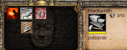
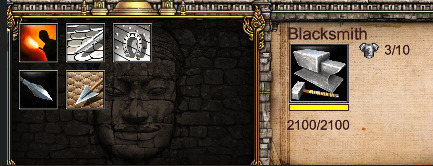
Note: I like the icon itself quite a bit, so hoping it isn’t changed. I’m just talking about its appearance when you can’t afford.